Hospitality Home page examples
11 deeply-analysed hospitality home pages, 2 flagship-tier. Each carries the design tokens, the do and don't rules, the signature moves and the section anatomy, so your AI builder grounds a hospitality home page in how the best sites actually build it.
A home page for a hospitality brand is not a blank template. The best ones share a shape, and they diverge in exactly the places that make a brand feel considered. The 11 references here (Dishoom, Noma, Afuri and Assembly Coffee among them) are read closely, not just screenshotted, so the patterns that carry a home page are on the table as structured data: the type scale, the one disciplined accent, the section order, the motion.
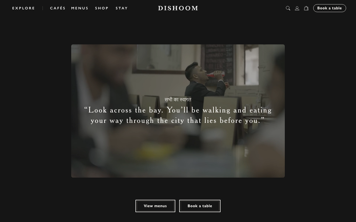
Take one specific: story-first hospitality narrative on Dishoom. The site sells place, heritage and feeling first, then threads menus-per-venue and "book a table" into the narrative so booking never feels transactional. That is the kind of concrete move a taste layer feeds your builder, instead of the generic home skeleton it defaults to with nothing to ground it.
Palate hands your AI builder these references over MCP with explicit borrow rules: what to take from each hospitality home page, what to leave, and how to re-skin it for your own brand. The point is not to copy one of them; it is to build a home page that is grounded in real craft and one-of-a-kind, not averaged. Browse the full set below, or open any reference for its tokens, do and don't rules and section anatomy.
Building a hospitality home page
Worth borrowing
- A restaurant or hospitality brand that wants to read as a gallery, not a menu PDF: white canvas, full-bleed food photography, and one outlined pill CTA per section.
- A near-monochrome interface (black ink on white, greys #B8B8B8 / #555555 / #8D8D8D) where the food photography is the only colour and a single yellow mark is the entire brand accent.
- An all-caps, wide-tracked wordmark treatment (0.28px to 0.65px letter-spacing) that turns a plain system sans into a considered logotype.
- Bilingual editorial bands (Japanese paragraph plus an English translation column) as the section pattern for a Japan-rooted brand speaking to two audiences.
- A calm 0.5s scrollFade reveal discipline (opacity up as elements enter) built without any animation library, proof that one CSS transition and a little jQuery carry a whole site's motion.
- A roaster or craft-food brand that wants to read like an art catalogue, not a Shopify theme: near-black grounds, off-white paper bands, a single brass accent, photography carrying every section.
Do not copy
- The Mt-Afuri yellow mountain mark and the AFURI wordmark are the brand's identity; rebuild the treatment (yellow tile, wide-tracked caps), never the mark itself.
- The Yu Gothic / Hiragino Japanese system stack is right for a Japanese site; for a Latin-script client map to a comparable humanist sans and do not ship the JP font stack by reflex.
- The jQuery + backstretch + bxslider plumbing is dated; borrow the look (full-bleed photo, 0.5s fade) and rebuild it on the modern stack, do not port the libraries.
- The bilingual two-column copy only earns its place for a genuinely bilingual brand; a single-language client should not fake it.
- The GT America Standard and ID00 Serif faces are licensed (GT America from Grilli Type, ID00 Serif from Playtype); map to a geometric grotesque plus a light-italic display serif you have rights to.
- The "Assembly | 10" anniversary lockup and the debossed bag wordmark are brand identity, borrow the idea of a wordmark-as-footer, not the mark itself.
Distilled across these 11 references. Open any one for its full guidance.
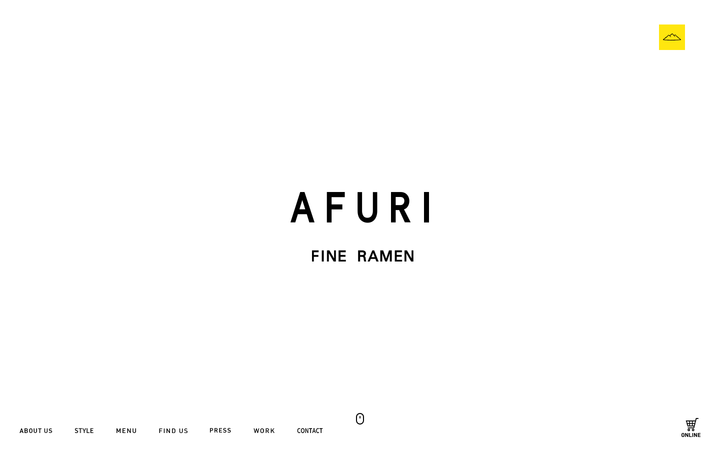
Afuri
strongHospitality
a Tokyo yuzu-shio ramen house that presents itself like a gallery, near-pure white space, a single yellow Mt-Afuri mark, an all-caps letter-spaced AFURI wordmark in a Yu Gothic system stack, and full-bleed food photography that fades up on a 0.5s scrollFade so a bowl of ramen reads as a still life.
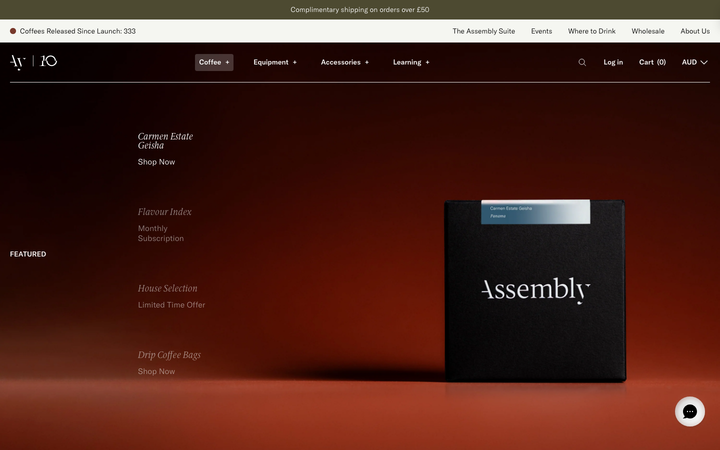
Assembly Coffee
exemplaryHospitality
a Brixton specialty roaster on Shopify that styles itself like an art-house gallery, a near-black oxblood hero, GT America Light paired with ID00 Serif italic for the editorial voice, a single brass-gold accent, and a giant "Assembly | 10" anniversary wordmark closing the page on black.
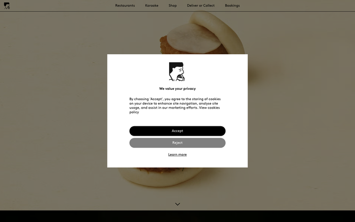
Bao London
strongHospitality
a Michelin Bib Gourmand Taiwanese restaurant group rendered as a full-screen photographic gallery, oversized bao floating on a warm #F9F9F5 cream ground, the geometric Brown typeface holding everything in black at a restrained 36px, and a single screaming #FF0000 booking bar that is the only colour the page allows itself.
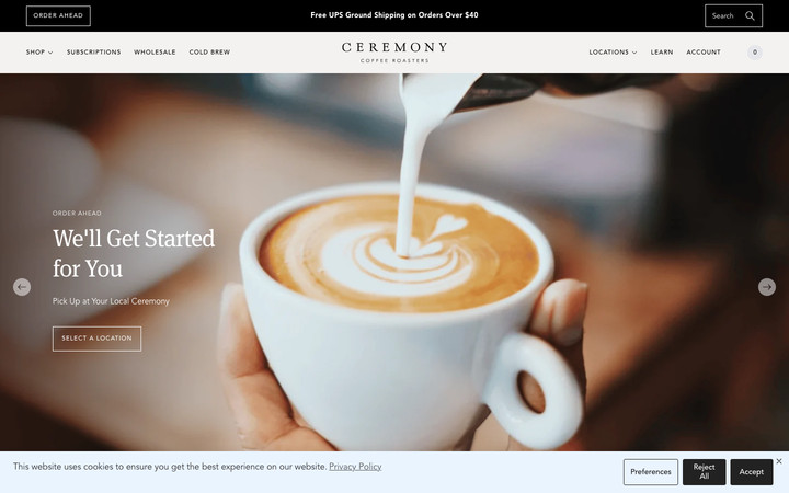
Ceremony Coffee
strongHospitality
a Maryland coffee roaster on Shopify that reads like an editorial magazine, warm off-white paper grounds, an Avenir-plus-Meta-serif pairing, large lifestyle photography of brewed coffee on linen, and a calm 0.15s fade discipline that keeps a busy commerce catalogue feeling unhurried.
Coffee Collective
strongHospitality
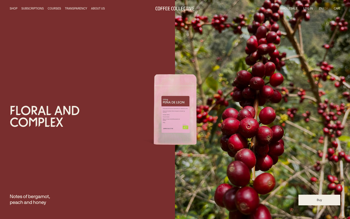
a Copenhagen specialty roaster whose Shopify storefront is built entirely in warm brown ink (#4C4341) on cream (#FAF6ED), set in one tight-tracked NB International Pro at all weights, with hard 0px corners, deep oxblood (#792E2E) editorial bands, and a quiet 0.2s-fade / 0.3s-transform discipline so full-bleed farm photography carries the whole page.
Dishoom
flagshipHospitality
a beloved restaurant group whose site is a love letter to its story, warm cream-and-charcoal editorial storytelling in a Cheltenham serif, with menus and "book a table" threaded through the narrative for each venue.
Dominique Ansel
strongHospitality
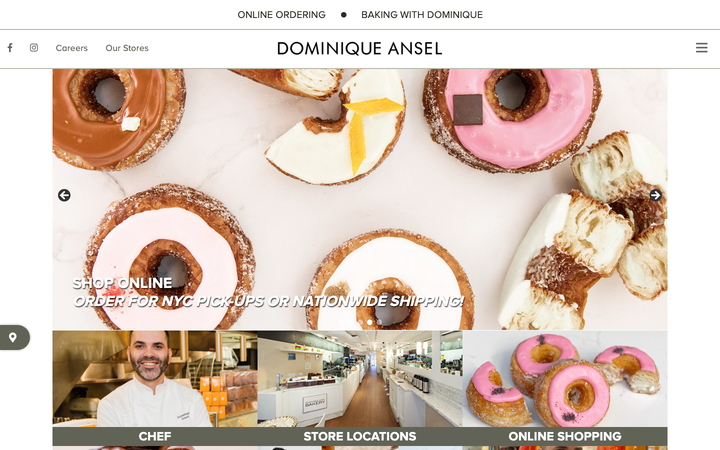
a world-famous pastry chef's bakery group on WordPress that leads entirely with product photography, a sage-and-olive neutral palette (#B8BAAB sage, #282D22 deep olive ink), all-caps Proxima Nova labels over a full-bleed image carousel of viennoiserie, and a gentle ease-driven motion that lets the food do the talking.
Frenchie Restaurant
strongHospitality
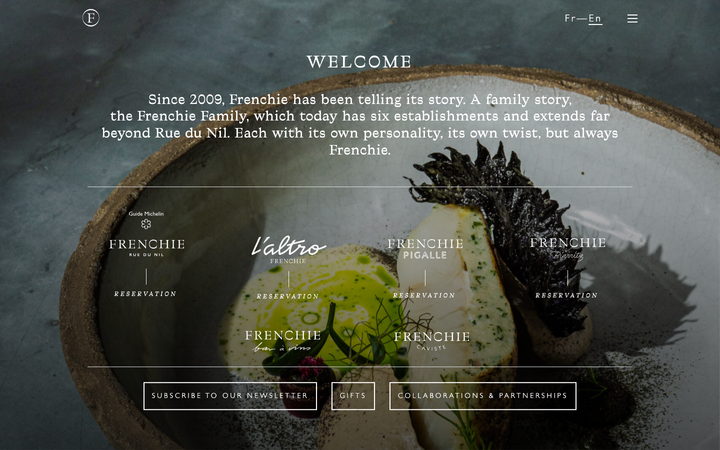
a Paris restaurant group telling a family story, a dark moody hero of textured produce stills, a Traulha display serif (roman and italic) over a Gill Sans body, cream type on near-black ink, and a calm row of venue cards that turns six establishments into one elegant front door.

Noma
flagshipHospitality
a three-Michelin-star restaurant that sells itself through photography and a quiet serif, full-bleed seasonal imagery, a lowercase joined wordmark, and almost no chrome, so the food and the place carry the whole page.
Onyx Coffee Lab
exceptionalHospitality
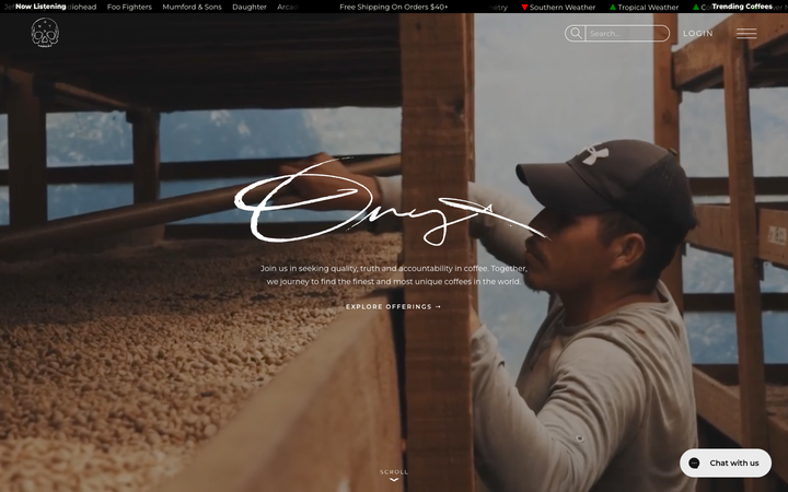
a Bentonville speciality roaster that treats its homepage like a documentary, full-bleed cinematic coffee-farm and cafe footage under a hand-drawn "Onyx" signature, near-black creme paper (#FBFAF3) carrying ink-black type, a Bajern display serif beside all-caps tracked Room-205, and a slow 1.1s/1.7s scroll-reveal that lets each photographic band rise into place.
Sweetgreen
strongHospitality
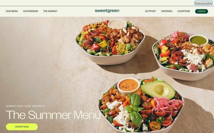
a fast-casual salad chain whose site is a confident, appetite-led order funnel, a bold cream/green/acid-lime brand with big custom-sans headlines, full-bleed food photography, and an "Order" path that is never more than a tap away.