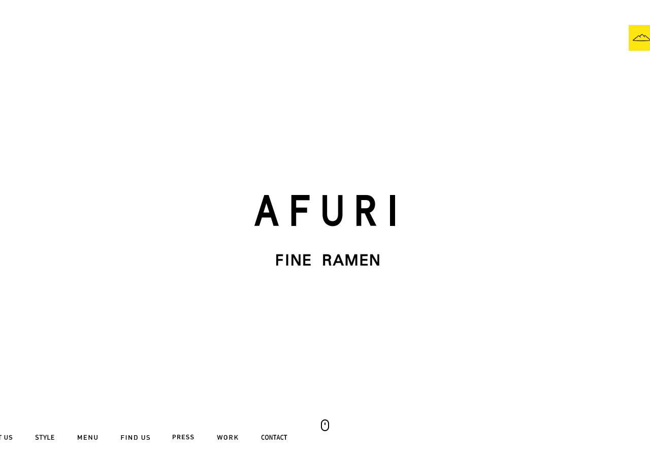
Afuri
afuri.coma Tokyo yuzu-shio ramen house that presents itself like a gallery, near-pure white space, a single yellow Mt-Afuri mark, an all-caps letter-spaced AFURI wordmark in a Yu Gothic system stack, and full-bleed food photography that fades up on a 0.5s scrollFade so a bowl of ramen reads as a still life.
Design tokens
- display
- Yu Gothic system stack (游ゴシック体, "Yu Gothic", YuGothic, "ヒラギノ角ゴ Pro", "Hiragino Kaku Gothic Pro", メイリオ, Meiryo, sans-serif)
- serif
- "EB Garamond", serif (Google Fonts) for the English-translation passages
- body
- Yu Gothic system stack for Japanese; Roboto (300/500) as a Latin fallback
- extra
- Times appears as a bare fallback in 3 spots
Do / Don't
Reference it for
- A restaurant or hospitality brand that wants to read as a gallery, not a menu PDF: white canvas, full-bleed food photography, and one outlined pill CTA per section.
- A near-monochrome interface (black ink on white, greys #B8B8B8 / #555555 / #8D8D8D) where the food photography is the only colour and a single yellow mark is the entire brand accent.
- An all-caps, wide-tracked wordmark treatment (0.28px to 0.65px letter-spacing) that turns a plain system sans into a considered logotype.
- Bilingual editorial bands (Japanese paragraph plus an English translation column) as the section pattern for a Japan-rooted brand speaking to two audiences.
- A calm 0.5s scrollFade reveal discipline (opacity up as elements enter) built without any animation library, proof that one CSS transition and a little jQuery carry a whole site's motion.
Do not copy
- The Mt-Afuri yellow mountain mark and the AFURI wordmark are the brand's identity; rebuild the treatment (yellow tile, wide-tracked caps), never the mark itself.
- The Yu Gothic / Hiragino Japanese system stack is right for a Japanese site; for a Latin-script client map to a comparable humanist sans and do not ship the JP font stack by reflex.
- The jQuery + backstretch + bxslider plumbing is dated; borrow the look (full-bleed photo, 0.5s fade) and rebuild it on the modern stack, do not port the libraries.
- The bilingual two-column copy only earns its place for a genuinely bilingual brand; a single-language client should not fake it.
Signature moves
Confidence through emptiness: an all-white hero with only a wide-tracked all-cap
Confidence through emptiness: an all-white hero with only a wide-tracked all-caps wordmark, then full-bleed food photography that fades its opacity up over 0.5s ease (jQuery scrollFade) as each band scrolls into view, one outlined 26px pill
Related references
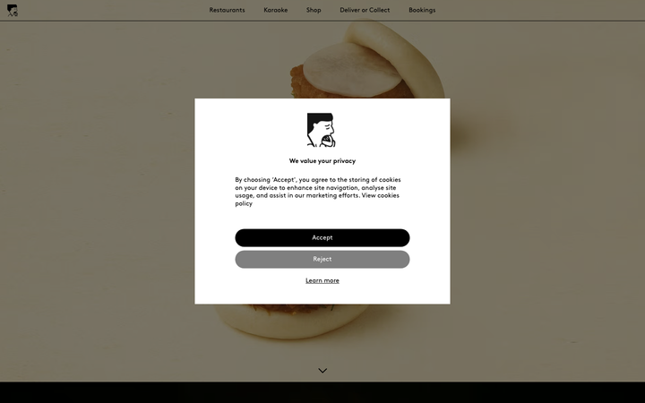
Bao London
strongHospitality
a Michelin Bib Gourmand Taiwanese restaurant group rendered as a full-screen photographic gallery, oversized bao floating on a warm #F9F9F5 cream ground, the geometric Brown typeface holding everything in black at a restrained 36px, and a single screaming #FF0000 booking bar that is the only colour the page allows itself.
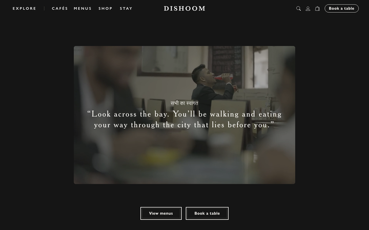
Dishoom
flagshipHospitality
a beloved restaurant group whose site is a love letter to its story, warm cream-and-charcoal editorial storytelling in a Cheltenham serif, with menus and "book a table" threaded through the narrative for each venue.
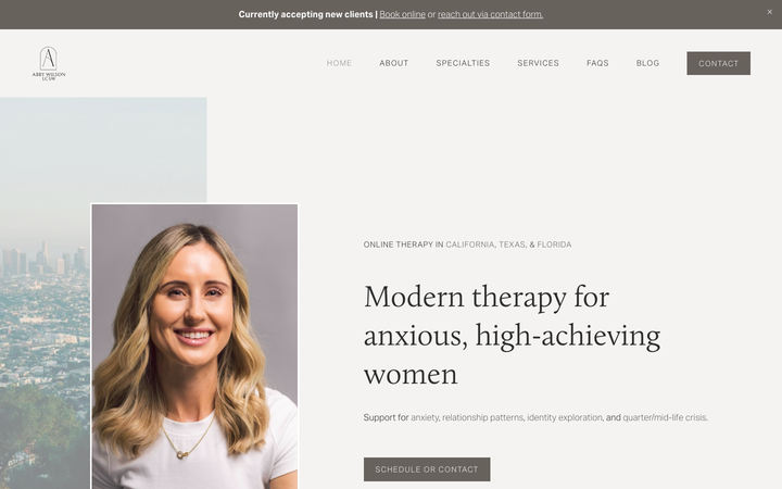
Abby Wilson Therapy
strongOther
A boutique therapist for "anxious, high-achieving women" who reassures by being polished and specific - a warm sand-and-charcoal editorial system, a Calluna serif voice, named specialties and a clearly walked process that says "I understand exactly who you are and how this works".
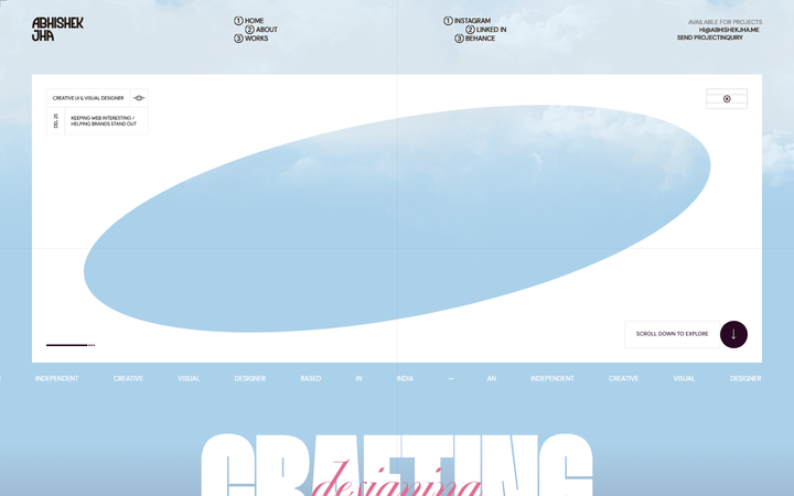
Abhishek Jha
nicheDesign Portfolio
Indian designer personal portfolio - 4-font system (DM Sans + thunder + editorial + playground), 17-step scale up to 288px, dark plum + pink palette, 9-keyframe marquee/cloud motion.