Bao London
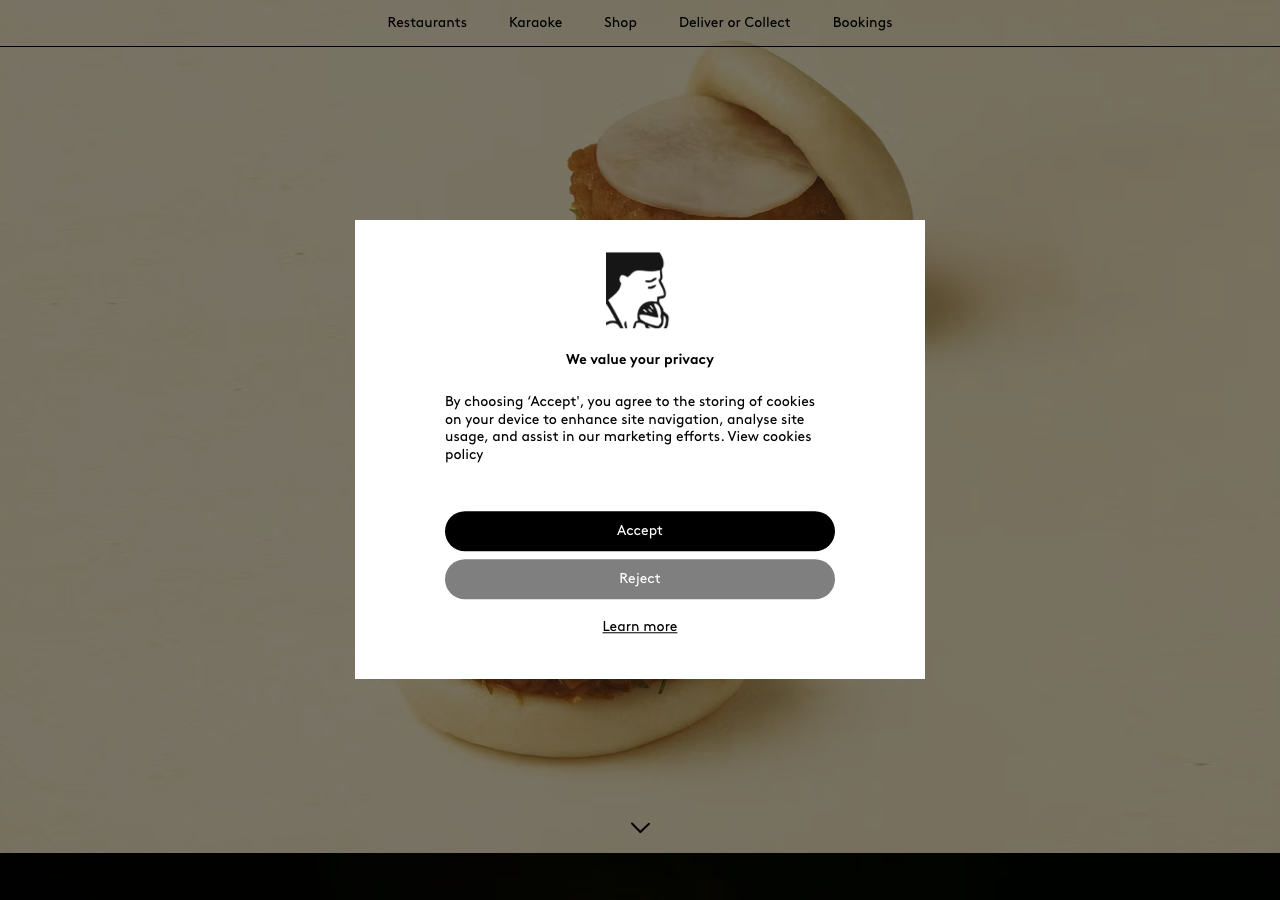
baolondon.coma Michelin Bib Gourmand Taiwanese restaurant group rendered as a full-screen photographic gallery, oversized bao floating on a warm #F9F9F5 cream ground, the geometric Brown typeface holding everything in black at a restrained 36px, and a single screaming #FF0000 booking bar that is the only colour the page allows itself.
Design tokens
- display
- Brown (geometric grotesque)
- body
- Brown
- mono
- none
Do / Don't
Reference it for
- A restaurant or food group that wants oversized, full-viewport food photography to be the entire hierarchy, with the UI reduced to a centred headline and a scroll cue.
- A warm near-monochrome palette: black (#000000) and soft charcoal (#4B4B4A) on a cream #F9F9F5 ground, with white only for type over imagery.
- Holding to one geometric typeface (Brown class) in three weights across a tight 14-36px scale, so the food carries all the contrast and the type never shouts.
- Reserving a single saturated colour (#FF0000) for one dismissable booking bar, the only loud element on the page, as a model of accent discipline.
- The full-viewport scroll-snap section stack (five 900px panels, each centring its own dish) as a structural pattern for a place that has a handful of strong stories to tell in sequence.
Do not copy
- The Brown typeface is a licensed commercial face (Lineto); map to a geometric grotesque with similar warmth (see typography.md) rather than shipping Brown.
- The BAO bear/character wordmark and the dish photography are brand-owned and identity-coded; the composition is borrowable, the marks and the actual images are not.
- The pure #FF0000 booking bar is a brand-confident choice that works because BAO has earned the loudness; a younger venue should keep the accent discipline but may want a less aggressive red.
- The seven-location nav and the karaoke/loyalty-app/careers breadth suit a multi-site group; a single venue should trim the navigation hard.
Signature moves
Full-viewport photographic panels (five 900px screens, one dish/idea each) on a
Full-viewport photographic panels (five 900px screens, one dish/idea each) on a warm cream ground tuned to the food's own background so the bao appear to float, with a deliberately small 36px headline so the photography owns the screen, and
Related references
Afuri
strongHospitality
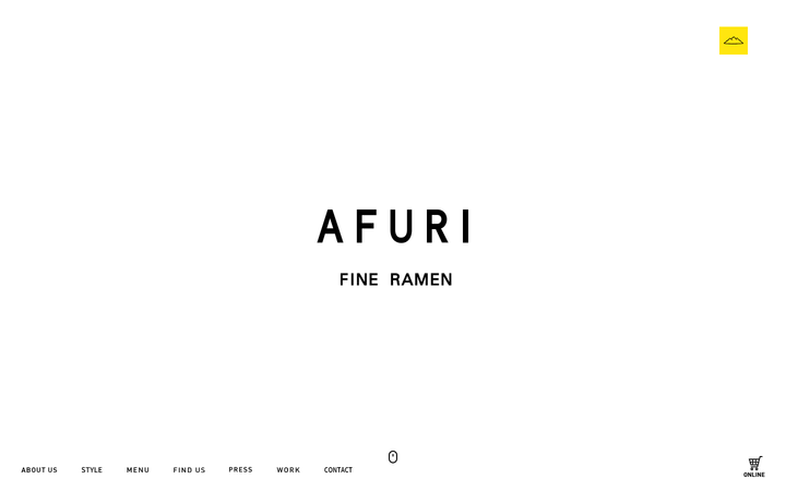
a Tokyo yuzu-shio ramen house that presents itself like a gallery, near-pure white space, a single yellow Mt-Afuri mark, an all-caps letter-spaced AFURI wordmark in a Yu Gothic system stack, and full-bleed food photography that fades up on a 0.5s scrollFade so a bowl of ramen reads as a still life.
Dishoom
flagshipHospitality
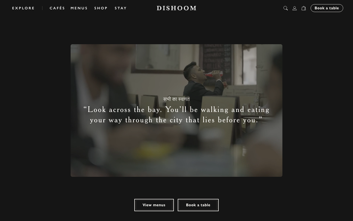
a beloved restaurant group whose site is a love letter to its story, warm cream-and-charcoal editorial storytelling in a Cheltenham serif, with menus and "book a table" threaded through the narrative for each venue.
Abby Wilson Therapy
strongOther
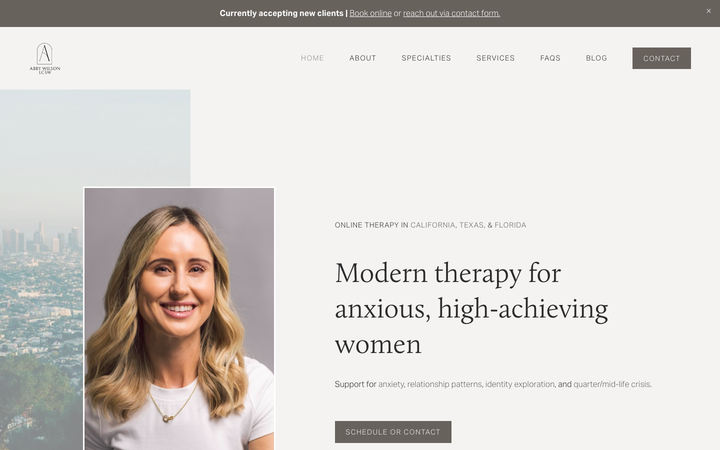
A boutique therapist for "anxious, high-achieving women" who reassures by being polished and specific - a warm sand-and-charcoal editorial system, a Calluna serif voice, named specialties and a clearly walked process that says "I understand exactly who you are and how this works".
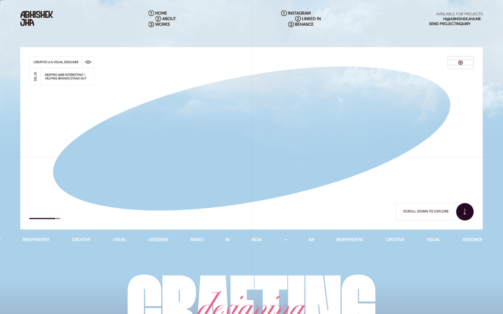
Abhishek Jha
nicheDesign Portfolio
Indian designer personal portfolio - 4-font system (DM Sans + thunder + editorial + playground), 17-step scale up to 288px, dark plum + pink palette, 9-keyframe marquee/cloud motion.