Coffee Collective
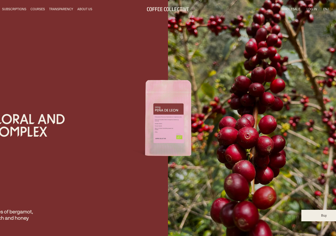
coffeecollective.dk/a Copenhagen specialty roaster whose Shopify storefront is built entirely in warm brown ink (#4C4341) on cream (#FAF6ED), set in one tight-tracked NB International Pro at all weights, with hard 0px corners, deep oxblood (#792E2E) editorial bands, and a quiet 0.2s-fade / 0.3s-transform discipline so full-bleed farm photography carries the whole page.
Design tokens
- display
- NB International Pro (neo-grotesque)
- heading
- NB International Pro
- body
- NB International Pro
- logo
- Coffee Collective (bespoke display face)
- mono
- NB International Pro Mono
- fallback
- Inter, sans-serif
Do / Don't
Reference it for
- A specialty roaster or provenance-led food brand that wants a Scandinavian gallery calm: warm-brown ink (#4C4341) on cream (#FAF6ED), full-bleed farm and product photography carrying every section.
- A single-family type system: one neo-grotesque (NB International Pro class) at weights 200 to 700 with tight -0.46px tracking, no serif and no second face needed.
- Hard 0px corners as a deliberate signature (--buttons-radius: 0px, card radius 0rem), the sharp-edged opposite of the default rounded Shopify theme.
- Editorial colour bands (oxblood #792E2E, forest #343E3B) breaking up cream product carousels, so the scroll reads as alternating gallery rooms rather than a thumbnail wall.
- A restrained CSS-only motion budget: 0.2s opacity fades, 0.3s transforms, 0.1s underline-thickness on links, Swiper for product rows, no scroll-jacking.
Do not copy
- NB International Pro is a licensed retail face (and the Coffee Collective wordmark is a bespoke identity asset); map to a freely licensed neo-grotesque and a custom or set logotype.
- The Shopify third-party stack (Klaviyo signup popup, Recharge subscriptions, GeoPro localisation, Clarity/GA/Bing pixels) ships with the platform; borrow the calm, not the 269-request, 84-script plumbing.
- The deep 11-item product nav (Filter Coffee, Espresso, Equipment, Merch, Courses, two subscription tiers, brew guides) suits a roaster with a real catalogue and a course business; a single venue should trim it hard.
- The brand's specific photography (farm origin shots, the cafe-location filmstrip) is identity-coded and licensed; reproduce the full-bleed treatment with the client's own imagery, never these frames.
Signature moves
Full-bleed photographic hero with a solid oxblood #792E2E panel pinned to the le
Full-bleed photographic hero with a solid oxblood #792E2E panel pinned to the left third and a product image floating over the seam, then alternating cream four-up product carousels with full-width editorial colour bands, all held at hard 0
Related references
Onyx Coffee Lab
exceptionalHospitality
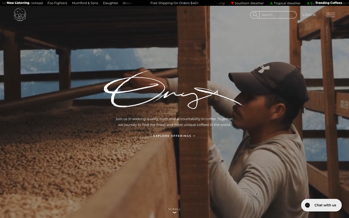
a Bentonville speciality roaster that treats its homepage like a documentary, full-bleed cinematic coffee-farm and cafe footage under a hand-drawn "Onyx" signature, near-black creme paper (#FBFAF3) carrying ink-black type, a Bajern display serif beside all-caps tracked Room-205, and a slow 1.1s/1.7s scroll-reveal that lets each photographic band rise into place.
Alternative Aesthetics
nicheDesign Portfolio
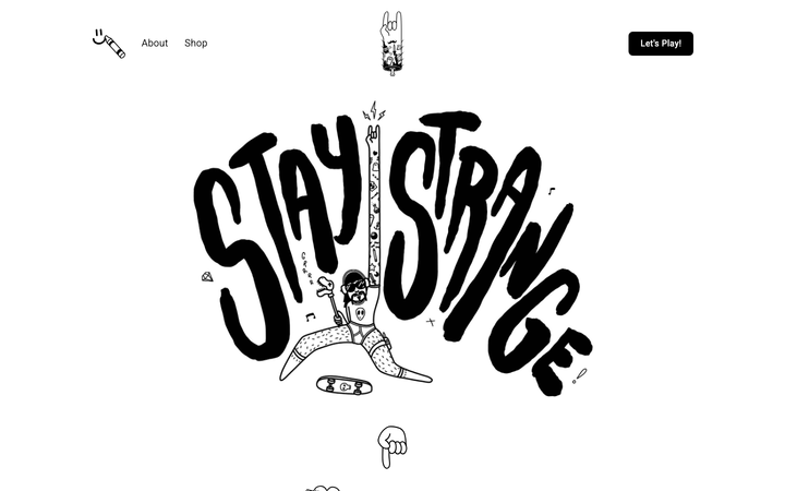
The reference for solo illustrator portfolios on Webflow - hand-drawn "Stay Strange" hero typography, monochrome black/white canvas, and a 4-column thumbnail grid that lets the artwork carry the entire visual voice.
Bellroy
flagshipRetail
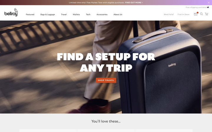
an accessories e-commerce site that fronts a deep catalogue with one bold, punchy hero, leading with heavy uppercase GTUltra type, a warm terracotta accent on a near-monochrome base, and a calm Material-style motion system that keeps a 40-section shop feeling composed.
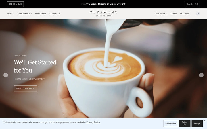
Ceremony Coffee
strongHospitality
a Maryland coffee roaster on Shopify that reads like an editorial magazine, warm off-white paper grounds, an Avenir-plus-Meta-serif pairing, large lifestyle photography of brewed coffee on linen, and a calm 0.15s fade discipline that keeps a busy commerce catalogue feeling unhurried.