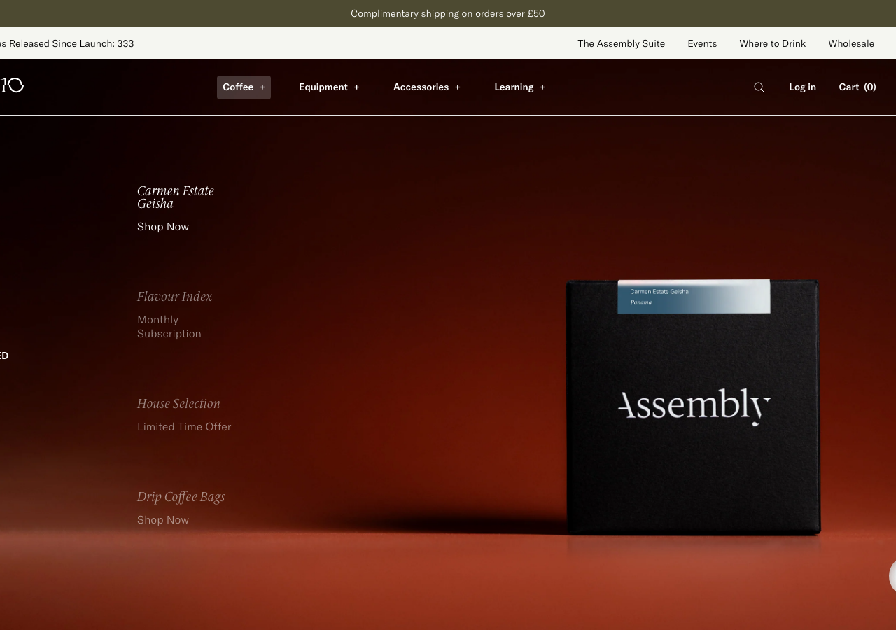
Assembly Coffee
assemblycoffee.co.uk/a Brixton specialty roaster on Shopify that styles itself like an art-house gallery, a near-black oxblood hero, GT America Light paired with ID00 Serif italic for the editorial voice, a single brass-gold accent, and a giant "Assembly | 10" anniversary wordmark closing the page on black.
Design tokens
- display
- ID00 Serif (light italic, weight 300) - Playtype
- body
- GT America Standard (Light 300, Medium 500) - Grilli Type
- mono
- ui-monospace stack (Atlas widget only)
Do / Don't
Reference it for
- A roaster or craft-food brand that wants to read like an art catalogue, not a Shopify theme: near-black grounds, off-white paper bands, a single brass accent, photography carrying every section.
- The GT America Light + ID00 Serif italic pairing, a geometric sans at weight 300 for structure with a light-italic serif for editorial headings and product names.
- A disciplined dark palette with role-locked colour: brass-gold #CFA53B for marks only, lemon #FAF080 reserved purely for "New Release" badges, never decoration.
- A custom motion curve (cubic-bezier(0.59, 0, 0.68, 0.69)) on GSAP/ScrollTrigger applied as quiet fades at 0.15s and 0.5s, restraint over spectacle.
- The closing wordmark-as-graphic full stop: an oversized brand lockup ("Assembly | 10") set as a full-bleed footer statement on black.
Do not copy
- The GT America Standard and ID00 Serif faces are licensed (GT America from Grilli Type, ID00 Serif from Playtype); map to a geometric grotesque plus a light-italic display serif you have rights to.
- The "Assembly | 10" anniversary lockup and the debossed bag wordmark are brand identity, borrow the idea of a wordmark-as-footer, not the mark itself.
- The mature Shopify martech stack (Klaviyo, Gorgias, LoyaltyLion, reviews.io, Corner cart, Smartlook, a dozen ad pixels) ships with the store; borrow the calm front of house, not the plumbing.
- The full B2B/wholesale catalogue depth and multi-shelf nav suit a real roastery; a single venue should trim hard.
Signature moves
The oversized "Assembly | 10" wordmark closing the page, set ~600px wide in ID00
The oversized "Assembly | 10" wordmark closing the page, set ~600px wide in ID00 Serif italic (flourished 'y' descender) as a full-bleed white-on-black graphic full stop in the footer.
Related references
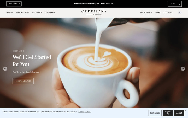
Ceremony Coffee
strongHospitality
a Maryland coffee roaster on Shopify that reads like an editorial magazine, warm off-white paper grounds, an Avenir-plus-Meta-serif pairing, large lifestyle photography of brewed coffee on linen, and a calm 0.15s fade discipline that keeps a busy commerce catalogue feeling unhurried.
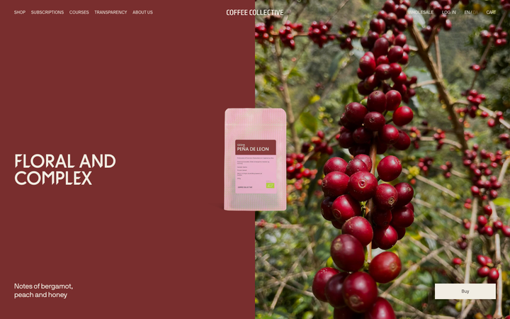
Coffee Collective
strongHospitality
a Copenhagen specialty roaster whose Shopify storefront is built entirely in warm brown ink (#4C4341) on cream (#FAF6ED), set in one tight-tracked NB International Pro at all weights, with hard 0px corners, deep oxblood (#792E2E) editorial bands, and a quiet 0.2s-fade / 0.3s-transform discipline so full-bleed farm photography carries the whole page.
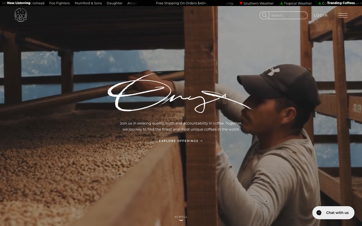
Onyx Coffee Lab
exceptionalHospitality
a Bentonville speciality roaster that treats its homepage like a documentary, full-bleed cinematic coffee-farm and cafe footage under a hand-drawn "Onyx" signature, near-black creme paper (#FBFAF3) carrying ink-black type, a Bajern display serif beside all-caps tracked Room-205, and a slow 1.1s/1.7s scroll-reveal that lets each photographic band rise into place.
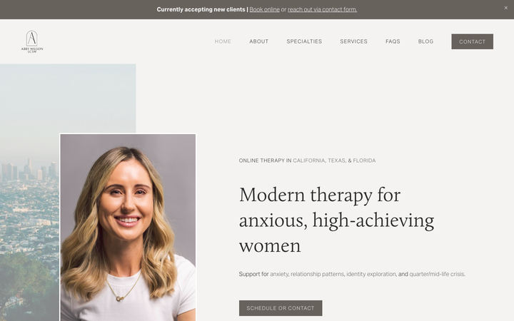
Abby Wilson Therapy
strongOther
A boutique therapist for "anxious, high-achieving women" who reassures by being polished and specific - a warm sand-and-charcoal editorial system, a Calluna serif voice, named specialties and a clearly walked process that says "I understand exactly who you are and how this works".