Creative Studio Home page examples
29 deeply-analysed creative studio home pages, 1 flagship-tier. Each carries the design tokens, the do and don't rules, the signature moves and the section anatomy, so your AI builder grounds a creative studio home page in how the best sites actually build it.
A home page for a creative studio brand is not a blank template. The best ones share a shape, and they diverge in exactly the places that make a brand feel considered. The 29 references here (Huge, Analogue, Brand Appart and Cappen among them) are read closely, not just screenshotted, so the patterns that carry a home page are on the table as structured data: the type scale, the one disciplined accent, the section order, the motion.
Take one specific: brutalist one-family black canvas on Huge. One type family at one weight, near-square 1-2px corners and vast black space signal taste through restraint. That is the kind of concrete move a taste layer feeds your builder, instead of the generic home skeleton it defaults to with nothing to ground it.
Palate hands your AI builder these references over MCP with explicit borrow rules: what to take from each creative studio home page, what to leave, and how to re-skin it for your own brand. The point is not to copy one of them; it is to build a home page that is grounded in real craft and one-of-a-kind, not averaged. Browse the full set below, or open any reference for its tokens, do and don't rules and section anatomy.
Building a creative studio home page
Worth borrowing
- Personality through type: a multi-alternate display wordmark and inline emoji/icon glyphs as brand voice.
- "Seriously playful": maximal motion kept controlled by a strict black/white + single-pink palette.
- A motion-studio stack done well, GSAP + ScrollTrigger + Lenis, as the reference for heavy, choreographed scroll motion.
- A playful nav that includes a "Playroom" (experiments) as a brand signal.
- A grotesque + serif + mono three-voice type system for range.
- Cream parchment background rgb(251, 249, 239) - warm off-white instead of grey
Do not copy
- The wonky multi-alternate wordmark and inline-emoji copy are very brand-coded; borrow the idea, not the execution.
- The volume of motion (29 keyframes, glitches, bounces) needs strong art direction and reduced-motion care; it can read as noisy if borrowed wholesale.
- MetroSans / Italian Plate are licensed; map to playful display + mono substitutes.
- The Brand Appart "ba" blue circle logomark
- The "design©" copy or the orange-superscript pun (unless brand has comparable wordplay)
- The "We help funded startups ship iconic brands..." copy
Distilled across these 29 references. Open any one for its full guidance.
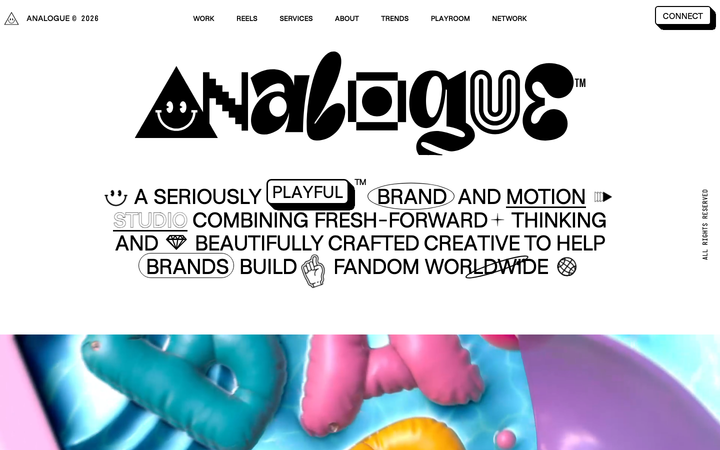
Analogue
strongCreative Studio
a "seriously playful" brand-and-motion studio that wears its personality as type, a wonky multi-alternate ANALOGUE wordmark, emoji and icon glyphs set inline in the copy, a candy-pink accent on white, and a GSAP-driven box of tricks (mexican-wave letters, glitches, bounce, float) kept just on the right side of chaos.
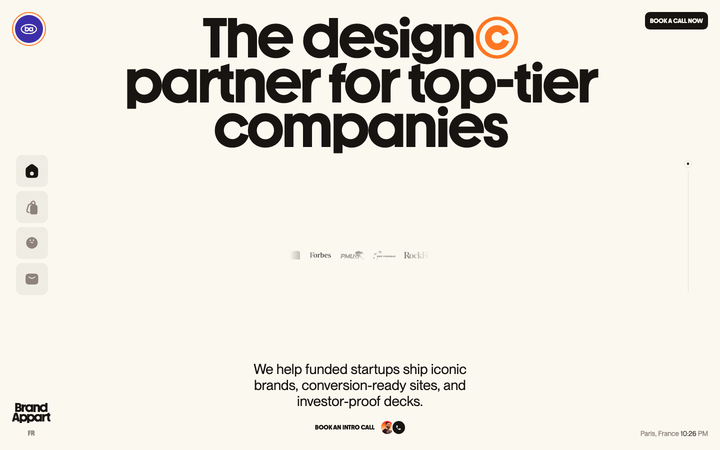
Brand Appart
strongCreative Studio
The reference for Paris startup design agencies - Youth chunky-sans display, cream parchment paper, orange ©-superscript wordplay, live Paris clock, Webflow + Lenis + Splitting.js stack.
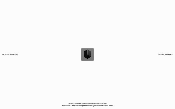
Cappen
strongCreative Studio
The reference for award-winning Miami creative dev studios - extreme typographic range (200 to 900 weight, 10 to 300px scale), three premium fonts, left/right-anchored hero positioning, PageLayer + Splitting.js stack.
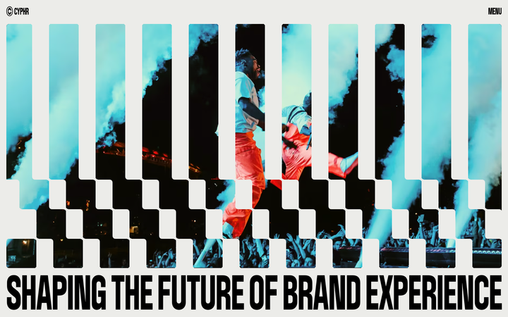
Cyphr
strongCreative Studio
The reference for venture-studio portfolios that flex through monumental condensed type, a single blue I-beam cursor accent, and a venetian-blind slat hero that fragments a single image into a column-rhythmic curtain.
Dipsy
nicheCreative Studio
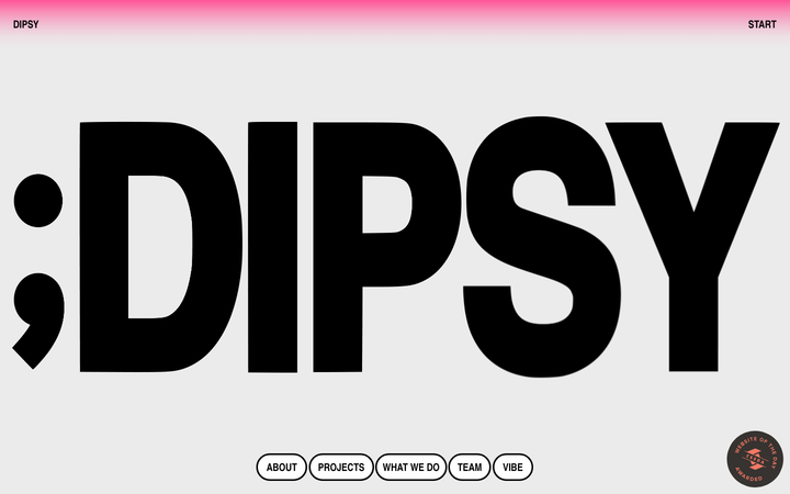
a family-run design studio that turns its own name into the hero, a screen-filling black ";DIPSY" set in a heavy condensed grotesque on warm grey, a pink gradient bleeding down from the top edge, pill-outlined nav and pill form fields, and a playful run of cookie-dough photography toward the end.
Drexler
nicheCreative Studio
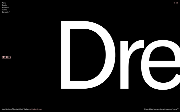
A Baltimore studio that uses a single 765px-tall wordmark as the entire homepage, with a warm pink-on-black palette and 5-link nav, signalling small-shop confidence through wordmark-as-canvas restraint.
Fiddle Digital
strongCreative Studio
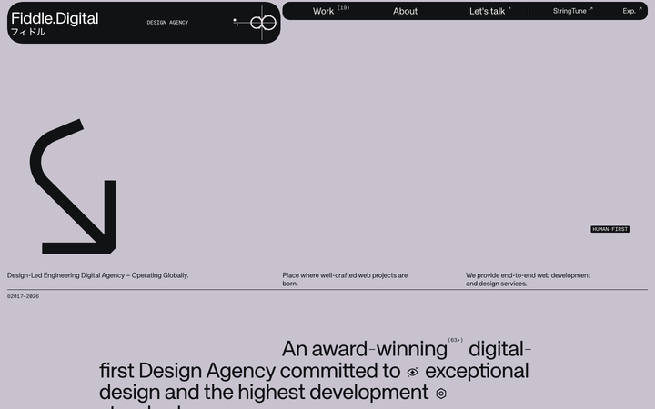
an award-agency site that runs on contrast, a near-black ink and soft mauve, a grotesque paired with its own mono, type that swings from 11px labels to viewport-filling 130px+ display, a custom loading cursor and horizontal marquees, with a glassy 3D aurora render as the one moment of spectacle.
Geex Arts
nicheCreative Studio
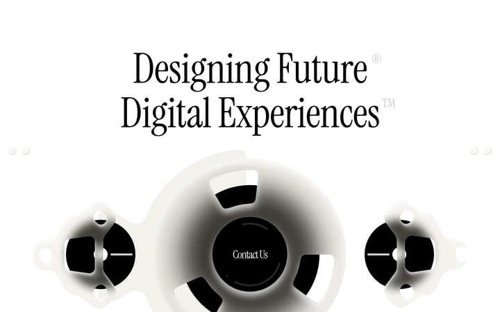
Award-winning creative agency "Designing Future" - Instrument Serif + Suisse Int'l Book editorial pairing, Webflow + GSAP + ScrollTrigger + Swiper stack, AI & ML capability section.
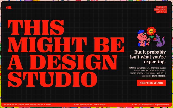
General Condition
nicheCreative Studio
Self-aware "this might be a design studio" hero on near-black with vivid red display + rainbow-bordered chrome - WordPress+Elementor post-modern creative aesthetic.
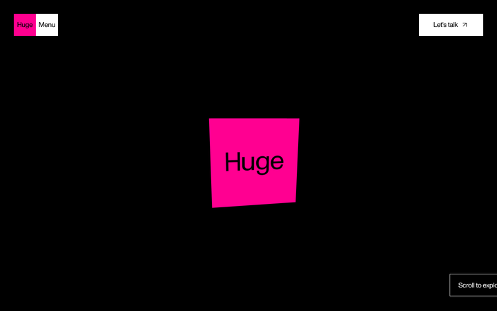
Huge
flagshipCreative Studio
a black-canvas, Monument-Grotesk agency site that turns brutalist restraint into confidence, sharp corners, one type family, vast empty space, then detonates a few hot-pink and acid-green colour blocks and lets Lenis-smooth scroll reveal the work.
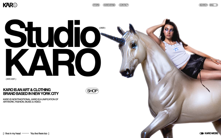
Karo Crafts
nicheCreative Studio
NYC creative studio + merch shop - "unification of artwork, fashion, music & video", Helvetica + ultra-blue accent, Nuxt + Prismic stack, 229px hero.
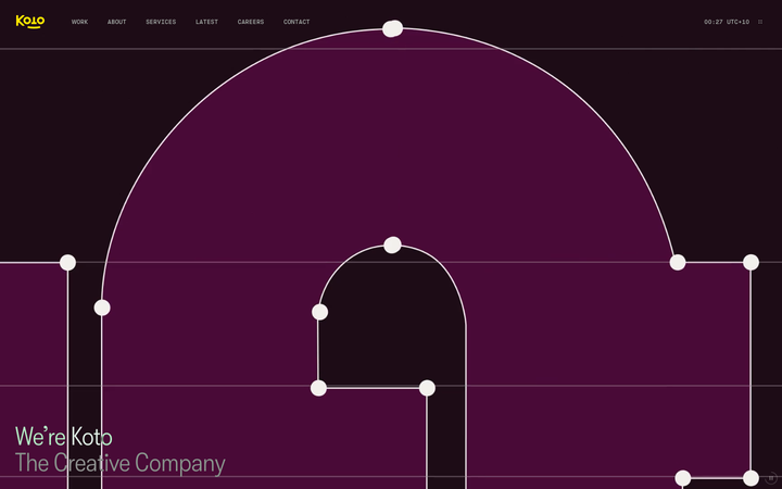
Koto
strongCreative Studio
The reference for global brand-agency studios - yellow logomark on near-black, four custom typefaces, live UTC clock chrome, split-screen sticky-text case study reveals.
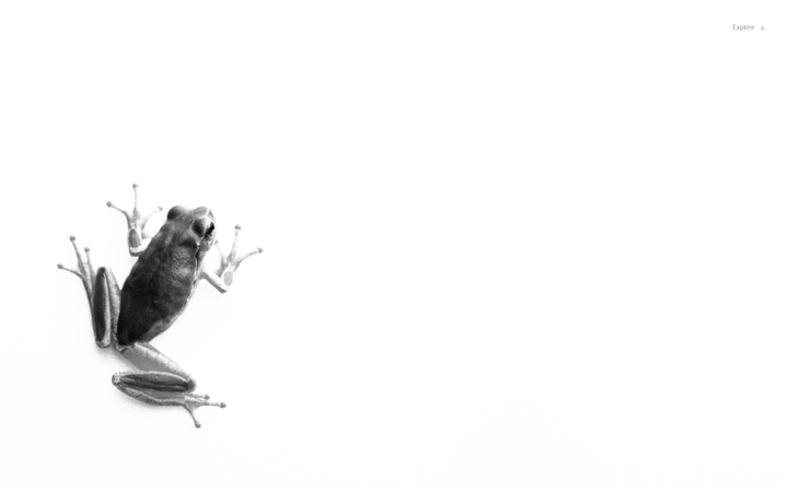
Lazy Eight
strongCreative Studio
a gallery-minimal brand-studio portfolio where a near-white canvas, one large black-and-white image and a tiny "Explore ↓" are the entire first screen, image carries everything, type whispers, and a single classic link-blue is the only colour.
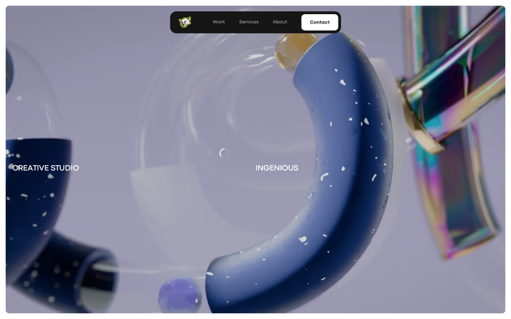
Leoleo Studio
nicheCreative Studio
French multidisciplinary studio that uses a totally achromatic black-on-white chrome and lets 3D render film carry every drop of colour, with cinematic 0.45s easeOutExpo transitions and a small cat-head logomark floating in a dark pill nav.
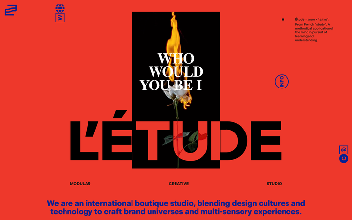
Letude
strongCreative Studio
The reference for international boutique studios - bold red background, royal-blue L'Étude wordmark overlaid on photography, SvelteKit + Sanity + Lenis stack, draw-in logomark animations.
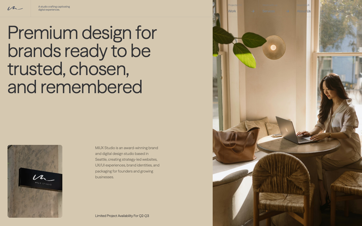
Miux
nicheCreative Studio
The reference for warm-neutral boutique UX/UI studios - handwritten signature mark, cream-and-stone palette, restrained editorial type, horizontal-scroll-pinned case study reveal on an otherwise calm vertical page.
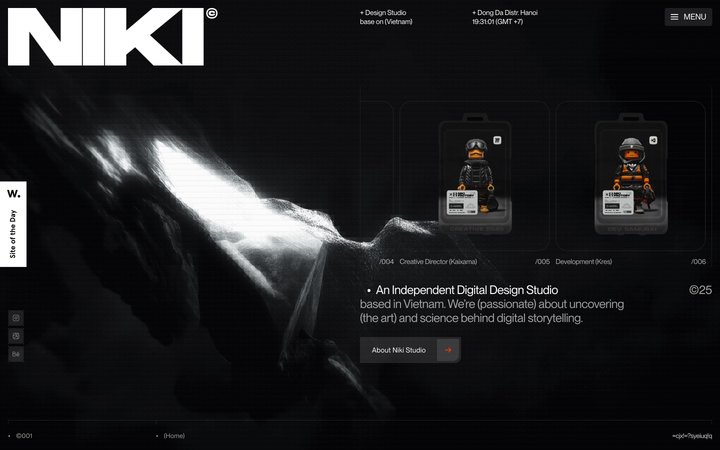
Niki Studio
nicheCreative Studio
a Vietnamese digital design studio that opens on a colossal Monument Extended "NIKI" wordmark over a near-black, cinematically lit scene, with orange-suited collectible action figures as the work showcase and an industrial monospace-label HUD framing everything.
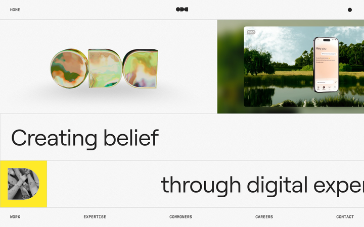
Oddcommon
strongCreative Studio
a digital-experience studio that builds its homepage like one of its products, a fixed, gridded "operating system" screen on an off-white grain canvas, where an iridescent 3D ODC logo, a big Roobert headline, a single yellow block and live Mux video tiles sit inside hairline-ruled frames and move with spring physics.
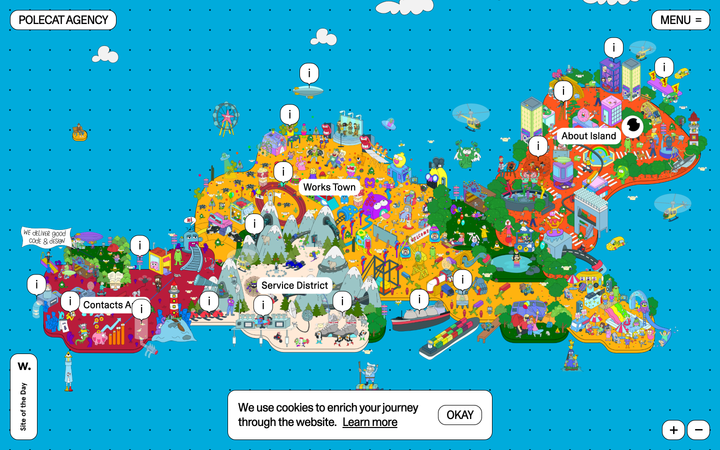
Polecat
nicheCreative Studio
a startup studio that throws out the scrolling landing page entirely and turns its homepage into an explorable illustrated island, a cartoon archipelago floating on a dotted cyan sea, divided into districts (Contacts Area, Service District, Works Town, About Island) you pan and zoom through, with info pins instead of a nav bar.
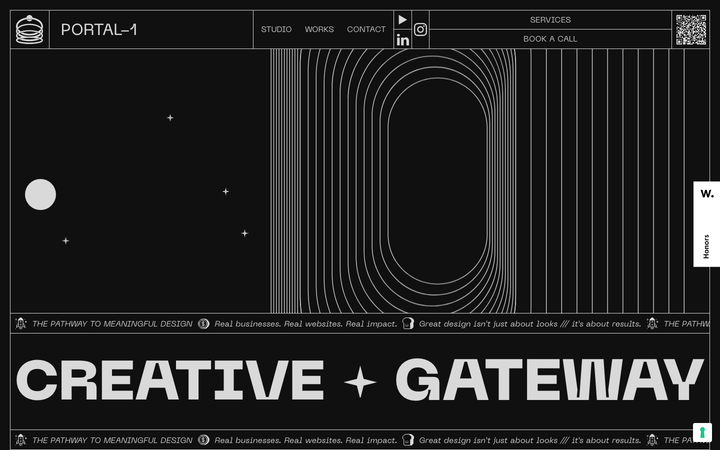
Portal One
strongCreative Studio
A Framer-built creative studio site where Inktrap display type, monochrome pure-black canvas, and large geometric SVG portals (tracks, wells, vortexes) carry the entire brand: a "creative gateway" rendered as actual gateways on every scroll.
Reform Collective
nicheCreative Studio
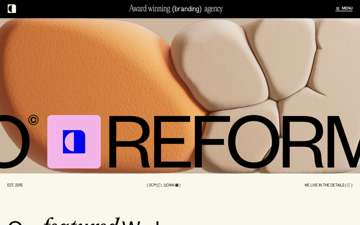
The reference for serif-display motion-creative agency sites - cream `#F9F8EE` paper, serif/grotesk hybrid wordmark, sticker-style organic shapes, and a fixed top chrome that morphs the brand tagline letterforms.
Soscale
nicheCreative Studio
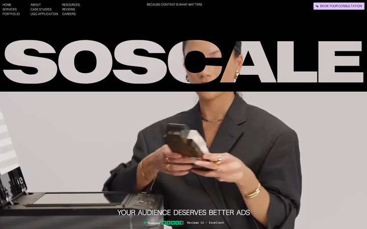
The reference for Swedish performance-marketing agencies that lead with creative rather than media-buying - pure-black canvas, oversized SOSCALE wordmark hero, lavender pill CTA, and a Webflow + GSAP + Lenis motion stack borrowed wholesale from the global studio scene.
Stokt
nicheCreative Studio
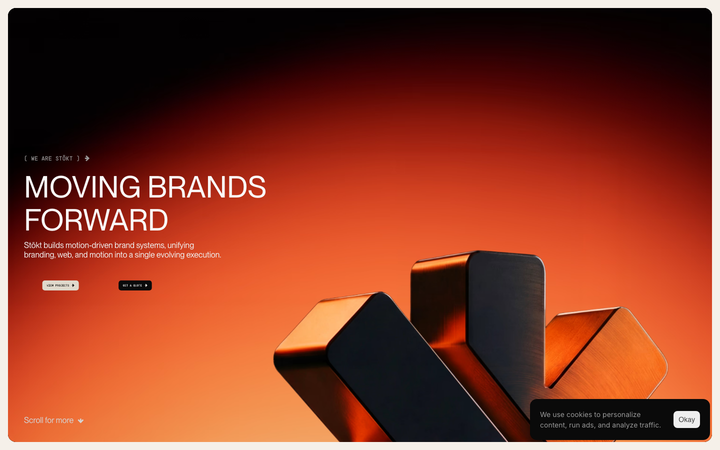
The reference for Quebec creative studios with Swedish-umlaut wordmark - cream paper + chili-orange accent + 150px hero + 40-section density + Framer Motion + Lenis stack.
Studio Herrstrom
nicheCreative Studio
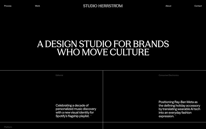
Pure-black editorial portfolio for a culture-shaping design studio, anchored by an uppercase serif display headline, four-pole nav chrome with a diacritic-stroke logomark, and a 2x2 grid of category-tagged case study tiles separated by hairline white rules.
Supersolid
nicheCreative Studio
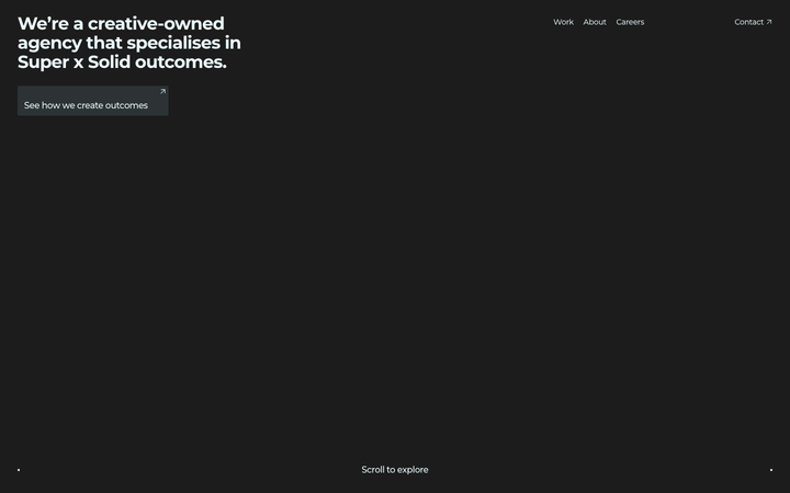
The reference for Sydney creative-agency portfolios - near-black canvas, single-headline hero with a tiny "Scroll to explore" indicator, then a tile-grid case study reel and a chromatic-aberration ROIdeas display moment.
Thingy And Thingy
nicheCreative Studio
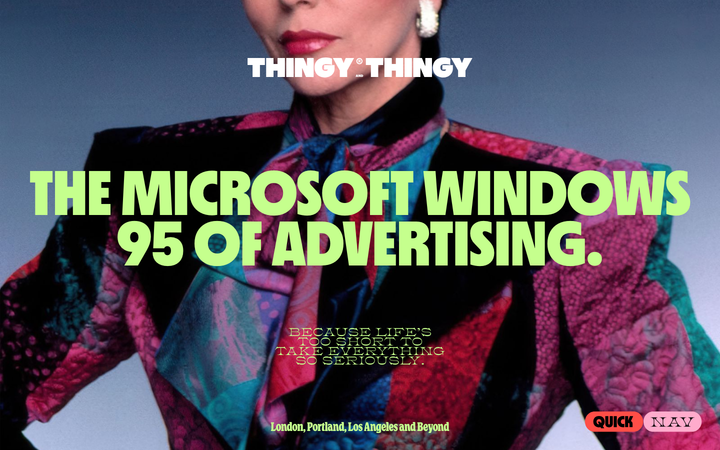
The reference for "anti-advertising" agency sites that weaponise chaos - zodiac-named nav, draggable physics-pill bubbles, colour-blocked viewport sections, and four foundry display faces stacked into a deliberately overstuffed, irreverent identity.
Tux Creative
nicheCreative Studio
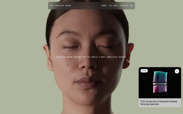
A bicoastal independent creative house (LA + Montréal) whose site is built around one monumentally oversized custom display face (TuxPlaza at ~223px), a chrome-grey blurred-pill top nav, and full-bleed cinematic Vimeo case study reels - motion-heavy creative portfolio at indie-craft tier.
We Are Example
nicheCreative Studio
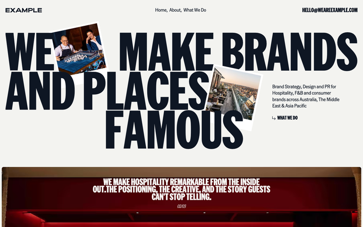
The reference for boutique hospitality-PR agencies - warm off-white canvas with deep navy ink, oversized American Grotesk Compressed display headlines, polaroid-style photo collage hero, and a soft Lenis-smoothed editorial rhythm.
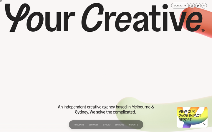
Your Creative
nicheCreative Studio
a Melbourne and Sydney creative agency that runs warm off-white pages on an eight-column grid, sets everything in the Greed grotesque from 22px body up to a 250px hero, anchors the work in oversized numbered category headers ("Science & Innovation", tagged 20) and floats a blurred pill nav while a custom cursor and a soft 3D blob carry the personality.