Health About page examples
6 deeply-analysed health about pages, 3 flagship-tier. Each carries the design tokens, the do and don't rules, the signature moves and the section anatomy, so your AI builder grounds a health about page in how the best sites actually build it.
A about page for a health brand is not a blank template. The best ones share a shape, and they diverge in exactly the places that make a brand feel considered. The 6 references here (Headspace, One Medical, Parsley Health and Capsule among them) are read closely, not just screenshotted, so the patterns that carry a about page are on the table as structured data: the type scale, the one disciplined accent, the section order, the motion.
Take one specific: warm safe palette for a sensitive service on Headspace. A cream canvas (not stark white), a gentle dark ink (not hard black), one sunshine-warm accent plus a clear action blue make a mental-health brand feel safe. That is the kind of concrete move a taste layer feeds your builder, instead of the generic about skeleton it defaults to with nothing to ground it.
Palate hands your AI builder these references over MCP with explicit borrow rules: what to take from each health about page, what to leave, and how to re-skin it for your own brand. The point is not to copy one of them; it is to build a about page that is grounded in real craft and one-of-a-kind, not averaged. Browse the full set below, or open any reference for its tokens, do and don't rules and section anatomy.
Building a health about page
Worth borrowing
- Turning a tedious, anxious category (pharmacy) into a calm, premium, human experience with a simple three-word promise.
- A trustworthy health palette: deep navy and white with a supporting tone and a reserved red for urgency, instead of clinical fluoro.
- A Mercury-style serif display over a clean Circular-style sans, for warmth plus authority.
- A focused, readable container (~1130px) and a clear "how it works" (transfer, fill, deliver).
- A trust spine (pharmacists, safety, insurance) under the primary action.
- A warm, safe palette for a sensitive service: a cream canvas (not stark white), gentle dark ink (not hard black), one sunshine-warm accent plus a clear action blue.
Do not copy
- The Circular / Mercury type and the exact navy-and-teal palette are capsule's identity; choose the client's own trustworthy colourway and licensed equivalents.
- capsule's delivery/insurance model is US-specific; an Australian community pharmacy should map the flow to scripts, click-and-collect and local delivery.
- "Meds made easy" is their line; calibrate the reassuring tone, do not copy it.
- The Headspace Apercu type, the exact cream/yellow/blue palette, and the illustrated characters are headspace's brand; build the client's own warm system, do not imitate the mascots.
- headspace's breadth (meditation, sleep, AI companion, coaching) suits a global app; a local therapy practice should keep the warmth but scope the nav to its real services.
- The brand voice is theirs; calibrate to a similar warmth, never copy phrasing.
Distilled across these 6 references. Open any one for its full guidance.
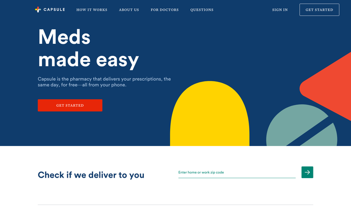
Capsule
strongHealth
a digital pharmacy whose site makes medication feel calm and human ("Meds made easy"), a trustworthy navy-and-white system with a Mercury serif display over Circular sans, built around the simple promise of transferring a prescription and getting it delivered.
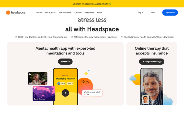
Headspace
flagshipHealth
a meditation and mental-health brand whose site radiates calm and friendliness, a warm cream canvas, the bespoke Headspace Apercu sans, big soft-rounded shapes, playful illustration and a signature sunshine yellow, so therapy and mindfulness feel approachable rather than clinical.

Nijinowa Clinic
strongHealth
a Yokohama home-visit clinic whose homepage runs as a fixed 270px left rail (logo, vertical bilingual nav, phone) against full-bleed warm photography on the right, a rainbow-fan motif fanning over the hero, ink-grey #222 type set in an old-style Japanese gothic with letter-spacing pushed wide (h1 50px on 90px leading, 10px tracking), and a single calm 0.15s ease-out as the whole site's transition.
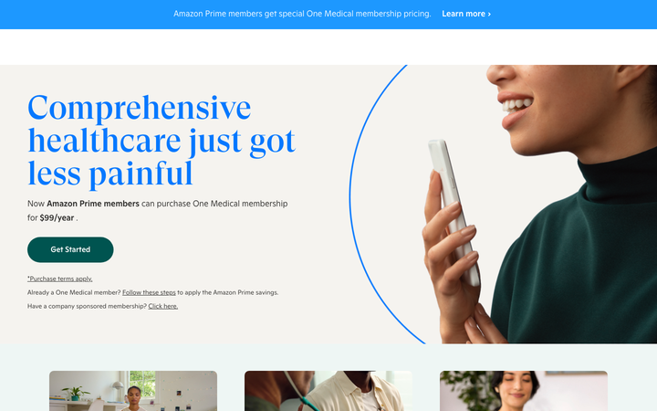
One Medical
flagshipHealth
a primary-care membership clinic whose site makes healthcare feel calm and human, a warm teal-and-peach palette, a GT Super serif display over clean Ginto sans, audience-segmented care paths, and a "book" action that treats getting care as the product.
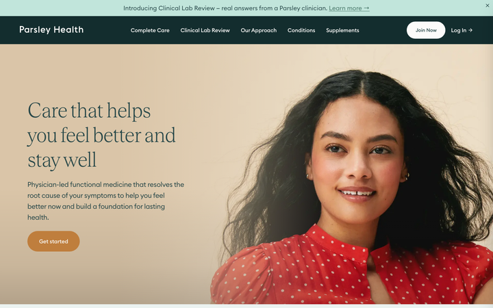
Parsley Health
flagshipHealth
a functional-medicine telehealth clinic that earns trust through calm, a deep forest-teal and warm-cream palette, an EuclidCircularB-plus-Teodor-serif pairing, a long evidence-led page of credential blocks, comparison tables and measurable outcomes, all on a clean Next.js + Tailwind build.
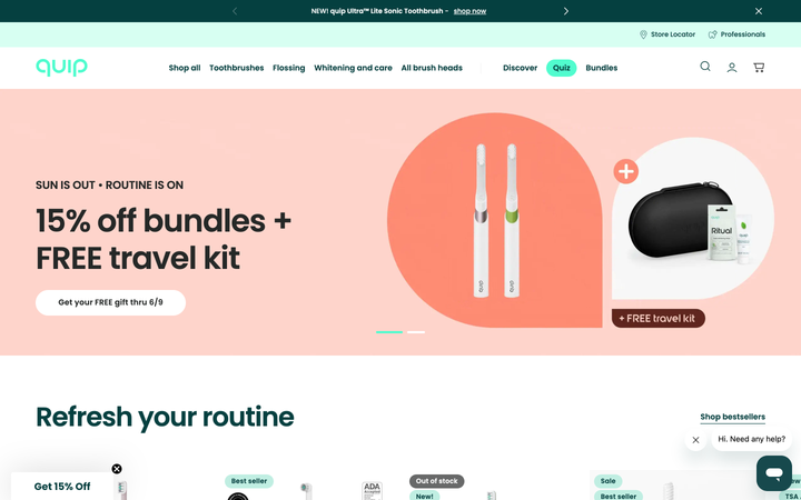
Quip
strongHealth
an oral-care brand that makes dental health feel friendly and modern rather than clinical, a clean mint-and-teal system, Poppins, soft pill shapes, with a shop, a store locator and a "find a professional" dentist network.