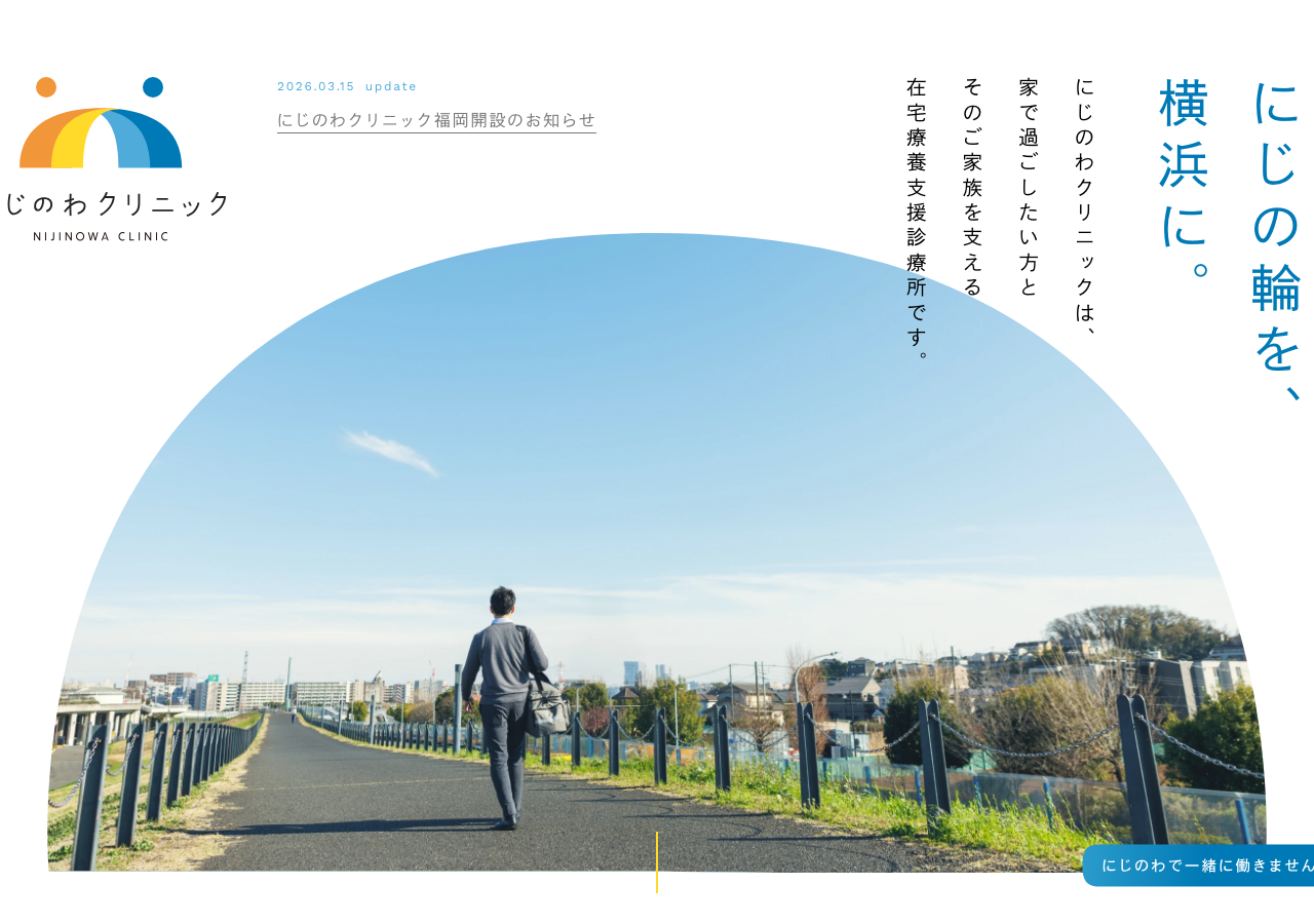
Nijinowa Clinic
nijinowa-clinic.jp/a Yokohama home-visit clinic whose homepage runs as a fixed 270px left rail (logo, vertical bilingual nav, phone) against full-bleed warm photography on the right, a rainbow-fan motif fanning over the hero, ink-grey #222 type set in an old-style Japanese gothic with letter-spacing pushed wide (h1 50px on 90px leading, 10px tracking), and a single calm 0.15s ease-out as the whole site's transition.
Design tokens
- displayJa
- I-OTFゴシックオールドPro (M and L cuts, served live via FontPlus)
- bodyJa
- I-OTFゴシックオールドPro M, falling back to Yu Gothic Medium, Hiragino Kaku Gothic ProN, Meiryo, sans-serif
- latin
- Work Sans (Google Fonts, weights 200-600)
- mono
- none
Do / Don't
Reference it for
- A health, GP or home-care clinic that wants warmth and trust: documentary photography of real care, a soft-rainbow accent set, ink-grey body type, no hard sell.
- The fixed left-rail layout: a ~270px sidebar holding logo, a vertical bilingual nav (Japanese label over a small English caption) and a pinned phone number, with full-bleed photography filling the right.
- Wide-tracked, tall-leading display typography (h1 10px tracking on 90px leading, h2 6.3px on 57.9px) that makes Japanese or any headline read like print.
- A restrained 0.15s ease-out house transition plus barba.js whole-page fades, proof a content site can move calmly without scroll theatre.
- A rainbow-without-the-cliche accent system (orange, yellow, two blues) held back to the logo, hero fan and dividers so near-white grounds stay calm.
Do not copy
- The I-OTF Gothic Old Pro faces are licensed live through FontPlus (a metered per-character webfont service); do not reuse the FontPlus accessor URLs. Substitute a licensed Japanese gothic or, for a Latin build, a humanist sans, and keep Work Sans for the Latin layer.
- The rainbow logo (the arch with two head-dots reading as connected figures) and the "にじの輪" rainbow-ring concept are brand identity; borrow the soft-rainbow palette idea, not the mark.
- The WordPress/nijinowa-clinic4 theme plumbing (jQuery, velocity, slick, modernizr, AIOSEO) is legacy stack baggage; rebuild the patterns on Astro, do not port the dependency stack.
- The bilingual nav (Japanese primary, English caption) is specific to a Japanese audience; for an English brief use a single label and drop the caption row.
Signature moves
A fixed ~270px left rail (logo + vertical bilingual nav + pinned phone) against
A fixed ~270px left rail (logo + vertical bilingual nav + pinned phone) against full-bleed documentary photography, with a soft-rainbow fan motif over the hero and wide-tracked, tall-leading display type that reads like a printed poster.
Related references
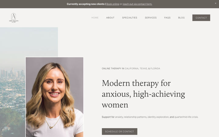
Abby Wilson Therapy
strongOther
A boutique therapist for "anxious, high-achieving women" who reassures by being polished and specific - a warm sand-and-charcoal editorial system, a Calluna serif voice, named specialties and a clearly walked process that says "I understand exactly who you are and how this works".
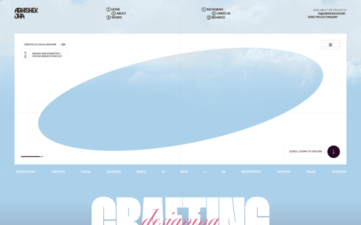
Abhishek Jha
nicheDesign Portfolio
Indian designer personal portfolio - 4-font system (DM Sans + thunder + editorial + playground), 17-step scale up to 288px, dark plum + pink palette, 9-keyframe marquee/cloud motion.
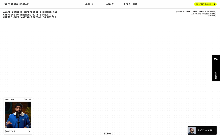
Alejandro Mejias
nicheDesign Portfolio
A Melbourne solo UX designer's Framer-built portfolio in a brutalist bracket-wrapped monospace voice - black-on-white chrome punctuated by a single neon-yellow accent, dotted-grid hero, and full-bleed yellow about page.
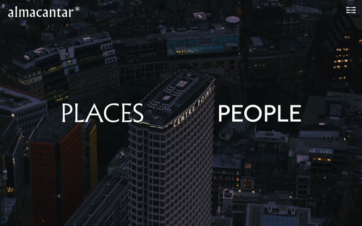
Almacantar
nicheReal Estate
an architecture-led property developer reduced to its barest, most confident form, full-bleed aerial London video on near-black, a single Albertus serif word-pair ("PLACES / PEOPLE"), almost no chrome, and a quiet fade-and-rise motion that lets the buildings carry everything.