Fitness Home page examples
9 deeply-analysed fitness home pages, 2 flagship-tier. Each carries the design tokens, the do and don't rules, the signature moves and the section anatomy, so your AI builder grounds a fitness home page in how the best sites actually build it.
A home page for a fitness brand is not a blank template. The best ones share a shape, and they diverge in exactly the places that make a brand feel considered. The 9 references here (Barrys, Tonal, Alo Yoga and Core Atelier Pilates among them) are read closely, not just screenshotted, so the patterns that carry a home page are on the table as structured data: the type scale, the one disciplined accent, the section order, the motion.
Take one specific: booking-first location-first hero on Barrys. The studio finder and Book Your First Class sit in the hero beside the headline, not buried in a menu. That is the kind of concrete move a taste layer feeds your builder, instead of the generic home skeleton it defaults to with nothing to ground it.
Palate hands your AI builder these references over MCP with explicit borrow rules: what to take from each fitness home page, what to leave, and how to re-skin it for your own brand. The point is not to copy one of them; it is to build a home page that is grounded in real craft and one-of-a-kind, not averaged. Browse the full set below, or open any reference for its tokens, do and don't rules and section anatomy.
Building a fitness home page
Worth borrowing
- A yoga / activewear / studio-retail brand wanting an aspirational, image-led feel: near-monochrome chrome, full-bleed lifestyle photography, almost no UI furniture.
- An editorial italic display overlaid on a hero image as the single personality move against an otherwise clean sans system.
- Disciplined merchandising rails: a small uppercase category label, an image grid, a "Shop X" link, repeated as the page rhythm.
- A deeply tokenised neutral system (named greys, a 4-120px spacing scale, shadow levels) that keeps a large Shopify catalogue consistent.
- Light, tasteful motion (0.3s colour, 0.6s transform) that supports rather than performs.
- Booking-first, location-first hero: the studio finder and "Book Your First Class" sit in the hero beside the headline, not buried in a menu.
Do not copy
- The "alo" wordmark, the golden-hour brand photography, and proxima-nova / arquitecta are Alo's identity; map to a comparable clean grotesque and source your own lifestyle imagery.
- The Shopify + Builder.io machinery and 182 custom properties are an enterprise retail apparatus; borrow the token discipline, not the volume.
- Pure black-on-white with full-bleed photography only works with consistently styled, professionally shot images.
- The Red Room red light and "best workout in the world" line are Barry's identity; borrow the technique of building the site around the studio's signature environment, not the red itself.
- United Sans and Benton Sans Pro are licensed; map to a condensed grotesque plus a clean humanist sans.
- The brush-script wordmark is bespoke artwork; commission the client's own, do not imitate this one.
Distilled across these 9 references. Open any one for its full guidance.
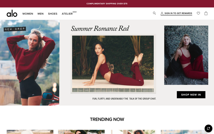
Alo Yoga
strongFitness
an aspirational activewear and yoga store that runs almost pure black-on-white, lets full-bleed editorial photography fill the frame, and adds personality through one handwritten-italic serif overlay and disciplined image-grid merchandising.
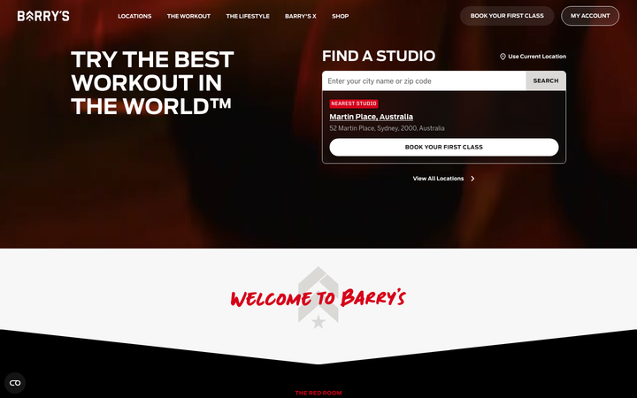
Barrys
flagshipFitness
the original HIIT studio brand selling "the best workout in the world", a dark, cinematic Webflow site built on near-black and the Red Room red, condensed athletic display type, a hand-painted script signature, and a booking-first hero that puts "find a studio" above everything.
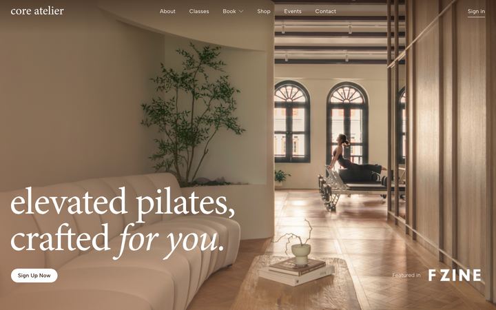
Core Atelier Pilates
nicheFitness
a warm, editorial pilates-studio site in espresso and cream (#25140C / #F7E7DE) with an Albert Sans plus Minion Pro serif-italic pairing, sun-lit interior photography, Lenis-smoothed scrolling and a giant "core atelier" wordmark closing the page.
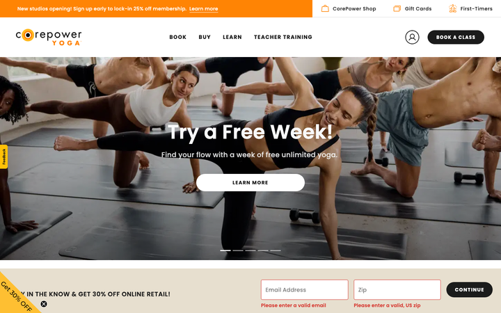
Corepower Yoga
strongFitness
a yoga studio chain whose site runs entirely on the class timetable, Book / Studio Schedule / On Demand sit at the front of the nav, in a warm sunset-orange-and-cream palette with friendly Poppins, so finding and booking a class is the whole experience.
Gymbox
strongFitness
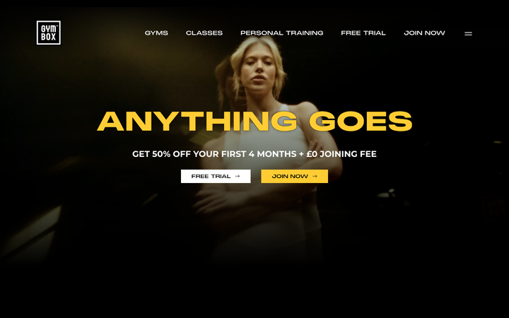
a London boutique gym that shouts, near-black backgrounds, one electric yellow accent, a custom condensed display face set in enormous all-caps ("ANYTHING GOES", "GOT QUESTIONS?"), gritty workout photography and Lenis-smoothed Swiper carousels.
Skulpt Fitness
nicheFitness
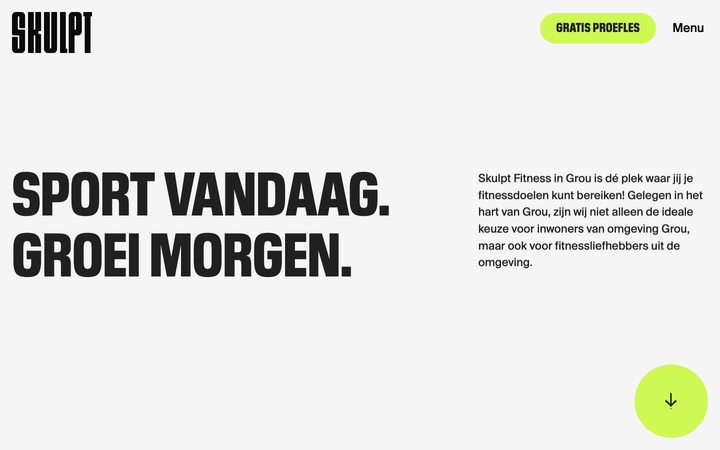
a Dutch boutique gym in Grou built on Webflow that swings between a near-white #F5F5F5 ground and a graphite #202020 ground, sets a single chartreuse #CEF952 against ink, and runs a 122-144px Pilat Condensed Heavy display in all-caps so loud that the only motion it needs is a looping lime word-marquee and a 1.2s expo reveal.
The Kay
strongFitness
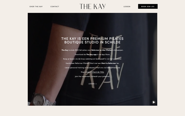
a Belgian reformer-pilates boutique on Webflow that runs the whole site on one linen ground (#f3eee8), all-caps Sofia Pro at light 300 weight with a wide 1-2px letter-spacing, a full-bleed video hero, and centred body columns capped at 500px so the page reads like a quiet print brochure rather than a fitness site.
Third Space
strongFitness
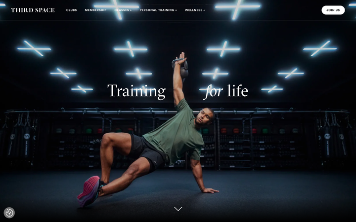
a London luxury-gym chain that frames fitness as culture, full-bleed cinematic photography of athletes in near-black studios lit by neon, a GTSectra serif display with the word "for" set in italic against Circular sans, and a single calm 0.3s opacity fade carrying a tall 6116px scroll of dark photographic cards.
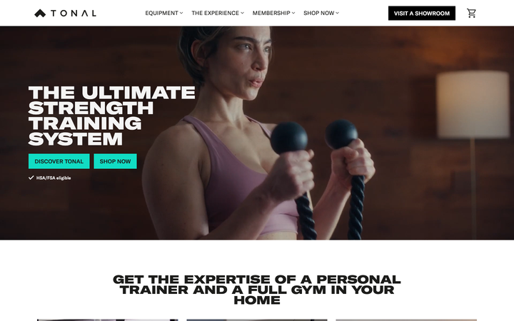
Tonal
flagshipFitness
a connected-fitness hardware brand selling a wall-mounted smart gym, a clean editorial system in near-black on warm bone, GT America plus a GT Expanded display cut, one electric teal accent, and Tailwind-driven cubic-bezier(0.4,0,0.2,1) transitions that keep a Vue app feeling like a premium product site.