Third Space
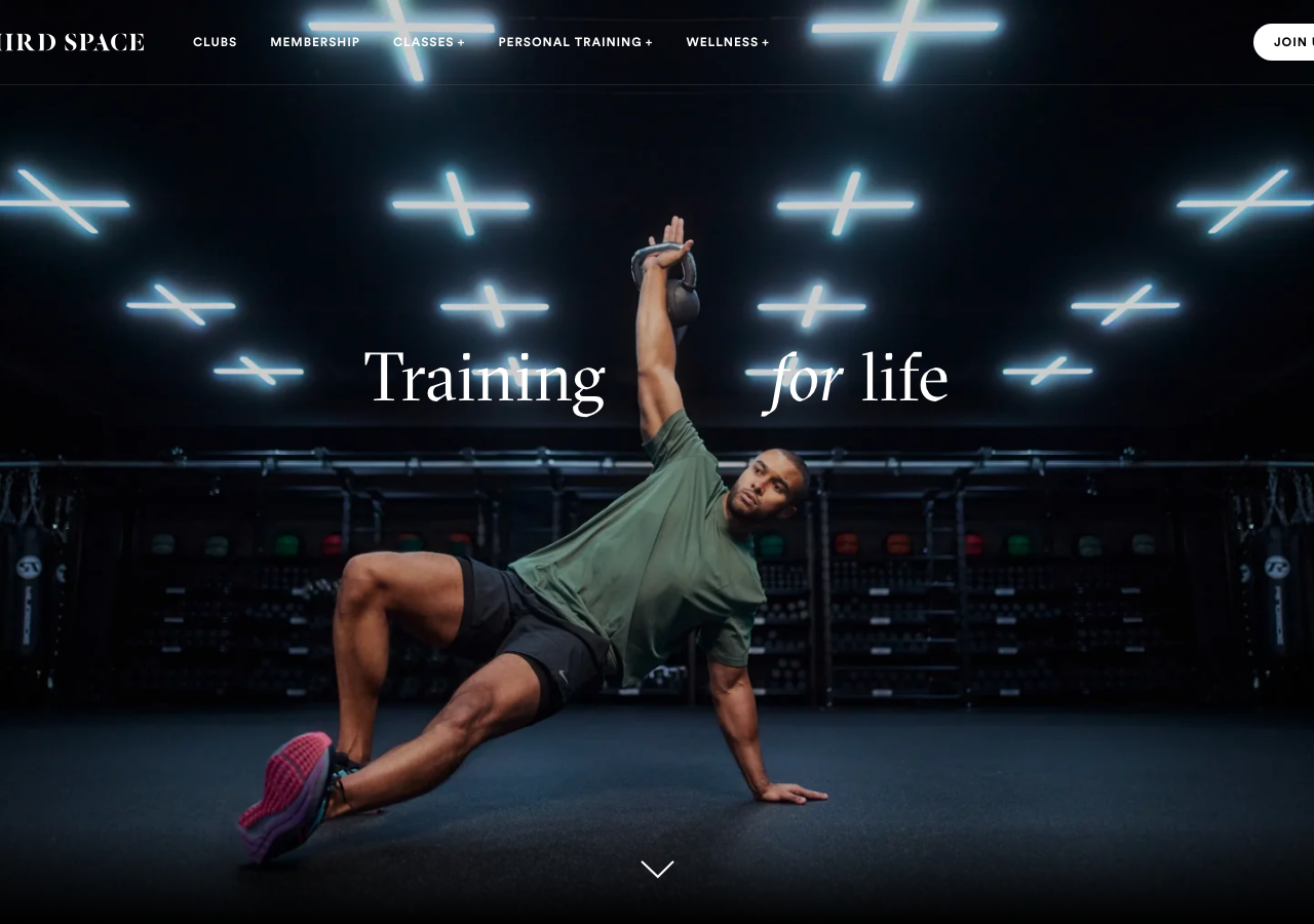
www.thirdspace.london/a London luxury-gym chain that frames fitness as culture, full-bleed cinematic photography of athletes in near-black studios lit by neon, a GTSectra serif display with the word "for" set in italic against Circular sans, and a single calm 0.3s opacity fade carrying a tall 6116px scroll of dark photographic cards.
Design tokens
- display
- GTSectra (GT Sectra Fine, serif)
- body
- Circular (Circular Std, geometric sans)
- mono
- none
Do / Don't
Reference it for
- A premium, place-based brand (gym, spa, members' club, hospitality group) that needs to feel aspirational and editorial, not like a sign-up funnel.
- A near-monochrome dark system: white and rgb(208,208,208) grey text over black / rgb(30,30,30) / rgb(42,42,42), with colour only ever borrowed from photography.
- A serif-display + geometric-sans pairing (GTSectra-class serif at 300 weight, ~66/50/35px, with one word set in italic) over a Circular-class workhorse sans.
- A single repeated dark card unit (16px radius, photo fill, pill tag top-left, circular "+" expander bottom-right) that carries clubs, classes and wellness across a 6116px scroll.
- A restrained 0.3s opacity-fade discipline (cubic-bezier(0.4, 0, 0.2, 1)) that lets cinematic imagery, not motion theatre, set the pace.
Do not copy
- GTSectra Fine and Circular are licensed retail faces; map to a high-contrast display serif (Canela, Ogg, GT Sectra alternatives) plus a geometric sans (Mona Sans, Geist, a Circular-class face you have a licence for).
- The hero is a commissioned location shoot (credited @RichMaciverPhoto); the dark-gym-plus-neon look is load-bearing and bespoke, do not fake it with stock.
- The "III" Roman-numeral mark and "THIRD SPACE" wordmark are brand identity; rebuild a client's own mark, do not borrow the lockup.
- The full operator stack (WordPress Pegasus theme, HubSpot forms, CookieYes, Veriff ID, Adyen checkout, Google Maps club locator) is real plumbing for a multi-club business; borrow the dark editorial surface, not the integrations.
Signature moves
A full-viewport near-black cinematic gym hero with a single light-300 GTSectra s
A full-viewport near-black cinematic gym hero with a single light-300 GTSectra serif headline where exactly one word ("for" in "Training for life") drops into italic, the whole long page then built from one repeated dark photographic card (
Related references
Abby Wilson Therapy
strongOther
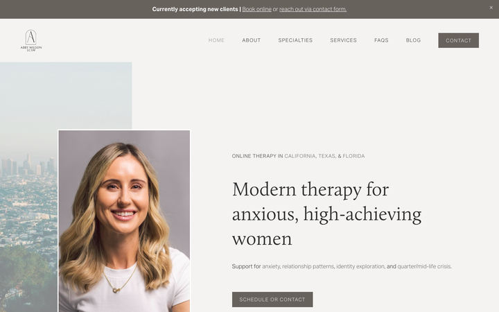
A boutique therapist for "anxious, high-achieving women" who reassures by being polished and specific - a warm sand-and-charcoal editorial system, a Calluna serif voice, named specialties and a clearly walked process that says "I understand exactly who you are and how this works".
Abhishek Jha
nicheDesign Portfolio
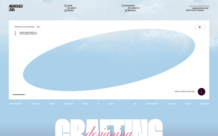
Indian designer personal portfolio - 4-font system (DM Sans + thunder + editorial + playground), 17-step scale up to 288px, dark plum + pink palette, 9-keyframe marquee/cloud motion.

Adaline
strongDeveloper Tool
an AI-infra product site that swaps the genre's default dark-neon for a hand-built 3D Japanese-garden world, then runs warm earth tones, a grotesque/mono type pair and patient scroll-reveal motion over the top so a developer tool feels like a calm place.
Aesop
flagshipConsumer Brand
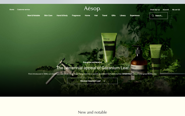
an editorial e-commerce reference where Suisse Intl on warm-cream `#fffef2`, a modular 1.13 type ratio, and full-bleed photography do all the work - no display face, no accent colour, no motion of consequence.