Beauty Home page examples
6 deeply-analysed beauty home pages, 1 flagship-tier. Each carries the design tokens, the do and don't rules, the signature moves and the section anatomy, so your AI builder grounds a beauty home page in how the best sites actually build it.
A home page for a beauty brand is not a blank template. The best ones share a shape, and they diverge in exactly the places that make a brand feel considered. The 6 references here (Glossier, Antara Spa, Book And Hair and Eshk Hair among them) are read closely, not just screenshotted, so the patterns that carry a home page are on the table as structured data: the type scale, the one disciplined accent, the section order, the motion.
Take one specific: restraint-as-confidence editorial system on Glossier. One grotesque, black on near-white (#ffffff), zero shadows, square corners (radius 0px everywhere) and a single accent let confidence replace decoration on a tall 1920px frame. That is the kind of concrete move a taste layer feeds your builder, instead of the generic home skeleton it defaults to with nothing to ground it.
Palate hands your AI builder these references over MCP with explicit borrow rules: what to take from each beauty home page, what to leave, and how to re-skin it for your own brand. The point is not to copy one of them; it is to build a home page that is grounded in real craft and one-of-a-kind, not averaged. Browse the full set below, or open any reference for its tokens, do and don't rules and section anatomy.
Building a beauty home page
Worth borrowing
- A local day spa or wellness business that wants atmosphere first: one giant serif wordmark, a warm photographic hero, almost no chrome.
- The earthy sand-and-green palette (#C5BEB1, #78694E, #425E40, #162015, #9A5E39) as a ready template for natural, calming local services.
- Fraunces display serif paired with Manrope body as a boutique-but-readable wellness type system.
- Slow, smooth scroll (Lenis + GSAP ScrollTrigger) and gentle 0.3-0.5s easings that make a service site feel unhurried.
- The organic green shape rising into the hero as a soft section-transition device.
- A concept-led brand or local venture sold as one scrolling story: full-bleed illustrated hero, a centred manifesto act, then named photo-plus-text chapters.
Do not copy
- The "AntarA" wordmark and the candle hero photograph are Antara's identity; borrow the giant-serif-over-warm-photo move, not the asset.
- WordPress with the Muffin / BeTheme builder is not Jiffi's stack; lift the look, rebuild on Astro.
- The palette is lovely but very spa-coded; for a non-wellness local business keep the restraint and warmth but reselect the hues.
- The TsukuA Old Min Pr6 mincho is licensed and served through fontplus.jp's tokenised subset endpoint; do not lift it, map to a licensed mincho or a workhorse serif.
- The hand-drawn editorial illustration (the two-figure hero, the floating tools, the salon interiors) is bespoke commissioned art and the brand's identity; commission your own, do not trace it.
- The WordPress theme plumbing (Facebook Pixel, GTM, dual GA tags) ships with the site; borrow the storytelling, not the marketing tags.
Distilled across these 6 references. Open any one for its full guidance.
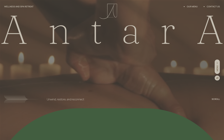
Antara Spa
strongBeauty
a Malaysian day spa that sells calm with one oversized Fraunces wordmark on a sun-warmed photographic hero, an earthy sand-brown-sage palette, and slow GSAP-and-Lenis scroll, the whole page tuned to feel like exhaling.
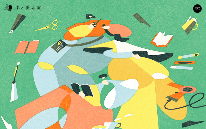
Book And Hair
strongBeauty
a Japanese "books-meets-hair-salon" venture site that runs as one long illustrated scroll, a flat textured editorial illustration carrying the full-bleed hero on a #42B775 green, manifesto prose centred on #F2EFDE cream paper, Yeseva One display caps over a TsukuA Old Min mincho body, and a slow 0.8s cubic-bezier(0.18,0.06,0.23,1) reveal with floating cut-out motifs that bob and drift between sections.
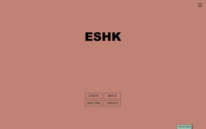
Eshk Hair
strongBeauty
a four-city hair-salon group (London, Berlin, New York, Toronto) on a WordPress + Bootstrap 4 theme that turns a colour-blocked palette of dusty rose #BF8275, sage green #6A8A6E and blush #E4DADA into the whole identity, with a heavy black Arial-Black "ESHK" wordmark, italic Roboto-100 section titles boxed in 1px outlines, and a calm 0.15s colour transition holding it together.

Glossier
flagshipBeauty
a beauty-DTC site stripped to near-nothing, black Apercu on white with millpond whitespace, a famous soft-pink campaign hero, and one electric-blue (#0600FF) accent, where the restraint itself is the brand.
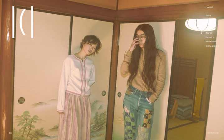
Hair Ici
exceptionalBeauty
a Tokyo hair salon built as a near-silent editorial split-screen, ink-black 10px Neue Haas Grotesk and a Ryo/Classico serif on a warm stone #D6D4C9 ground, where the only voice of colour is a muted plum #725068, two panels scroll independently, and a GSAP-plus-Barba intro brings the fixed header up over 1.1s on an expo-out curve.
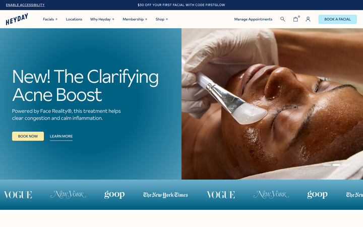
Heyday Skincare
strongBeauty
a facial-membership skincare chain that feels friendly and trustworthy, deep navy ink on warm cream, soft powder-blue and butter-yellow accent panels, the Sunset Gothic grotesque, close-up facial photography and lots of proof (press logos, big stats, reviews).