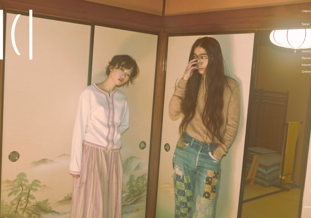
Hair Ici
hair-ici.com/a Tokyo hair salon built as a near-silent editorial split-screen, ink-black 10px Neue Haas Grotesk and a Ryo/Classico serif on a warm stone #D6D4C9 ground, where the only voice of colour is a muted plum #725068, two panels scroll independently, and a GSAP-plus-Barba intro brings the fixed header up over 1.1s on an expo-out curve.
Design tokens
- body
- neue-haas-grotesk-text (Adobe Fonts / Typekit), JP fallback ryo-gothic-plusn / Hiragino Kaku Gothic ProN / Hiragino Sans
- serifDisplay
- ryo-display-plusn (Adobe Fonts), serif
- serifHeading
- classico-urw (Adobe Fonts), the f-serif class on section headings
Do / Don't
Reference it for
- A salon, beauty or fashion-lifestyle brand that wants an editorial lookbook feel: warm stone #D6D4C9 ground, ink text, one muted plum #725068, photography in tall portrait frames.
- A split-screen homepage where two columns scroll as independent editorial panels, each introducing one facet, under a fixed wordmark and a fixed text menu.
- Tiny-type discipline: a 10 to 12px Neue-Haas body at 0.2px tracking with bracketed micro-labels (Salon [11], ( View More )), letting whitespace and image carry the hierarchy.
- A GSAP + Barba + Splitting motion system: per-character reveals and combined opacity-transform entrances on cubic-bezier(0.215, 0.61, 0.355, 1), with a slow 1.1s expo-out header intro.
- A Swiper Journal shelf of dated, category-bracketed cards and a footer that loops the |(| wordmark as a marquee.
Do not copy
- The |(| wordmark and "HAIR ICI / ヘアーアイス" identity are the salon's mark; rebuild the split-screen idea with the client's own logo, never this glyph.
- The Typekit pairing (Neue Haas Grotesk Text + Ryo Display PlusN + Classico URW) is licensed through Adobe Fonts; map to a grotesque sans plus a workhorse serif and license your own.
- The 10px working body size is brave but borderline for accessibility outside a CJK editorial context; lift to 12 to 14px unless the brief genuinely calls for this density.
- Barba SPA transitions are heavy for a small brochure site; reproduce the feeling with Astro View Transitions, not a ported Barba stack.
Signature moves
Two-column independent-scroll editorial split-screen under a fixed floating word
Two-column independent-scroll editorial split-screen under a fixed floating wordmark and text menu, with a slow 1.1s expo-out header intro and easeOutCubic (cubic-bezier(0.215,0.61,0.355,1)) opacity-plus-transform reveals at 0.42s/0.7s, cap
Related references
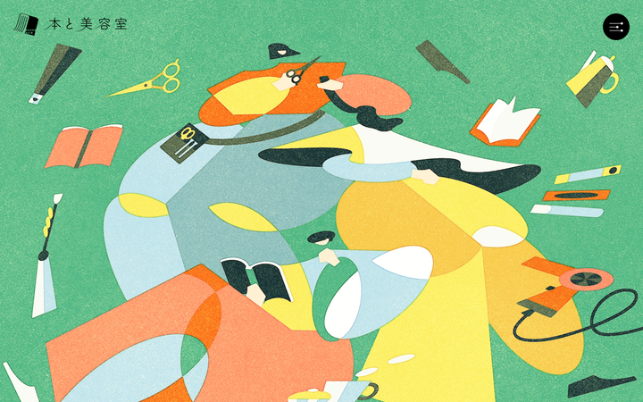
Book And Hair
strongBeauty
a Japanese "books-meets-hair-salon" venture site that runs as one long illustrated scroll, a flat textured editorial illustration carrying the full-bleed hero on a #42B775 green, manifesto prose centred on #F2EFDE cream paper, Yeseva One display caps over a TsukuA Old Min mincho body, and a slow 0.8s cubic-bezier(0.18,0.06,0.23,1) reveal with floating cut-out motifs that bob and drift between sections.
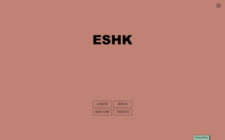
Eshk Hair
strongBeauty
a four-city hair-salon group (London, Berlin, New York, Toronto) on a WordPress + Bootstrap 4 theme that turns a colour-blocked palette of dusty rose #BF8275, sage green #6A8A6E and blush #E4DADA into the whole identity, with a heavy black Arial-Black "ESHK" wordmark, italic Roboto-100 section titles boxed in 1px outlines, and a calm 0.15s colour transition holding it together.
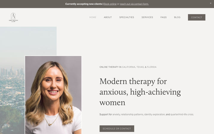
Abby Wilson Therapy
strongOther
A boutique therapist for "anxious, high-achieving women" who reassures by being polished and specific - a warm sand-and-charcoal editorial system, a Calluna serif voice, named specialties and a clearly walked process that says "I understand exactly who you are and how this works".
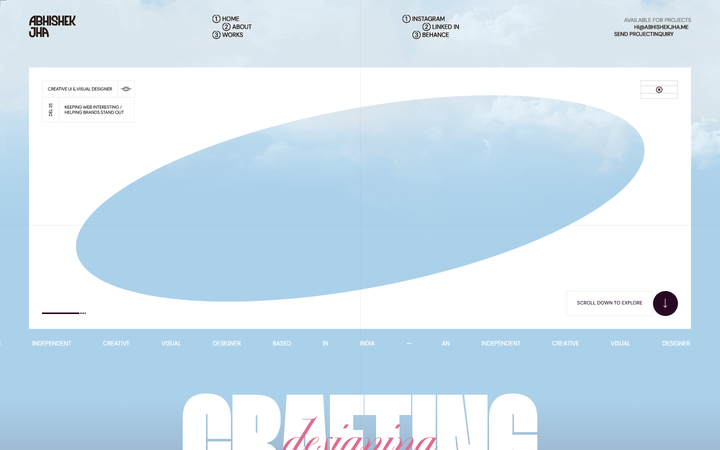
Abhishek Jha
nicheDesign Portfolio
Indian designer personal portfolio - 4-font system (DM Sans + thunder + editorial + playground), 17-step scale up to 288px, dark plum + pink palette, 9-keyframe marquee/cloud motion.