Creative Studio Blog page examples
7 deeply-analysed creative studio blog pages, 1 flagship-tier. Each carries the design tokens, the do and don't rules, the signature moves and the section anatomy, so your AI builder grounds a creative studio blog page in how the best sites actually build it.
A blog page for a creative studio brand is not a blank template. The best ones share a shape, and they diverge in exactly the places that make a brand feel considered. The 7 references here (Huge, Analogue, Cyphr and Drexler among them) are read closely, not just screenshotted, so the patterns that carry a blog page are on the table as structured data: the type scale, the one disciplined accent, the section order, the motion.
Take one specific: brutalist one-family black canvas on Huge. One type family at one weight, near-square 1-2px corners and vast black space signal taste through restraint. That is the kind of concrete move a taste layer feeds your builder, instead of the generic blog skeleton it defaults to with nothing to ground it.
Palate hands your AI builder these references over MCP with explicit borrow rules: what to take from each creative studio blog page, what to leave, and how to re-skin it for your own brand. The point is not to copy one of them; it is to build a blog page that is grounded in real craft and one-of-a-kind, not averaged. Browse the full set below, or open any reference for its tokens, do and don't rules and section anatomy.
Building a creative studio blog page
Worth borrowing
- Personality through type: a multi-alternate display wordmark and inline emoji/icon glyphs as brand voice.
- "Seriously playful": maximal motion kept controlled by a strict black/white + single-pink palette.
- A motion-studio stack done well, GSAP + ScrollTrigger + Lenis, as the reference for heavy, choreographed scroll motion.
- A playful nav that includes a "Playroom" (experiments) as a brand signal.
- A grotesque + serif + mono three-voice type system for range.
- Warm off-white rgb(236, 236, 233) page with pure black ink (not pure white, not greys)
Do not copy
- The wonky multi-alternate wordmark and inline-emoji copy are very brand-coded; borrow the idea, not the execution.
- The volume of motion (29 keyframes, glitches, bounces) needs strong art direction and reduced-motion care; it can read as noisy if borrowed wholesale.
- MetroSans / Italian Plate are licensed; map to playful display + mono substitutes.
- The Cyphr © CYPHR wordmark or roundel logomark
- The Bandit Condensed bespoke type (commercial licence from FaceType / similar)
- The Messina Sans + Messina Sans Mono pair (Luzi Type commercial licence)
Distilled across these 7 references. Open any one for its full guidance.
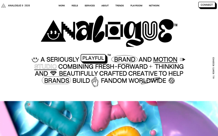
Analogue
strongCreative Studio
a "seriously playful" brand-and-motion studio that wears its personality as type, a wonky multi-alternate ANALOGUE wordmark, emoji and icon glyphs set inline in the copy, a candy-pink accent on white, and a GSAP-driven box of tricks (mexican-wave letters, glitches, bounce, float) kept just on the right side of chaos.
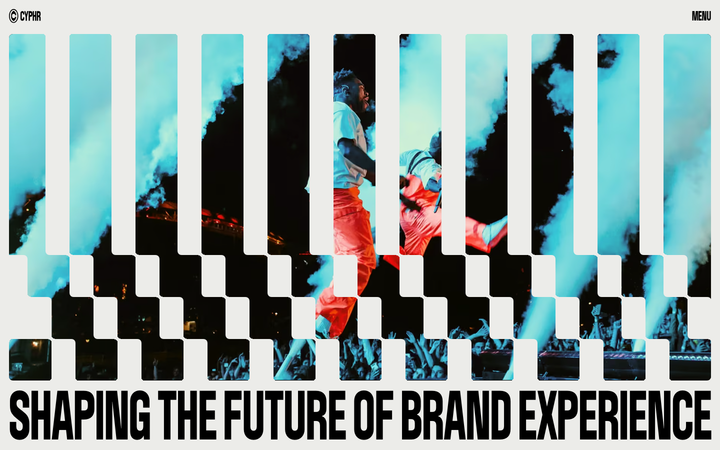
Cyphr
strongCreative Studio
The reference for venture-studio portfolios that flex through monumental condensed type, a single blue I-beam cursor accent, and a venetian-blind slat hero that fragments a single image into a column-rhythmic curtain.
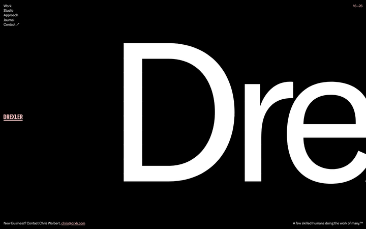
Drexler
nicheCreative Studio
A Baltimore studio that uses a single 765px-tall wordmark as the entire homepage, with a warm pink-on-black palette and 5-link nav, signalling small-shop confidence through wordmark-as-canvas restraint.
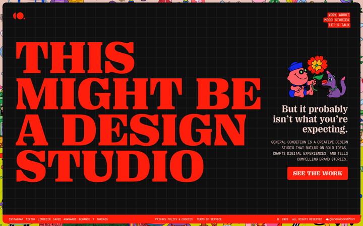
General Condition
nicheCreative Studio
Self-aware "this might be a design studio" hero on near-black with vivid red display + rainbow-bordered chrome - WordPress+Elementor post-modern creative aesthetic.
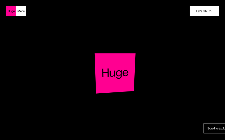
Huge
flagshipCreative Studio
a black-canvas, Monument-Grotesk agency site that turns brutalist restraint into confidence, sharp corners, one type family, vast empty space, then detonates a few hot-pink and acid-green colour blocks and lets Lenis-smooth scroll reveal the work.
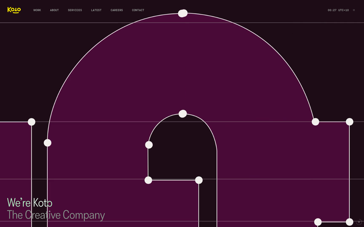
Koto
strongCreative Studio
The reference for global brand-agency studios - yellow logomark on near-black, four custom typefaces, live UTC clock chrome, split-screen sticky-text case study reveals.
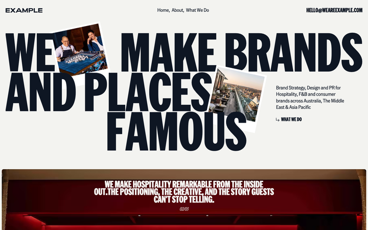
We Are Example
nicheCreative Studio
The reference for boutique hospitality-PR agencies - warm off-white canvas with deep navy ink, oversized American Grotesk Compressed display headlines, polaroid-style photo collage hero, and a soft Lenis-smoothed editorial rhythm.