SaaS Product Home page examples
12 deeply-analysed saas product home pages, 7 flagship-tier. Each carries the design tokens, the do and don't rules, the signature moves and the section anatomy, so your AI builder grounds a saas product home page in how the best sites actually build it.
A home page for a saas product brand is not a blank template. The best ones share a shape, and they diverge in exactly the places that make a brand feel considered. The 12 references here (Basecamp, Dropbox, Figma and Loom among them) are read closely, not just screenshotted, so the patterns that carry a home page are on the table as structured data: the type scale, the one disciplined accent, the section order, the motion.
Take one specific: 100% OKLCH perceptual colour system on Basecamp. Every colour value in CSS custom properties is oklch(L C H) or oklch(L C H / a), the library's leading edge for perceptually-uniform colour. That is the kind of concrete move a taste layer feeds your builder, instead of the generic home skeleton it defaults to with nothing to ground it.
Palate hands your AI builder these references over MCP with explicit borrow rules: what to take from each saas product home page, what to leave, and how to re-skin it for your own brand. The point is not to copy one of them; it is to build a home page that is grounded in real craft and one-of-a-kind, not averaged. Browse the full set below, or open any reference for its tokens, do and don't rules and section anatomy.
Building a saas product home page
Worth borrowing
- 100% OKLCH colour adoption - every value in CSS custom properties is oklch(L C H) or oklch(L C H / a). The library's leading edge for perceptually-uniform colour adoption.
- Two-keyframe motion budget - blink and status. Most sites ship 20-30 keyframes; Basecamp ships two.
- Bulleted-prose navigation in the hero margin - every nav item is one line with an em-dash explainer ("Pricing - Two paid plans, one free plan / Features - Remarkably simple, surprisingly usable / Reliable to the core - A multi-decade track record"). This is Jason Fried / DHH writing style.
- A literal product screenshot dominates the page - not a tilted angled mock or a 3D scene. The product UI rendered at full fidelity.
- 45 stylesheets, 23 scripts - heavy CSS, light JS. The 37signals discipline of doing as much as possible with CSS and as little as possible with JS.
- Graphik as the sole face - no display/body split, no mono. One typeface, three weights (400, 500, 600).
Do not copy
- Graphik Web is licensed (Commercial Type). Substitute with Inter or Helvetica Now Variable.
- The pure white background + slate-blue text on a brand that needs more visual energy - Basecamp's restraint suits 37signals's contrarian B2B position, not every project.
- The bulleted-prose nav pattern unless the team is genuinely comfortable writing it themselves. Jason Fried's prose is the signature; without that voice, the format reads as quirky.
- OKLCH-only if the team isn't comfortable thinking in perceptual colour space - staff training cost is non-trivial.
- 45 stylesheets - only works because the team are CSS specialists.
- "Tell me if this sounds about right." H1 - strongly Basecamp / DHH-coded conversational tone.
Distilled across these 12 references. Open any one for its full guidance.
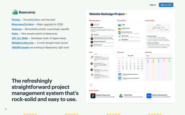
Basecamp
flagshipSaaS Product
a 2026 Basecamp 5 launch site where every captured colour value is in OKLCH (the most aggressive perceptual-uniform colour-space adoption in the library), Graphik is the sole typeface, two CSS keyframes is the entire animation budget (`blink` + `status`), and the page is composed as a literal product screenshot with bulleted prose navigation in the margin.
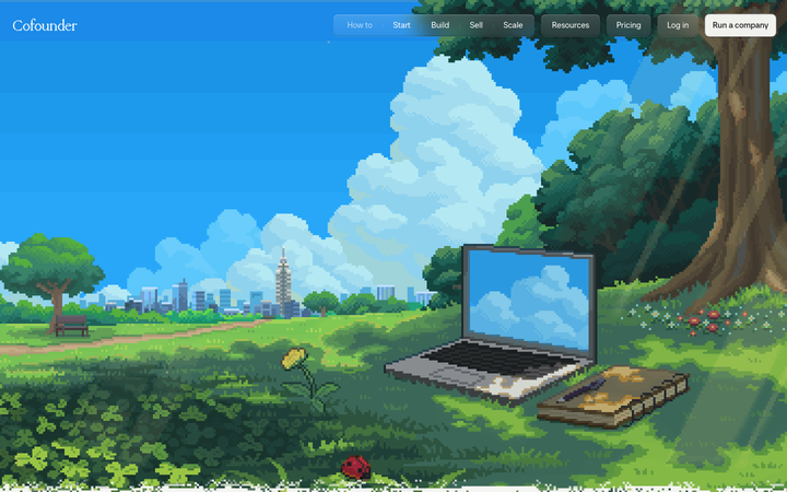
Cofounder
strongSaaS Product
The reference for fusing a pixel-art world-building aesthetic with editorial chapter-based content - a 16-bit hero on a learning-guide body.
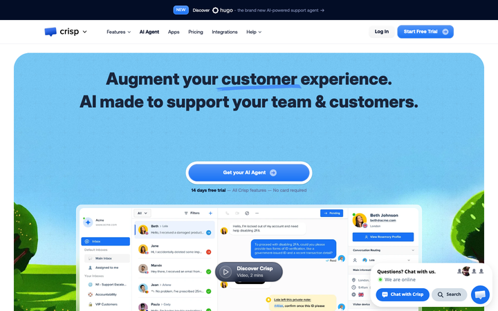
Crisp
strongSaaS Product
The reference for AI customer-support brand - bespoke Crisp Aeonik Pro, real chat dashboard hero, link-blue underline emphasis, dark navy announcement banner promoting AI agent.
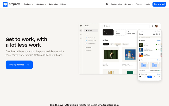
Dropbox
flagshipSaaS Product
The reference for a 700-million-user product brand at restraint: cream "coconut" backgrounds, one saturated blue CTA, real product UI rendered enormous, and a 13-section page that never raises its voice.
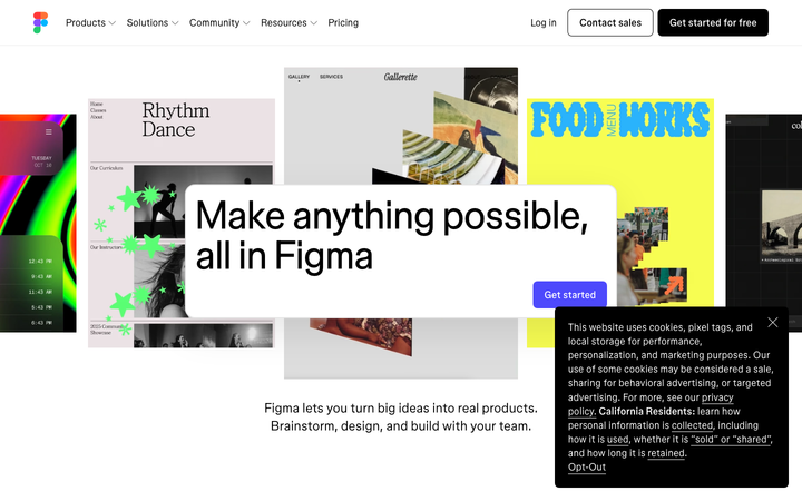
Figma
flagshipSaaS Product
a white-canvas product site that uses tilted Figma file-cards as the hero imagery, the bespoke variable figmaSans + figmaMono pair at non-integer weights (340, 480, 520, 540), and a 0.16s ease-out motion contract to demonstrate breadth without showing a single screenshot of the actual Figma UI.
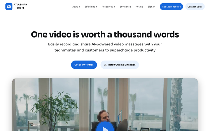
Loom
flagshipSaaS Product
a post-Atlassian-acquisition SaaS site (now branded "Atlassian Loom") built in Next.js, set in Atlassian's Charlie Text + Charlie Display, anchored by a single Atlassian-blue `#1868db` CTA and a hero video thumbnail that doubles as the product demo - the canonical reference for "absorbed-by-enterprise SaaS that still feels like itself."
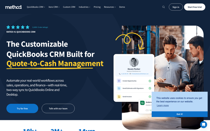
Method
nicheSaaS Product
The reference for QuickBooks-niche B2B CRM - clean deep-navy + royal-blue conservative B2B design with yellow-underline accent and customer-photo-driven testimonials.
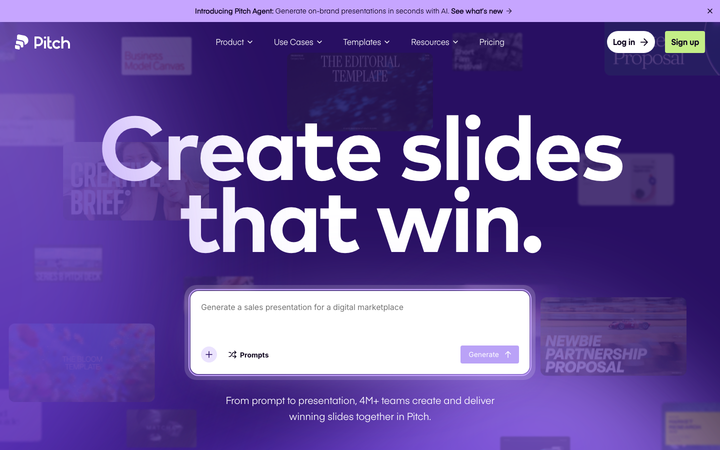
Pitch
flagshipSaaS Product
a violet-and-yellow presentation-tool flagship that pairs Eina01 + Mark Pro on a warm-navy ink, sparkle keyframes (`sparkL`, `sparkM`, `sparkS`, `sparkHover`), animated cursor pointers, and a numbered four-step "Plan / Build / Pitch / Measure" walkthrough - the canonical reference for "B2B presentation software that earns playfulness."
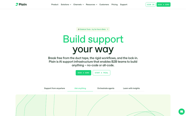
Plain
strongSaaS Product
a Framer-built operational site that turns a bifurcated 80px headline (bright green + dark green) into the whole brand, leaving everything else - cream cards, Geist Mono micro-labels, single-easing colour transitions - in subordinate role.

Slack
flagshipSaaS Product
a post-Salesforce-acquisition product flagship where the iconic aubergine `#611f69` survives as the primary CTA, Salesforce-Sans replaces Lato, and a 30-keyframe motion library powers the "workspace-people-bump" avatar animations that have always been Slack's brand signature.
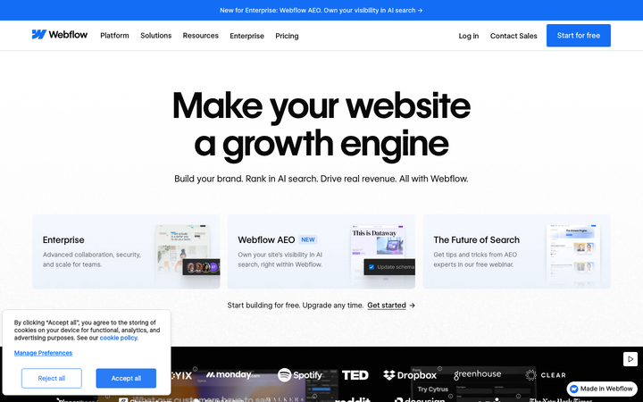
Webflow
flagshipSaaS Product
a white-canvas product flagship that is itself built in Webflow - using the bespoke WF Visual Sans Variable + WF Visual Sans Mono, a Webflow-blue `#146ef5` primary, GSAP + ScrollTrigger + Three.js + Swiper all bundled, and a three-card "AI / Template / Scratch" entry hero that mirrors the actual product's onboarding paths.
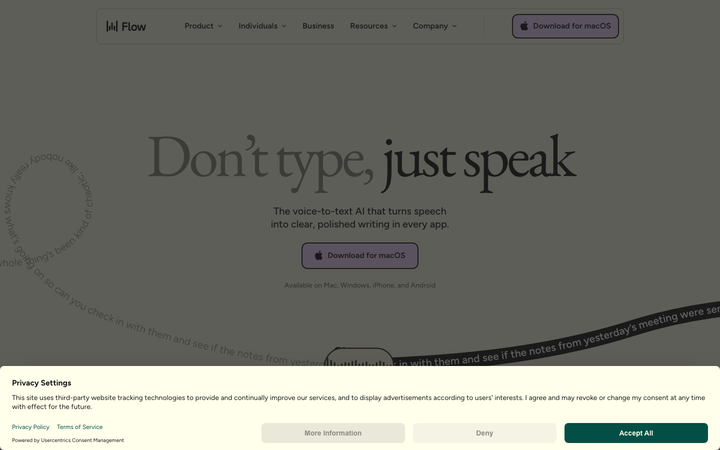
Wispr Flow
strongSaaS Product
The reference for a butter-cream voice-AI brand at peak typographic confidence - EB Garamond serif hero on lavender-and-evergreen surfaces, with curved-path transcript animations as the signature motion.