SaaS Product Case Study page examples
6 deeply-analysed saas product case study pages, 4 flagship-tier. Each carries the design tokens, the do and don't rules, the signature moves and the section anatomy, so your AI builder grounds a saas product case study page in how the best sites actually build it.
A case study page for a saas product brand is not a blank template. The best ones share a shape, and they diverge in exactly the places that make a brand feel considered. The 6 references here (Dropbox, Figma, Loom and Slack among them) are read closely, not just screenshotted, so the patterns that carry a case study page are on the table as structured data: the type scale, the one disciplined accent, the section order, the motion.
Take one specific: cream-on-cream surface banding on Dropbox. A coconut #f7f5f2 page plus coconut-200 #eee9e2 section bands carry a 13-section long page with zero box-shadows, depth coming from surface contrast not elevation. That is the kind of concrete move a taste layer feeds your builder, instead of the generic case study skeleton it defaults to with nothing to ground it.
Palate hands your AI builder these references over MCP with explicit borrow rules: what to take from each saas product case study page, what to leave, and how to re-skin it for your own brand. The point is not to copy one of them; it is to build a case study page that is grounded in real craft and one-of-a-kind, not averaged. Browse the full set below, or open any reference for its tokens, do and don't rules and section anatomy.
Building a saas product case study page
Worth borrowing
- Cream-on-cream surface system - coconut #f7f5f2 page background + coconut-200 #eee9e2 section bands; warmer than pure white, more trustworthy than grey
- Single saturated brand colour rationed for CTAs - #0061fe appears 1 time as background, 4 times as ambient brand colour; never used decoratively
- Real product UI in the hero - Dropbox desktop app + mobile app composed side-by-side, real file names, real avatars, real interface chrome
- Section-banded long-page structure - 13 H2-led sections, each on a coconut variant, separated by adequate vertical breathing room
- 12px-radius workhorse with 100px pill reserved for the CTA - sharp-enough-to-feel-modern, soft-enough-to-feel-friendly
- Body type at 16px / 22px line-height - generous reading rhythm with 19.2px and 21.6px line-heights used for the secondary product cards
Do not copy
- The Dropbox blue #0061fe itself - pick the client's saturated colour
- Atlas Grotesk Web and Sharp Grotesk licences - these are Dropbox-bespoke commissioned families
- The "Try Dropbox free" / "Discover Dash" dual-CTA pattern (two CTAs in the hero) - this only works because Dropbox has two strongly differentiated products to compete for the click; for most clients, one CTA converts better
- The 700M-user social-proof H2 - only ship that pattern if the client genuinely has the scale
- The dwg- and dig- design-token prefix system - Dropbox's foundations library is internal infrastructure; copying the naming reads as derivative
- figmaSans / figmaMono - bespoke and licensed for Figma's use only. Substitute with Inter Variable (good fit) or Söhne Variable (paid alt).
Distilled across these 6 references. Open any one for its full guidance.
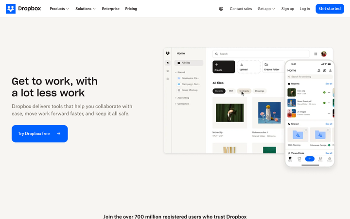
Dropbox
flagshipSaaS Product
The reference for a 700-million-user product brand at restraint: cream "coconut" backgrounds, one saturated blue CTA, real product UI rendered enormous, and a 13-section page that never raises its voice.
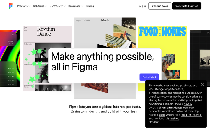
Figma
flagshipSaaS Product
a white-canvas product site that uses tilted Figma file-cards as the hero imagery, the bespoke variable figmaSans + figmaMono pair at non-integer weights (340, 480, 520, 540), and a 0.16s ease-out motion contract to demonstrate breadth without showing a single screenshot of the actual Figma UI.
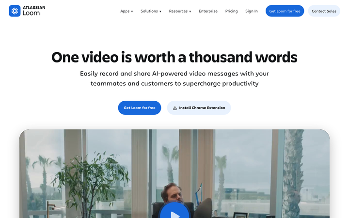
Loom
flagshipSaaS Product
a post-Atlassian-acquisition SaaS site (now branded "Atlassian Loom") built in Next.js, set in Atlassian's Charlie Text + Charlie Display, anchored by a single Atlassian-blue `#1868db` CTA and a hero video thumbnail that doubles as the product demo - the canonical reference for "absorbed-by-enterprise SaaS that still feels like itself."
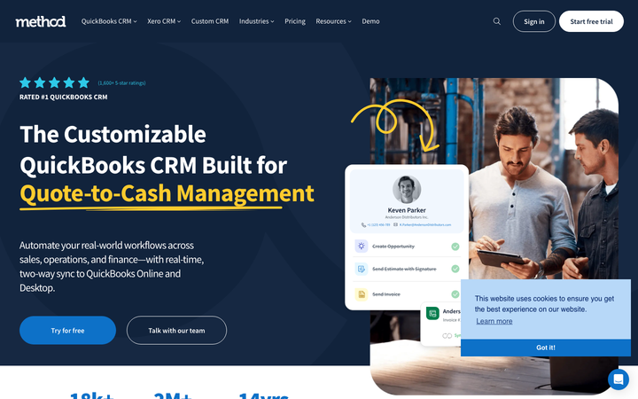
Method
nicheSaaS Product
The reference for QuickBooks-niche B2B CRM - clean deep-navy + royal-blue conservative B2B design with yellow-underline accent and customer-photo-driven testimonials.

Slack
flagshipSaaS Product
a post-Salesforce-acquisition product flagship where the iconic aubergine `#611f69` survives as the primary CTA, Salesforce-Sans replaces Lato, and a 30-keyframe motion library powers the "workspace-people-bump" avatar animations that have always been Slack's brand signature.
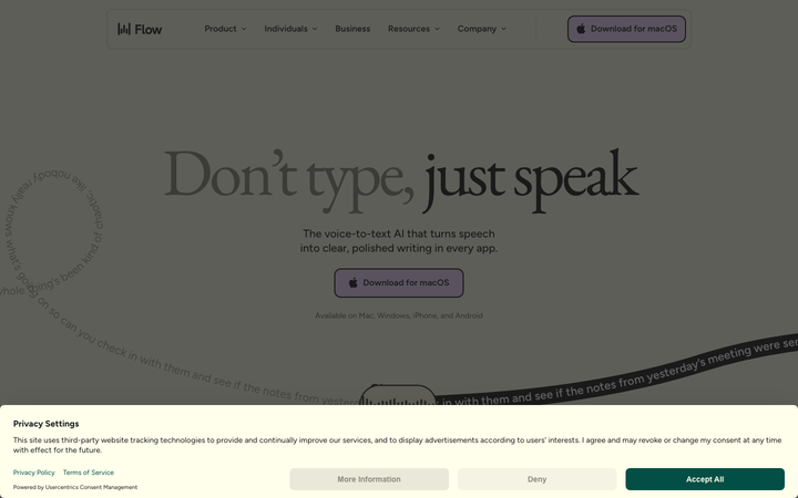
Wispr Flow
strongSaaS Product
The reference for a butter-cream voice-AI brand at peak typographic confidence - EB Garamond serif hero on lavender-and-evergreen surfaces, with curved-path transcript animations as the signature motion.