Editorial Publishing references
3 deeply-analysed editorial publishing sites, 1 flagship-tier. Each carries the design tokens, the do and don't rules, the signature moves and the section anatomy, so an AI builder grounds a editorial publishing brief in how the best sites actually build it (home, blog, article, about, contact, case study, shop, product).

Caffe Design
nicheEditorial Publishing
An Italian "design gang" community-magazine fronted by a hand-drawn one-eyed coffee-cup mascot - bubblegum-pink canvas, a literal animated preloader as the brand voice, GT Haptik sans paired with Argent Pixel CF italic for headline accents.
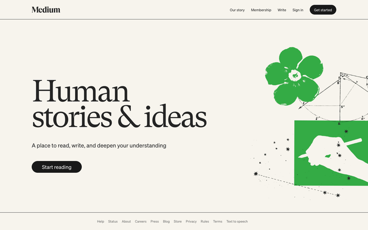
Medium
flagshipEditorial Publishing
The reference for an editorial reading-room hero: a transitional book serif (GT Super) set huge at weight 400 with tight tracking on warm newsprint cream #f7f4ed, all ink monochrome with a single green gesture.

The Brand Identity
strongEditorial Publishing
The reference for editorial design publications - centred italic-serif wordmark, light-grey paper background, mixed Times-serif body + Bauhaus-sans chrome, content-density home grid.