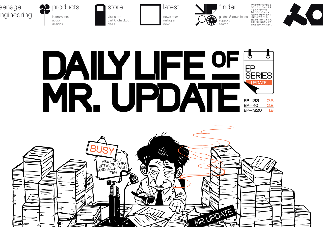
Teenage Engineering
teenage.engineeringThe reference for letting a single photographed product carry the whole page: a graphite studio gradient (#3a3a3e to #0f0e12), weight-100 type that nearly disappears, zero radius and zero shadow, and one rationed amber note (#F5A623) as the only chroma.
Consumer Brand flagship
Design tokens
background
surface
text
textMuted
accent
border
tone1
tone2
- display
- Te-40
- body
- te-20
- mono
Do / Don't
Reference it for
- Studio-gradient product hero: a dark vignette graphite backdrop (#3a3a3e fading to #0f0e12) with the product render floating mid-frame, no panel or card around it
- Ultra-thin type system: set nav, labels and body in weight 100 to 300 so the UI recedes and the product object is the only dense mass on the page
- Hard-edge industrial rule: every corner 0px radius, zero drop-shadow, zero gradient on UI chrome; elevation comes only from the tonal jump to the dark plane
- Single rationed accent: keep the entire palette neutral (pure black text, #b2b2b2 graphite, #e5e5e5 steel hairlines) and spend one warm note (amber #F5A623) on exactly one element
- Light-mode counterpart: a Canvas Mist #f6f8f7 backdrop for catalogue and inner pages, same hairline rules, flat surfaces
- Pill buttons with hairline borders: text-only buttons (settings / accept all) as outlined or solid pills, lowercase, thin-weight label, no icon
- Spec-sheet micro-labelling: tiny uppercase technical captions (OUTPUT, INPUT, MIDI, SYNC, USB) and model codes printed straight onto the product as the typographic texture
- Lowercase voice everywhere: 'we use required, performance and marketing cookies' kept lowercase and matter-of-fact to match the engineering tone
Do not copy
- The +te / teenage engineering wordmark and the cross-dot logo lockup
- The actual K.O. II / EP-133 product render and its printed faceplate graphics
- The Japanese katakana product subtitle (サンプラー) as decoration
- The exact amber warning-triangle cookie widget with the black hand glyph
- The proprietary te-20 / te-40 typefaces (substitute a thin grotesque)
- The literal barcode and 128 MB SAMPLER COMPOSER spec print as borrowed ornament