Taphome
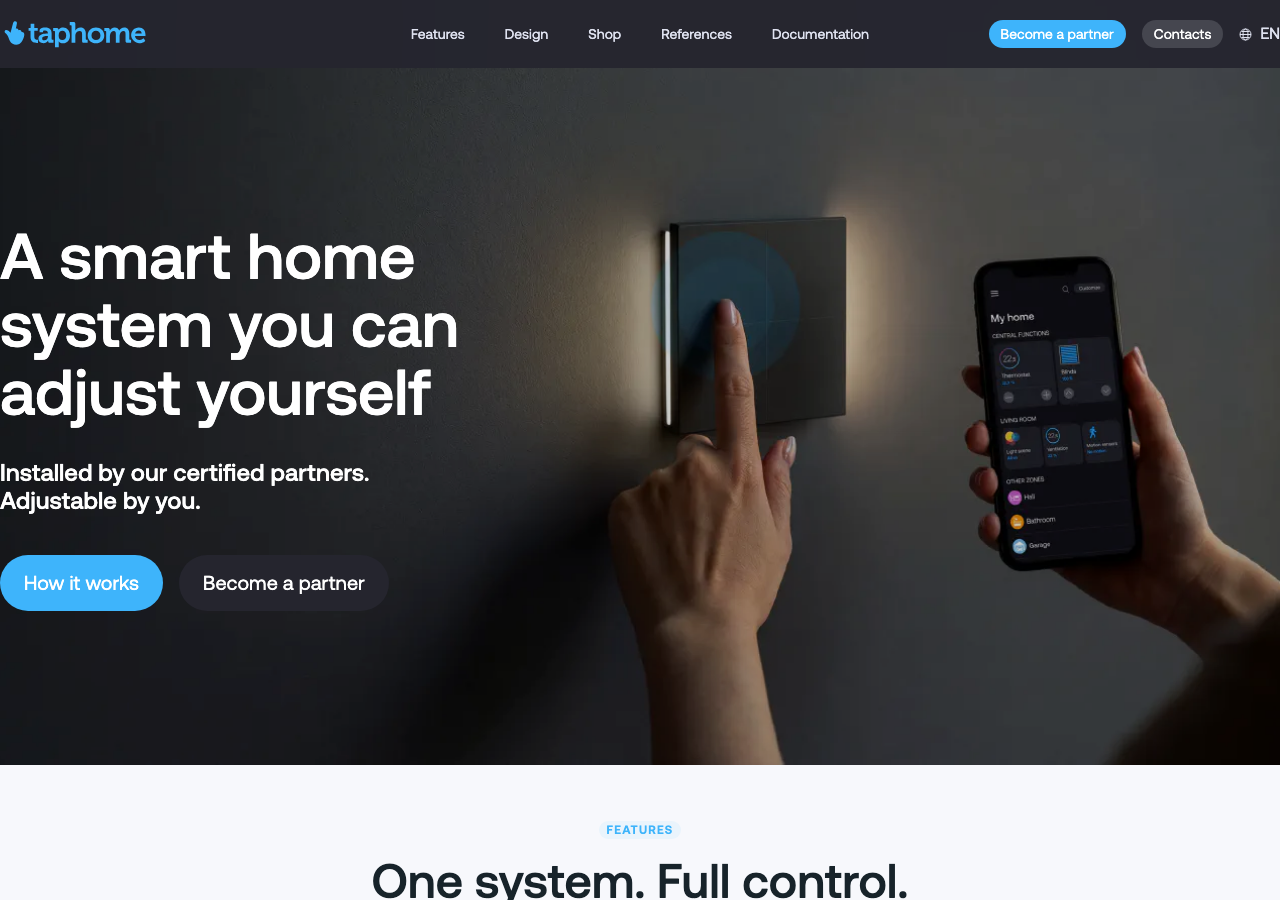
taphome.coma European smart-home automation brand rendered as a calm product-marketing site, near-black ink (#25252e) on cool blue-grey paper (#f7f8fc), a single Aeonik variable face from 18px body to a 64px display, one sky-blue (#3eb4fb) doing every call to action, and dark full-bleed bands that alternate with white 24px-radius cards so a technical HVAC, shading and lighting catalogue reads as approachable rather than industrial.
Design tokens
- display
- Aeonik (variable, 100-900)
- body
- Aeonik (variable)
- mono
- ui-monospace / SFMono-Regular system stack
Do / Don't
Reference it for
- A trades, HVAC, shading, lighting or building-automation brand that wants to read as a calm consumer product, not an industrial spec sheet: plain-language hero, one accent, real product photography.
- A cool grey-scale system (ink #25252e on blue-tinted paper #f7f8fc, a nine-step named grey ladder) with a single sky-blue #3eb4fb carrying every CTA, eyebrow and live-state cue.
- A one-typeface discipline: Aeonik variable from 18px body to a 64px / 68px display, headings held at medium weight 500, uppercase 14px blue eyebrows at 0.05em tracking.
- A light/dark band rhythm: pale feature bands of white 24px-radius cards alternating with full-bleed #1a1b22 dark bands for product and app moments, so a technical catalogue stays approachable.
- Swiper-driven horizontal rails (news, references, Google reviews, a timed daily-schedule of automation cards) as the practical furniture for content-dense sections, with quiet 0.15s hover transitions and no scroll theatre.
Do not copy
- Aeonik is a licensed face (here served as a self-hosted variable woff2/ttf from /fonts/aeonikvf.woff2); map to a comparable grotesque such as Schibsted Grotesk, Mona Sans or a hosted Hanken Grotesk rather than shipping Aeonik without a licence.
- The multilingual nav (Features, Design, Shop, References, Documentation, Become a partner, Contacts plus SK / CS / HU / IT / PL / DE language switches) and the partner/distributor channel exist for a real European hardware company; a single-market Jiffi trades client should trim the nav and drop the locale switcher.
- Do not inherit the third-party stack by reflex (GTM, Meta Pixel, Cloudflare Insights, Comgate payments, the app-store and DWG-library plumbing, the cookie-consent banner); borrow the band rhythm and the accent discipline, not the tracking and commerce furniture.
- The in-app product screenshots (the thermostat dial, the lighting wheel, the shading widget) and the brand wordmark are TapHome's own; reference the composition, never lift the assets.
Signature moves
A labelled light/dark band rhythm: pale #f7f8fc feature bands of white 24px-radi
A labelled light/dark band rhythm: pale #f7f8fc feature bands of white 24px-radius cards (soft cool-grey --shadow-pekny lift) punctuated by full-bleed dark #1a1b22 bands for the app showcase and CTA, each section opening with an uppercase 1
Related references
Alternative Aesthetics
nicheDesign Portfolio
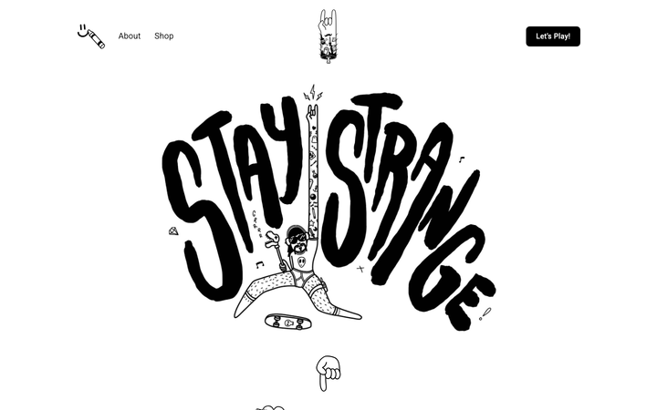
The reference for solo illustrator portfolios on Webflow - hand-drawn "Stay Strange" hero typography, monochrome black/white canvas, and a 4-column thumbnail grid that lets the artwork carry the entire visual voice.
Ceremony Coffee
strongHospitality
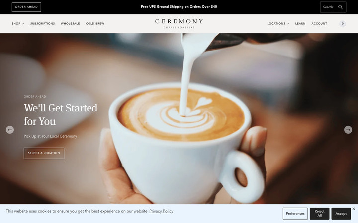
a Maryland coffee roaster on Shopify that reads like an editorial magazine, warm off-white paper grounds, an Avenir-plus-Meta-serif pairing, large lifestyle photography of brewed coffee on linen, and a calm 0.15s fade discipline that keeps a busy commerce catalogue feeling unhurried.
Core Atelier Pilates
nicheFitness
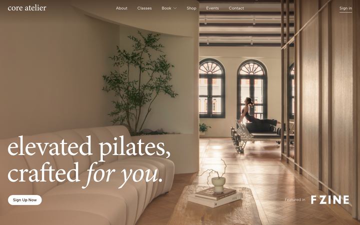
a warm, editorial pilates-studio site in espresso and cream (#25140C / #F7E7DE) with an Albert Sans plus Minion Pro serif-italic pairing, sun-lit interior photography, Lenis-smoothed scrolling and a giant "core atelier" wordmark closing the page.
Karo Crafts
nicheCreative Studio
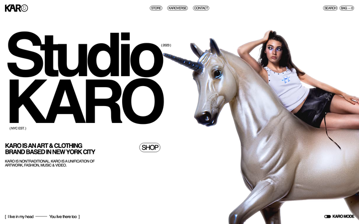
NYC creative studio + merch shop - "unification of artwork, fashion, music & video", Helvetica + ultra-blue accent, Nuxt + Prismic stack, 229px hero.