Six B
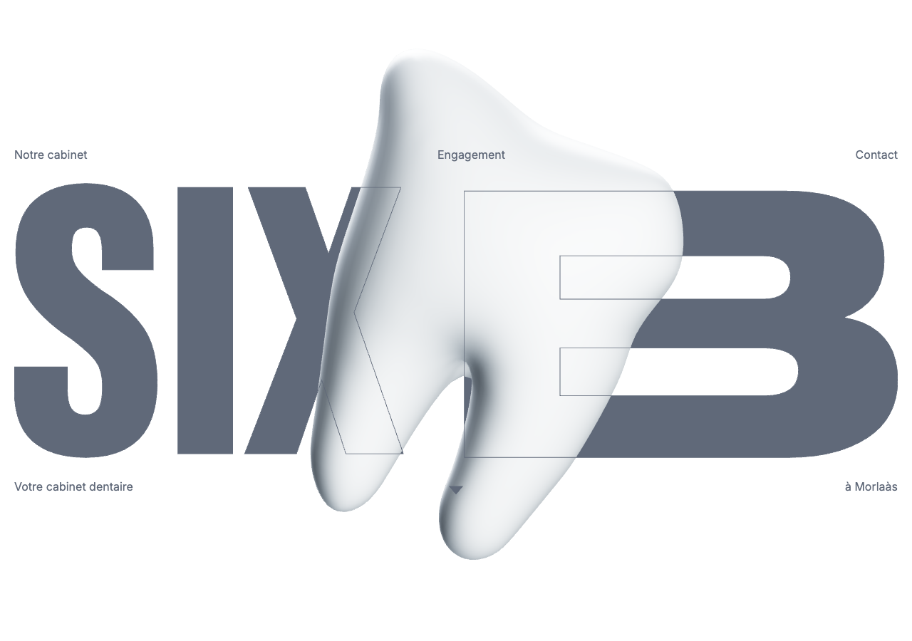
sixb-dentaire.fr/a French dental practice that opens on a viewport-filling 54px+ slate-blue "SIX B" wordmark with a photoreal 3D tooth wedged through the letters, then drops into calm white editorial bands of clinical photography and 520px muted-slate prose, the whole thing scrolled on Lenis with a single 0.15s fade as its only motion.
Design tokens
- display
- Figtree (--font-figtree, variable 300-900)
- body
- Inter (--font-inter, variable 100-900)
- mono
- none
Do / Don't
Reference it for
- A confident display-wordmark hero: the brand name set viewport-tall in light-weight Figtree (300 / 54px+) with a 3D object threaded through the letters and nav links pinned to the four corners.
- A cool monochrome slate system with no accent: text #606979, soft #8594AE, dark #333C4C, panels #F2F4F8 on white, footer on a full slate field, hierarchy carried by tone alone.
- A frosted pill nav that detaches from the corners and docks to centre-top on scroll (the one real interaction).
- Restraint as a method for a thin-content service site: 1400px outer / 520px text columns, big 40-96px section gaps, photography and 3D renders doing the work the copy does not.
- Lenis smooth-scroll plus a single 0.15s cubic-bezier(0.4,0,0.2,1) fade as the entire motion budget on a 16,000px page.
Do not copy
- The Six B wordmark, the rendered 3D tooth and the practice photography (team portraits, the building render) are brand-coded and licensed/personal; rebuild the *idea* (oversized name + a 3D hero object) with the client's own mark and asset.
- Inter and Figtree are the Next.js defaults here; the pairing is fine to map, but do not assume the brand intent was specifically these faces, treat Figtree-light-at-display as the move, not the font name.
- The all-French corner-pinned nav with only three items suits a tiny practice; a site with real depth needs a fuller, more discoverable nav, do not strand links in the corners if there is more than a handful.
- Do not inherit the thin-content pacing as a target: it reads as deliberate here because the practice is small; a content-rich client needs mid-range type tiers this site omits.
Signature moves
A chrome-free, viewport-filling display-wordmark hero: the brand name set in lig
A chrome-free, viewport-filling display-wordmark hero: the brand name set in light-weight grotesque (Figtree 300, 54px, line-height 1.0) at poster scale with a photoreal 3D object threaded through the letters and nav links pinned to the fou
Related references
Quip
strongHealth
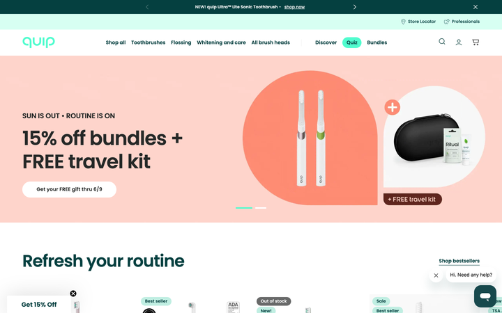
an oral-care brand that makes dental health feel friendly and modern rather than clinical, a clean mint-and-teal system, Poppins, soft pill shapes, with a shop, a store locator and a "find a professional" dentist network.
Abby Wilson Therapy
strongOther
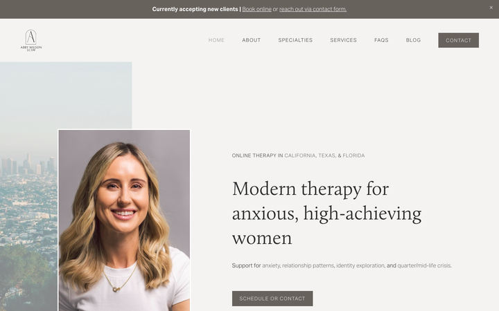
A boutique therapist for "anxious, high-achieving women" who reassures by being polished and specific - a warm sand-and-charcoal editorial system, a Calluna serif voice, named specialties and a clearly walked process that says "I understand exactly who you are and how this works".
Abhishek Jha
nicheDesign Portfolio
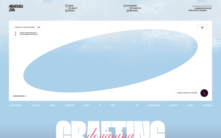
Indian designer personal portfolio - 4-font system (DM Sans + thunder + editorial + playground), 17-step scale up to 288px, dark plum + pink palette, 9-keyframe marquee/cloud motion.
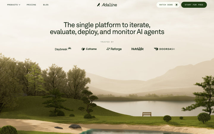
Adaline
strongDeveloper Tool
an AI-infra product site that swaps the genre's default dark-neon for a hand-built 3D Japanese-garden world, then runs warm earth tones, a grotesque/mono type pair and patient scroll-reveal motion over the top so a developer tool feels like a calm place.