Home Page Impossible Foods
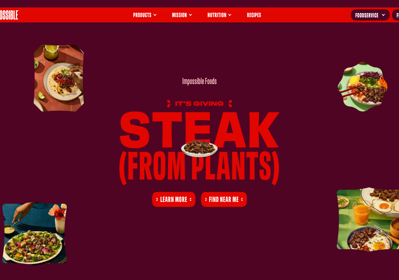
impossiblefoods.comThe reference for a punk-poster food hero: blood-red condensed display type (#e10600) set ultra-tight (line-height ~0.73) on a velvet wine-dark canvas (#260212) with mask-cut food photos floating loose around the headline.
Consumer Brand flagship
Design tokens
background
surface
text
textMuted
accent
border
tone1
tone2
- display
- Sans-Meat
- body
- sans-meat
- mono
Do / Don't
Reference it for
- Wine-dark canvas palette: #260212 background stepping to #4f0423 surface (a 12 to 15% lightness shift, no shadow) carrying a single hot red #e10600 for every CTA and headline
- Viewport-filling condensed display headline (~103 to 160px) with brutal negative leading (line-height ~0.73) and slightly opened tracking, stacked over two lines like STEAK / (FROM PLANTS)
- A small all-caps animated kicker ('IT'S GIVING') in red above the headline, bracketed by decorative glyphs, as a lightweight eyebrow accent
- Pill-shaped solid-red CTA buttons (~15px radius) sitting side by side under the headline, label in bone white all-caps
- Irregular mask-cut food photography floating at the four corners of the hero around the type, not boxed in rectangular frames
- A small product photo nested directly behind/inside the headline word (the plate of steak overlapping the type) to fuse food and typography
- Deliberately flat elevation: hierarchy from colour contrast (red on wine, white on black) and extreme scale jumps, never drop shadows
- Crisp black hairline borders (#000000) on the sticky top nav bar and pill controls
Do not copy
- The IMPOSSIBLE wordmark and chiselled logo lockup
- The 'sans-meat' custom condensed display face (use a licensed condensed grotesque instead)
- The exact Impossible red #e10600 as a brand-defining colour
- Product copy and slogans like 'STEAK (FROM PLANTS)' and 'IT'S GIVING'
- The specific plant-based meat product photography
- The plant-based / food-tech category positioning