Flamingo Estate
www.flamingoestate.comThe reference for making a garden-luxury e-commerce catalogue feel like a magazine: one olive-green ink (#45523e) on warm bone paper (#fcfbf6), a variable display serif (Exposure) over Maison Neue body, and full-bleed editorial banners cut into the product grid.
Consumer Brand flagship
Design tokens
background
surface
text
textMuted
accent
border
tone1
tone2
- display
- Exposure VAR
- body
- maison-neue
- mono
Do / Don't
Reference it for
- Two-colour discipline: nearly everything is olive-green ink #45523e on bone #fcfbf6 (1617 vs the near-white ground); resist adding a third hue and the whole site reads expensive
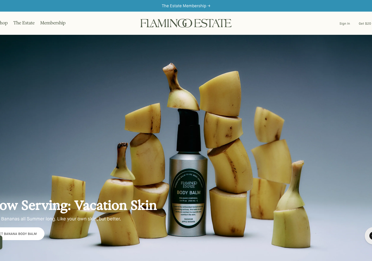
- Display serif Exposure (variable, '--exposure: Exposure VAR') set large and tight for hero lines like 'Now Serving: Vacation Skin', paired with Maison Neue Book for all body and UI copy
- Warm-paper canvas #fcfbf6 instead of pure white, with a secondary panel of #f1f1ec (rgb 241,241,236) for alternating sections
- Deep-green footer and nav on #45523e with muted sage link text #9eb091 and hover lift to #d6e0ce
- Full-bleed cinematic product photography as the hero (single hero product staged against a graded studio backdrop), banner headline overlaid bottom-left in white serif
- Editorial break-banners spliced between grid rows ('Peel the Glow', 'Wake Up to Summer', 'Ride the Heat Wave') that read as magazine spreads not ads, each with an uppercase Maison Neue CTA
- Product cards: uppercase 'ADD TO BASKET' micro-label, price, small 'New'/'Best Seller'/'Limited Edition' eyebrow tags, one-line poetic description, star rating + review count
- Generous type-scale gap: 11-14px workhorse UI text jumping straight to a 44px+ serif display, no timid mid-sizes
Do not copy
- The Flamingo Estate wordmark and the interlocked-O 'FLAMINGO ESTATE' logotype
- The proprietary Exposure (205TF) and Maison Neue licensed typefaces, plus Ortica/Baxter/Triptych display faces
- The exact olive #45523e + bone #fcfbf6 + sage #9eb091 brand palette as a set
- Signature product copy and scent poetry ('A luscious melt of Banana, Violet Leaf & Patchouli', 'Now Serving: Vacation Skin')
- The real product photography, banana-sculpture styling, and staged studio shots
- Named products (Heirloom Tomato Candle, Prinsesstarta, Three Sisters), founder 'Richard', and press pull-quotes
- The teal announcement-bar colour #3191b4 as the brand's contrast accent