Fishwife
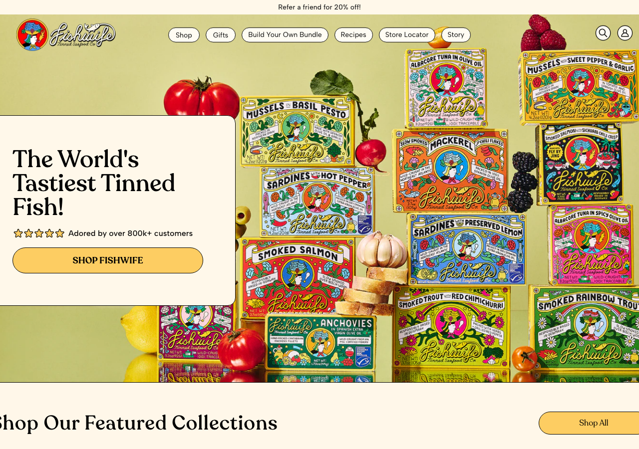
eatfishwife.comThe reference for a warm, high-appetite CPG storefront: cream #fffcf3 canvas, buttery #fecd59 pill CTAs and a floating rounded-card hero overlay set in Recoleta, letting maximalist product illustration carry all the colour.
Consumer Brand flagship
Design tokens
background
surface
text
textMuted
accent
border
tone1
tone2
- display
- Albert Sans
- body
- Recoleta
- mono
Do / Don't
Reference it for
- Cream near-white page canvas #fffcf3 (not stark white) as the base tone for a food/consumer brand
- Recoleta serif for every headline (400/500/600 weights) paired with Albert Sans for body and UI, a friendly-serif + geometric-sans split
- Oversized 60px Recoleta hero headline tightly set (line-height 60px, -0.5px tracking) over a full-bleed product photo
- A floating rounded content card (border-radius 20px, cream bg) laid over the hero image, holding headline + rating + CTA so text stays legible against busy photography
- Fully-rounded pill buttons: #fecd59 yellow fill, near-black #010101 label, 30px+ radius, used for the primary SHOP CTA and nav chips
- Pill-shaped nav items floating on a transparent header that fades in a #73c3f5 sky-blue background on scroll
- Inline 5-star rating (#fdcd62 stars) beside a social-proof line ("Adored by over 800k+ customers") as hero trust signal
- A rotating announcement bar at the very top with prev/next/pause carousel controls for promos (referral, free shipping)
Do not copy
- The Fishwife wordmark, the mermaid/fishwife illustrated logo mark and the woodcut tin illustrations
- The exact packaging artwork on every tin (the illustrated labels are the brand's whole identity)
- The specific product names and copy ("The World's Tastiest Tinned Fish!", Smoked Rainbow Trout, etc.)
- The @-handle creator/UGC video wall and named influencer testimonials
- The exact cream + yellow + sky-blue + red packaging-derived palette as a set
- Named press pull-quotes and the specific 800k customer claim
- The Shopify/Okendo/Klaviyo widget chrome baked into the theme