Trades Home page examples
7 deeply-analysed trades home pages, 2 flagship-tier. Each carries the design tokens, the do and don't rules, the signature moves and the section anatomy, so your AI builder grounds a trades home page in how the best sites actually build it.
A home page for a trades brand is not a blank template. The best ones share a shape, and they diverge in exactly the places that make a brand feel considered. The 7 references here (Block Renovation, Lanserring, Caliber and Props Furniture among them) are read closely, not just screenshotted, so the patterns that carry a home page are on the table as structured data: the type scale, the one disciplined accent, the section order, the motion.
Take one specific: warm-neutral trust system with one orange CTA on Block Renovation. A bone/taupe/black-ink palette carries the page while a single warm orange owns every primary action, so the CTA always reads against calm neutrals. That is the kind of concrete move a taste layer feeds your builder, instead of the generic home skeleton it defaults to with nothing to ground it.
Palate hands your AI builder these references over MCP with explicit borrow rules: what to take from each trades home page, what to leave, and how to re-skin it for your own brand. The point is not to copy one of them; it is to build a home page that is grounded in real craft and one-of-a-kind, not averaged. Browse the full set below, or open any reference for its tokens, do and don't rules and section anatomy.
Building a trades home page
Worth borrowing
- A warm-neutral system (bone #EFEBE9, taupe #CDC3B9, black ink) with one warm orange CTA (#FF7C55) carrying every primary action.
- Big, bold grotesque headlines (Fakt / FaktBlock) stating trust plainly, paired with an Optima-style serif accent.
- Real renovated-room photography and real homeowners as the proof, not renders.
- A Next.js + Contentful pattern: content-driven sections, strong on-page conversion (estimate / "Get Started").
- Restrained, modern spring linear() easing for reveals instead of a heavy motion library.
- Quote-and-book-first navigation: "Online Estimate" and "Book an Appointment" promoted as primary actions for a trade customer who wants to move fast.
Do not copy
- The "BLOCK" wordmark, the orange and the specific photography are Block's identity; borrow the palette logic and the trust framing, not the assets.
- Fakt, FaktBlock, Optima and Polar are licensed; map to a neutral grotesque + a heavy display grotesque + a humanist serif + a mono accent.
- The site carries a very heavy third-party tracking load (40+ ad/analytics domains); do not inherit that. Keep the design pattern, drop the trackers.
- The purple accent and Akkurat type are caliber's identity; pick the client's own accent and a licensed equivalent.
- caliber's national scale (fleet, many locations) justifies its nav; a single workshop should trim to Estimate / Book / Services / Location.
- "Get back on track" is their line; match the reassuring tone, do not lift the phrasing.
Distilled across these 7 references. Open any one for its full guidance.
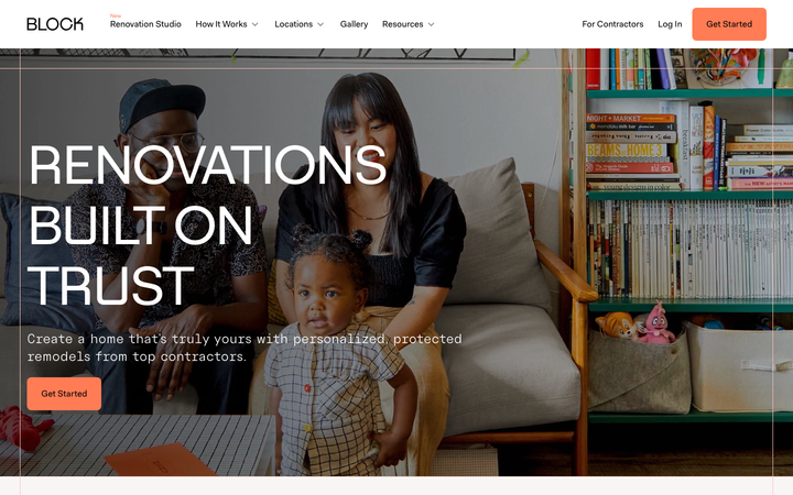
Block Renovation
flagshipTrades
a US renovation marketplace that sells trust through warmth, big bold Fakt sans headlines over real renovated-room photography, a calm black-on-bone palette with one warm orange call to action, on a Next.js + Contentful stack with restrained spring-eased motion.
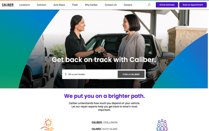
Caliber
strongTrades
a collision and auto-service chain whose site is a clean, trust-first conversion funnel, with "Online Estimate" and "Book an Appointment" front and centre, a confident dark-on-white system, and a single bold accent.
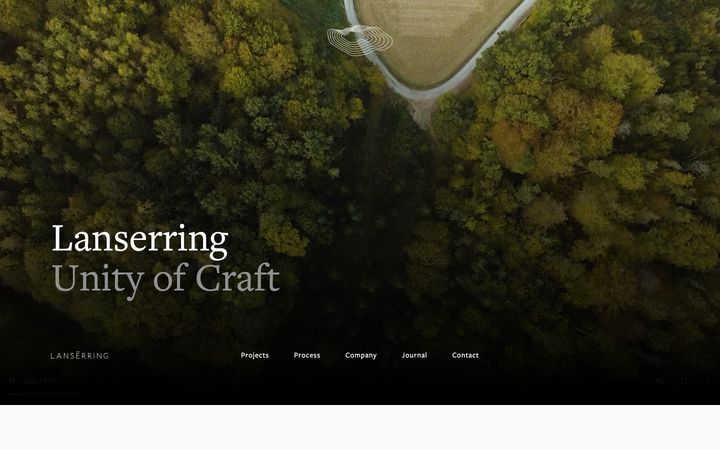
Lanserring
flagshipTrades
a bespoke-joinery house that sells craft as heritage, warm sepia interiors and meadow photography under a high-contrast transitional serif, the brand reduced to a single fine line-drawn ring, with quiet WordPress structure and almost no visible motion furniture.
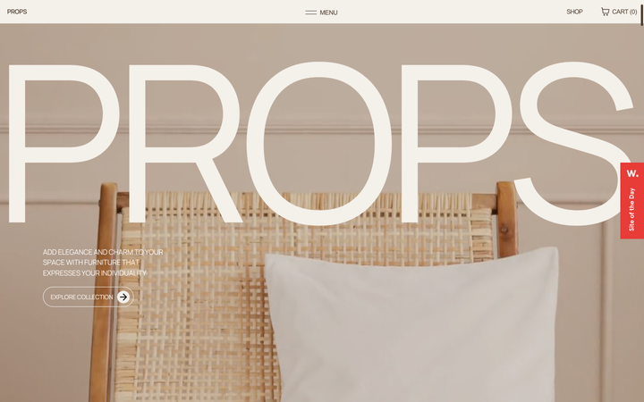
Props Furniture
strongTrades
a Studio Lumio demo store for a furniture maker that turns the brand name into a colossal 408px bone-white "PROPS" wordmark sitting over a warm, sunlit photograph of a hand-woven rattan chair, all set in a calm beige-and-brown palette with a Manrope variable sans paired against a Times serif and a Lenis-smoothed scroll.
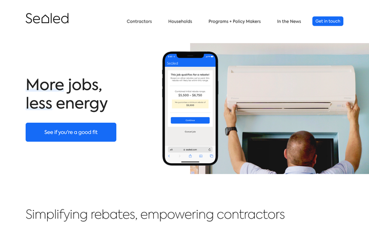
Sealed Home
nicheTrades
a home-energy-efficiency company gone B2B, presenting a measured, trustworthy SaaS-style interface (white space, one electric blue, a friendly geometric sans) with a phone mockup hero and a calm "more jobs, less energy" pitch to contractors.
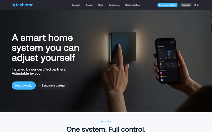
Taphome
strongTrades
a European smart-home automation brand rendered as a calm product-marketing site, near-black ink (#25252e) on cool blue-grey paper (#f7f8fc), a single Aeonik variable face from 18px body to a 64px display, one sky-blue (#3eb4fb) doing every call to action, and dark full-bleed bands that alternate with white 24px-radius cards so a technical HVAC, shading and lighting catalogue reads as approachable rather than industrial.
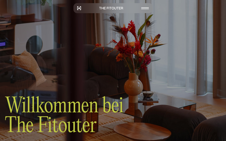
The Fitouter
strongTrades
a boutique interior fitout studio rendered as a moody design object: a deep oxblood-maroon ground (#38050E), a single chartreuse-lime accent (#BFC941), an Editorial New serif paired with Aspekta sans, oversized 150px pill radii and rich interior photography, all carried on Framer with Lenis smooth scroll and Framer Motion.