SaaS Product Service Detail page examples
6 deeply-analysed saas product service detail pages, 3 flagship-tier. Each carries the design tokens, the do and don't rules, the signature moves and the section anatomy, so your AI builder grounds a saas product service detail page in how the best sites actually build it.
A service detail page for a saas product brand is not a blank template. The best ones share a shape, and they diverge in exactly the places that make a brand feel considered. The 6 references here (Dropbox, Slack, Webflow and Crisp among them) are read closely, not just screenshotted, so the patterns that carry a service detail page are on the table as structured data: the type scale, the one disciplined accent, the section order, the motion.
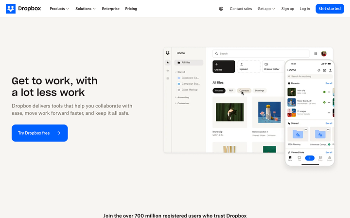
Take one specific: cream-on-cream surface banding on Dropbox. A coconut #f7f5f2 page plus coconut-200 #eee9e2 section bands carry a 13-section long page with zero box-shadows, depth coming from surface contrast not elevation. That is the kind of concrete move a taste layer feeds your builder, instead of the generic service detail skeleton it defaults to with nothing to ground it.
Palate hands your AI builder these references over MCP with explicit borrow rules: what to take from each saas product service detail page, what to leave, and how to re-skin it for your own brand. The point is not to copy one of them; it is to build a service detail page that is grounded in real craft and one-of-a-kind, not averaged. Browse the full set below, or open any reference for its tokens, do and don't rules and section anatomy.
Building a saas product service detail page
Worth borrowing
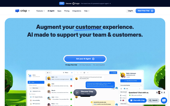
- Bespoke Crisp Aeonik Pro (Regular + Bold + Medium as separate font files)
- Royal blue #1972f5 CTA on white with link-blue #0000ee for inline emphasis
- Underlined emphasis phrases in H1 ("customer experience" and "team & customers" with classic blue underlines)
- Dark navy #030d26 pre-nav banner promoting "NEW" feature with sparkle/asterisk icon
- Real Crisp dashboard mockup in hero at near-full fidelity (conversations list + chat thread + user profile)
- "hugo" AI agent sub-brand with custom asterisk/sparkle logo
Do not copy
- The Crisp Aeonik Pro font licence (bespoke Aeonik variants)
- The Crisp logo
- The "Hugo" AI agent branding + sparkle icon
- The "Augment your customer experience" copy
- The Beth Johnson user profile in dashboard mockup
- The royal blue #1972f5 exact hue
Distilled across these 6 references. Open any one for its full guidance.
Crisp
strongSaaS Product
The reference for AI customer-support brand - bespoke Crisp Aeonik Pro, real chat dashboard hero, link-blue underline emphasis, dark navy announcement banner promoting AI agent.
Dropbox
flagshipSaaS Product
The reference for a 700-million-user product brand at restraint: cream "coconut" backgrounds, one saturated blue CTA, real product UI rendered enormous, and a 13-section page that never raises its voice.
Method
nicheSaaS Product
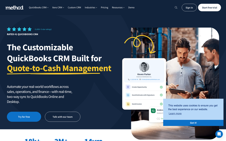
The reference for QuickBooks-niche B2B CRM - clean deep-navy + royal-blue conservative B2B design with yellow-underline accent and customer-photo-driven testimonials.

Slack
flagshipSaaS Product
a post-Salesforce-acquisition product flagship where the iconic aubergine `#611f69` survives as the primary CTA, Salesforce-Sans replaces Lato, and a 30-keyframe motion library powers the "workspace-people-bump" avatar animations that have always been Slack's brand signature.
Webflow
flagshipSaaS Product
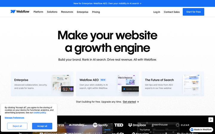
a white-canvas product flagship that is itself built in Webflow - using the bespoke WF Visual Sans Variable + WF Visual Sans Mono, a Webflow-blue `#146ef5` primary, GSAP + ScrollTrigger + Three.js + Swiper all bundled, and a three-card "AI / Template / Scratch" entry hero that mirrors the actual product's onboarding paths.
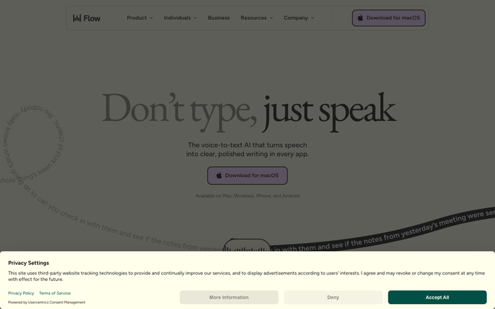
Wispr Flow
strongSaaS Product
The reference for a butter-cream voice-AI brand at peak typographic confidence - EB Garamond serif hero on lavender-and-evergreen surfaces, with curved-path transcript animations as the signature motion.