Creative Studio Careers page examples
5 deeply-analysed creative studio careers pages, 1 flagship-tier. Each carries the design tokens, the do and don't rules, the signature moves and the section anatomy, so your AI builder grounds a creative studio careers page in how the best sites actually build it.
A careers page for a creative studio brand is not a blank template. The best ones share a shape, and they diverge in exactly the places that make a brand feel considered. The 5 references here (Huge, Koto, Oddcommon and Soscale among them) are read closely, not just screenshotted, so the patterns that carry a careers page are on the table as structured data: the type scale, the one disciplined accent, the section order, the motion.
Take one specific: brutalist one-family black canvas on Huge. One type family at one weight, near-square 1-2px corners and vast black space signal taste through restraint. That is the kind of concrete move a taste layer feeds your builder, instead of the generic careers skeleton it defaults to with nothing to ground it.
Palate hands your AI builder these references over MCP with explicit borrow rules: what to take from each creative studio careers page, what to leave, and how to re-skin it for your own brand. The point is not to copy one of them; it is to build a careers page that is grounded in real craft and one-of-a-kind, not averaged. Browse the full set below, or open any reference for its tokens, do and don't rules and section anatomy.
Building a creative studio careers page
Worth borrowing
- Brutalist confidence: one type family, one weight, near-square corners, and a lot of black space, used to signal taste through restraint.
- Accent strategy: a near-monochrome base with a tiny number of loud flat colour blocks (hot pink #FF0090, acid green #48FF65, navy #27455C) that land hard because they are rare.
- The trailing em-rule label convention as a quiet, repeatable typographic signature.
- Numbered service list + case-study work grid as a clean agency structure.
- Lenis smooth-scroll pacing that makes a long page feel deliberate.
- Near-black rgb(20, 20, 20) page with rgb(32,32,32) secondary surfaces - not pure black
Do not copy
- A pure-black canvas plus Monument Grotesk plus a custom cursor is a recognised high-end-agency uniform; lean on it too literally and the site reads as a Huge-or-generic-studio clone.
- The custom JS cursor is a signature flourish and an accessibility cost; only add one with a real reason and a reduced-motion / pointer fallback.
- The ~30,270px length is an agency flex; a client site rarely earns it.
- The Koto logomark with subscript-o
- The gtKotoheim / gtKotoheimMono / gtKotoheimCondensed bespoke typefaces (Grilli Type-owned)
- The exact #FFE600-style yellow brand colour
Distilled across these 5 references. Open any one for its full guidance.
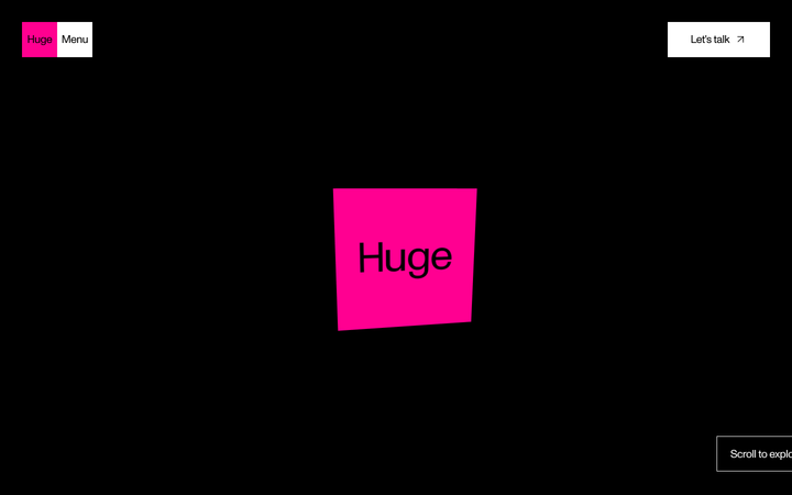
Huge
flagshipCreative Studio
a black-canvas, Monument-Grotesk agency site that turns brutalist restraint into confidence, sharp corners, one type family, vast empty space, then detonates a few hot-pink and acid-green colour blocks and lets Lenis-smooth scroll reveal the work.
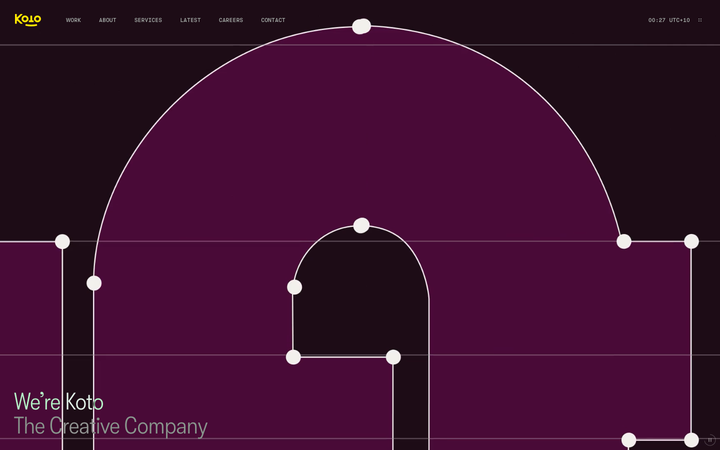
Koto
strongCreative Studio
The reference for global brand-agency studios - yellow logomark on near-black, four custom typefaces, live UTC clock chrome, split-screen sticky-text case study reveals.
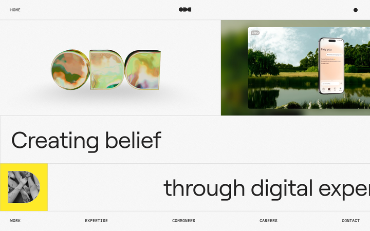
Oddcommon
strongCreative Studio
a digital-experience studio that builds its homepage like one of its products, a fixed, gridded "operating system" screen on an off-white grain canvas, where an iridescent 3D ODC logo, a big Roobert headline, a single yellow block and live Mux video tiles sit inside hairline-ruled frames and move with spring physics.
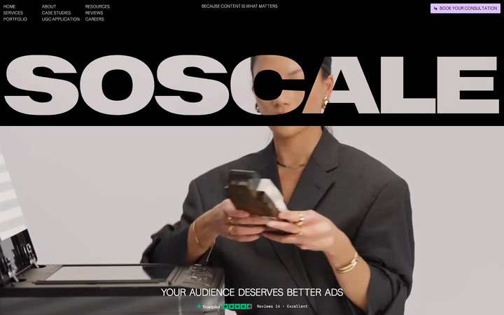
Soscale
nicheCreative Studio
The reference for Swedish performance-marketing agencies that lead with creative rather than media-buying - pure-black canvas, oversized SOSCALE wordmark hero, lavender pill CTA, and a Webflow + GSAP + Lenis motion stack borrowed wholesale from the global studio scene.
Supersolid
nicheCreative Studio
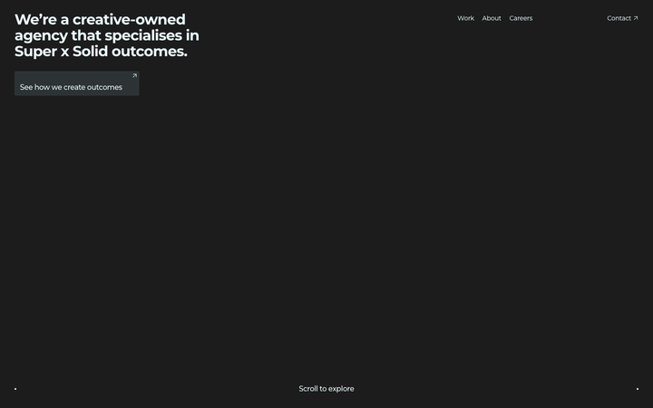
The reference for Sydney creative-agency portfolios - near-black canvas, single-headline hero with a tiny "Scroll to explore" indicator, then a tile-grid case study reel and a chromatic-aberration ROIdeas display moment.