Design tokens
background
surface
text
textMuted
accent
border
tone1
tone2
- display
- Helvetica Now Text
- body
- Helvetica Now Text
- mono
Do / Don't
Reference it for
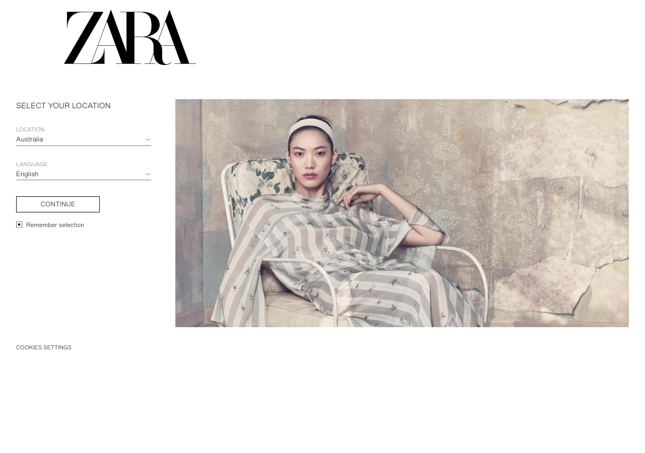
- Binary palette: #ffffff canvas, #000000 ink, single #757575 grey for secondary labels, and nothing else
- A didone/high-contrast serif wordmark set oversized (the logo is the only display type; body stays sans)
- Compact neutral sans UI at 11 to 16px (Helvetica Now Text feel), everything small and magazine-like
- Zero radius everywhere: buttons, inputs, cards all 0px square corners
- Zero elevation: no shadows, no gradients, hierarchy from whitespace and border weight only
- Hairline 1px black underlines as the entire form-field treatment (selects underlined, not boxed)
- Solid black bordered CTA button (CONTINUE) with square corners and uppercase compact label
- Split hero: left column of quiet form/text against a right-side full-bleed editorial photo doing all the colour work
Do not copy
- The ZARA didone wordmark itself and its exact tight letterspaced lockup
- The specific location/language gateway screen pattern (a global-retailer necessity, not a design idea)
- Helvetica Now Text as a literal font choice (it is Zara's licensed brand face)
- The 'Si nos visitas desde Islas Canarias' Spanish market copy
- The particular editorial photo styling and model direction
- Reading the near-total absence of colour as a universal rule; it only works with strong photography