Design tokens
background
surface
text
textMuted
accent
border
tone1
tone2
- display
- Helvetica_
- body
- Helvetica_Reg
- mono
Do / Don't
Reference it for
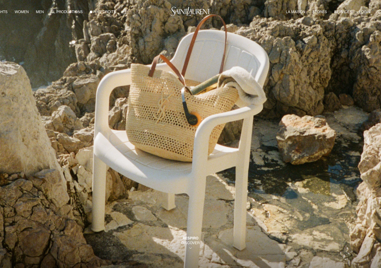
- Full-bleed edge-to-edge hero photography as the entire first screen, image supplies all the colour while the chrome stays black-on-photo
- Centred logotype anchored to the very top of the viewport with the nav split left and right of it (HIGHLIGHTS / MUJER / HOMBRE left, LA MAISON / TIENDAS / SERVICIOS / INICIAR SESION right)
- Tiny (~10px) uppercase nav labels with wide letter-spacing carrying the whole interface, no dropdowns visible at rest
- Strict binary palette: #000000 text and chrome over #ffffff / photographic ground, no intermediate greys, no accent
- Zero border-radius (0px everywhere), zero box-shadow, elevation expressed only by photographic bleed and value
- Centred bottom caption pattern (RESPIRO / DESCUBRIR with a small chevron) as the only call-to-action, floated near the lower edge
- Search glyph and minimal bag icon as line icons at the far right of the nav, matched in weight to the text
- Generous top and side whitespace framing the wordmark so the photograph reads as a magazine spread
Do not copy
- The Saint Laurent / YSL wordmark and its cassandre monogram lockup
- The specific campaign photograph, model, cherry earring and red-shirt styling
- The exact centred-wordmark-with-flanking-nav lockup, it reads unmistakably as this maison
- Spanish market nav labels (MUJER / HOMBRE / TIENDAS) as literal copy
- The Rive Droite black-square glyph and SL Productions naming
- Any implication of luxury-fashion heritage or house codes for a non-luxury brand