Design tokens
background
surface
text
textMuted
accent
border
tone1
tone2
- display
- Wise Sans
- body
- Inter
- mono
Do / Don't
Reference it for
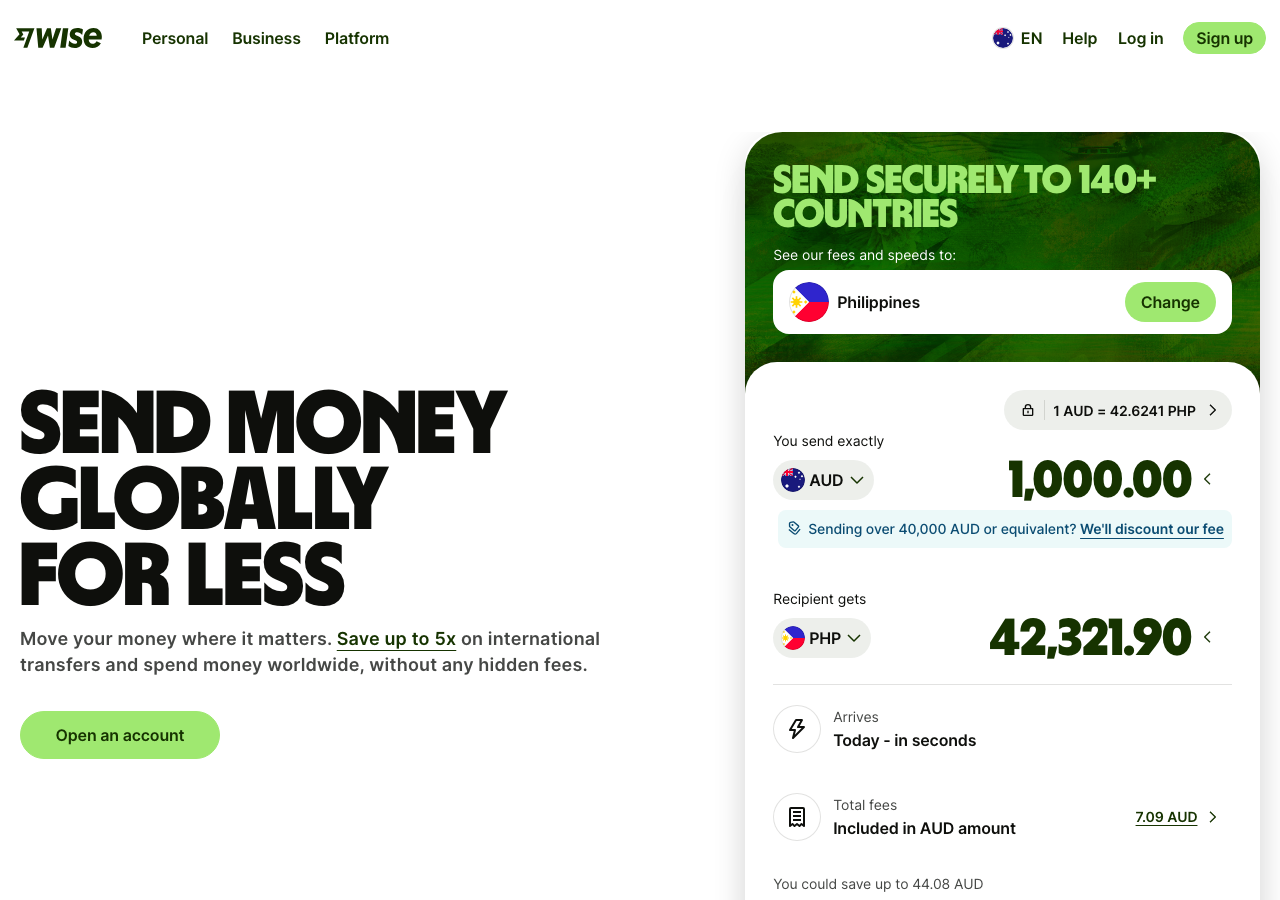
- Oversized black display type (weight 900, tight tracking) set across two stacked lines at ~105px on desktop, doing all the visual shouting
- A single functional accent: lime #9fe870 reserved only for the primary CTA pill and active states, never decorative
- Fully pill-shaped buttons (radius 9999px): a solid lime 'Open an account' beside a plain underlined text link 'Send money now' for clear primary/secondary hierarchy
- Calm near-white/cream canvas (~#f5f7f2 to #ffffff) so the heavy type and lime read as the only colour events
- Forest-ink brand colour (#163300) for the logo, nav links and body, keeping everything off pure black
- Tight two-CTA row centred under a short value-prop subhead ('160 countries and territories. 40 currencies.')
- Centred, restrained top nav (three product links left, locale flag + Help + Log in + lime Sign up pill right)
- Animated 3D hero object (rotating globe piggy bank) with a visible pause control respecting motion preferences
Do not copy
- The Wise logomark and the 'wise' lowercase wordmark
- The exact forest-ink + lime-voltage pairing (#163300 / #9fe870), which is Wise's locked brand signature
- The 3D globe-piggybank-with-coin motif
- Headline copy like 'Money for here, there and everywhere'
- Wise Sans, the proprietary display face
- The country/currency claim numbers (160 countries, 40 currencies)