The Clove Club
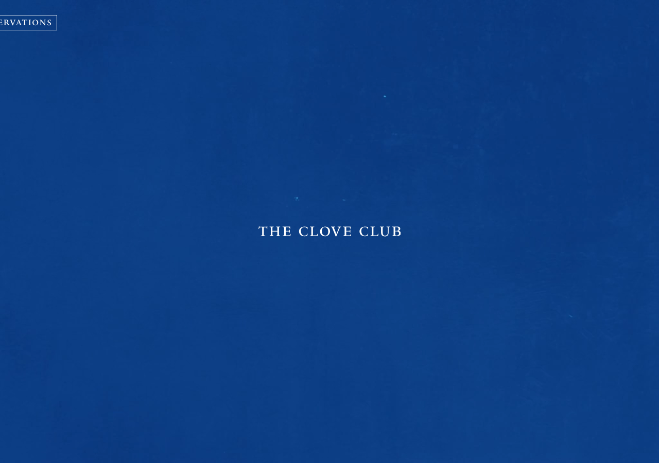
www.thecloveclub.comThe reference for a Michelin-restaurant landing that is one full-bleed cobalt field (#154b90), a centred small-caps wordmark set in a Times serif, and almost nothing else, confidence expressed as restraint.
Hospitality flagship
Design tokens
background
surface
text
accent
tone1
- display
- Practice
- body
- Practice
- mono
Do / Don't
Reference it for
- The single-colour full-viewport hero: paint the whole screen cobalt #154b90 (rgb 21,75,144) with a faint hand-painted paper texture, no imagery, no scroll cue
- Optically centred serif wordmark in Times/Times-like serif, wide letter-spacing (~1.125px), small-caps feel, pure white #ffffff on the blue
- A tiny outlined pill button top-left, 'RESERVATIONS' in ~0.75rem letter-spaced caps inside a 1px white stroke box, the only clickable chrome
- A minimalist '+' glyph top-right as the menu affordance instead of a word or hamburger
- Two-face pairing: a body/UI sans (custom 'Practice') for nav and small caps, a Times serif reserved only for the brand name
- Tight compact type scale: body 1.0625rem, small 0.75rem, h1 1.875rem, with a snug 1.2 body line-height
- Fixed header height token (4.8125rem) and a consistent 1.625rem gutter driving the whole grid
- High-contrast monochrome-on-colour system: only black, white and one blue across the entire page (44 black + 31 white uses, one blue field)
Do not copy
- The Clove Club name and its Times-set small-caps wordmark
- The exact cobalt #154b90, it reads as this restaurant's signature colour
- The custom 'Practice' typeface (proprietary web font)
- The hand-painted blue paper texture as a literal background asset
- 'RESERVATIONS' as the framing CTA copy and its boxed treatment
- The Shoreditch/London restaurant identity and any menu or chef content
- The bare '+' as your own nav mark if it would just ape this layout