Terremoto
terremoto.laThe reference for a landscape-studio portfolio that lets one oversized Mabry wordmark and a single documentary photograph carry the whole page on off-white #f2f3ef, no chrome, no radius, no shadow.
Architecture flagship
Design tokens
background
surface
text
textMuted
accent
border
- display
- Mabry
- body
- Mabry
- mono
Do / Don't
Reference it for
- Split-wordmark hero: TERRE top-left at 78px, MOTO dropped a line and indented so the logo reads as two staggered blocks instead of a centred lockup
- Warm near-white paper background #f2f3ef paired with pure black #000000 text, the only two colours on the page
- Mabry (MabryPro) as the sole face across display and UI, weights 400/600/700 plus a real italic cut, Arial as the fallback
- Type scale of just four sizes: 15/16px body, 48px medium, 78px large (line-height 63px, tight negative leading on the display)
- An 8-column grid with a 36px page gutter and 18px inner gutter/gap, driven off CSS custom props (--columns:8, --page-gutter:36px, --gutter:18px)
- Top-right stacked text nav (PROJECTS / SMALL WORKS / WRITINGS & RAMBLES / LAND AND LABOR / OFFICE), current item bolded to 600, everything else 400
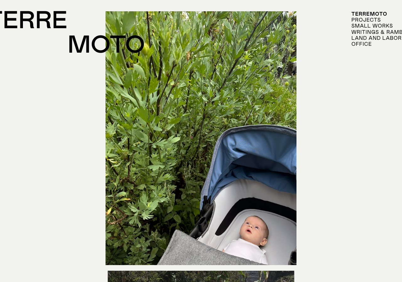
- A single tall portrait image centred as the page's whole hero, edge-defined by whitespace not a frame or border
- Uppercase menu labels with 1px letter-spacing on the 15/16px items for a quiet editorial register
Do not copy
- The TERREMOTO wordmark and its split TERRE/MOTO staggered lockup
- Mabry Pro itself, it is a licensed face, swap to your own grotesque
- The studio's project photography (nursery plants, the pram documentary shot)
- The named sections WRITINGS & RAMBLES / LAND AND LABOR / SMALL WORKS as-is
- The specific paper-white #f2f3ef as a brand signature
- The 'Terremoto' Spanish-for-earthquake naming conceit and its landscape-architecture positioning