Tailwind Css
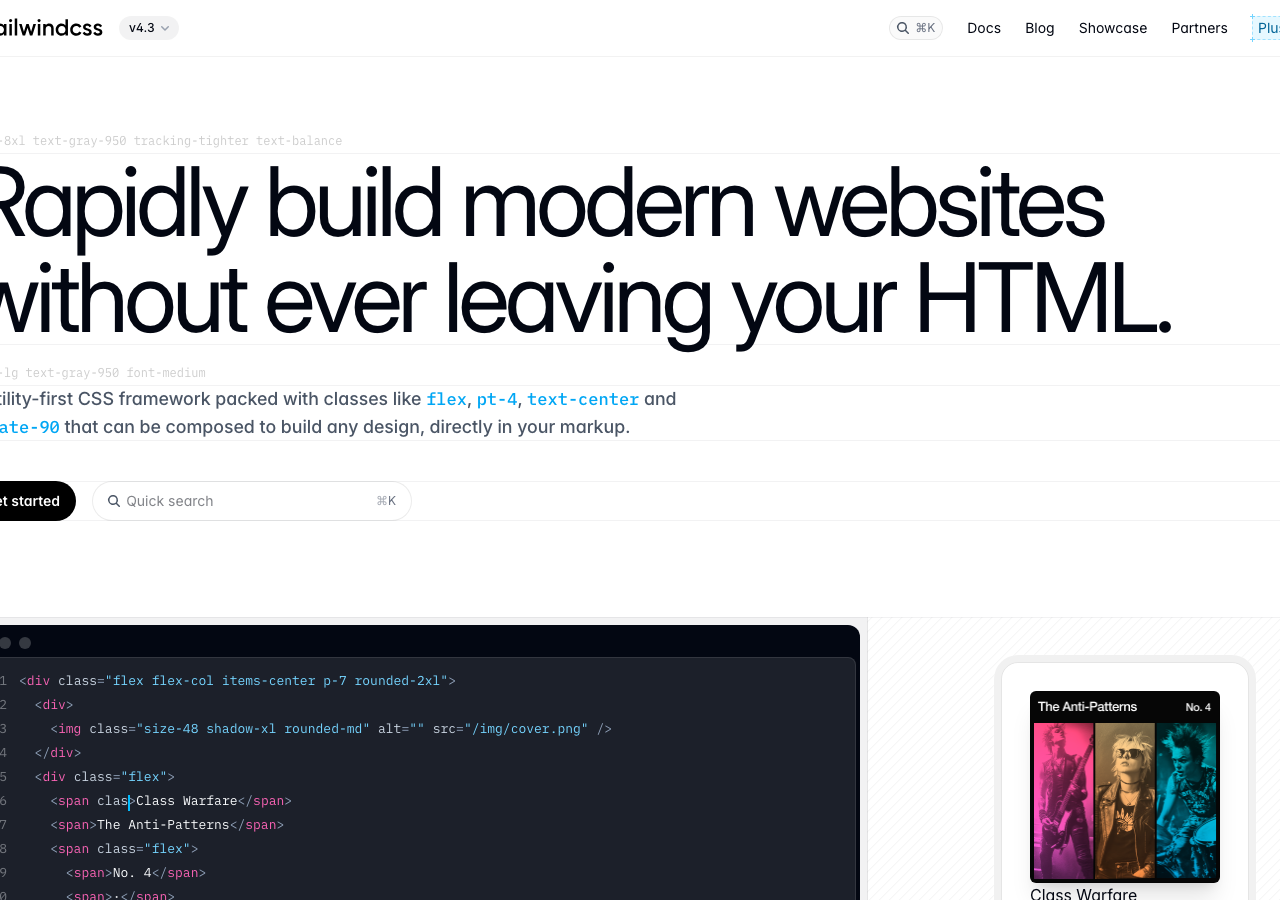
tailwindcss.comThe reference for letting type scale carry the whole hero: 96px near-black ink (#030712) headline on bare white, with colour banished to inline code syntax only.
Developer Tool flagship
Design tokens
background
surface
text
textMuted
accent
border
- display
- Inter
- body
- inter
- mono
- plexMono
Do / Don't
Reference it for
- Oversized headline as the entire hero: ~96px, weight 700, tight tracking and balanced wrapping (text-8xl / tracking-tighter / text-balance), two lines deep, no supporting imagery
- Monochrome discipline: ink-black #030712 does headings, body, borders and the primary button, so the page reads as one tonal system
- Colour kept inside content, not chrome: sky blue #00a6f4 and rose #e60076 appear only as syntax highlights in inline code (flex, pt-4, rotate-90), never as UI accents
- Pill primary CTA: fully-rounded black 'Get started' button (radius ~32px) paired with an inline quick-search field carrying a kbd hint
- Code-block-as-proof beneath the pitch: a dark macOS-chrome editor panel with line numbers, syntax colour and a rounded-2xl frame, demonstrating the product in situ
- Inset ring borders instead of drop shadows: 1px inset at ~10% black defines card edges with no visual mass, drop shadow reserved for the one floating preview card
- Body copy at text-lg / weight 500 in the same ink, sitting directly under the headline with no eyebrow or kicker label
- Slim utilitarian top nav: wordmark plus logo left, text links (Docs, Blog, Showcase) and command-K search right, hairline only
Do not copy
- The Tailwind wave logo and tailwindcss wordmark
- The 'Rapidly build modern websites without ever leaving your HTML' headline and utility-first framing
- The literal class-name code samples (flex, pt-4, rotate-90, size-48 shadow-xl) which are product-specific
- The full systematic rainbow swatch grid of every Tailwind hue further down the page
- Inter as the display face (a recognised AI-build default tell)
- The 'Anti-Patterns / Class Warfare' album mock card content