Ssense
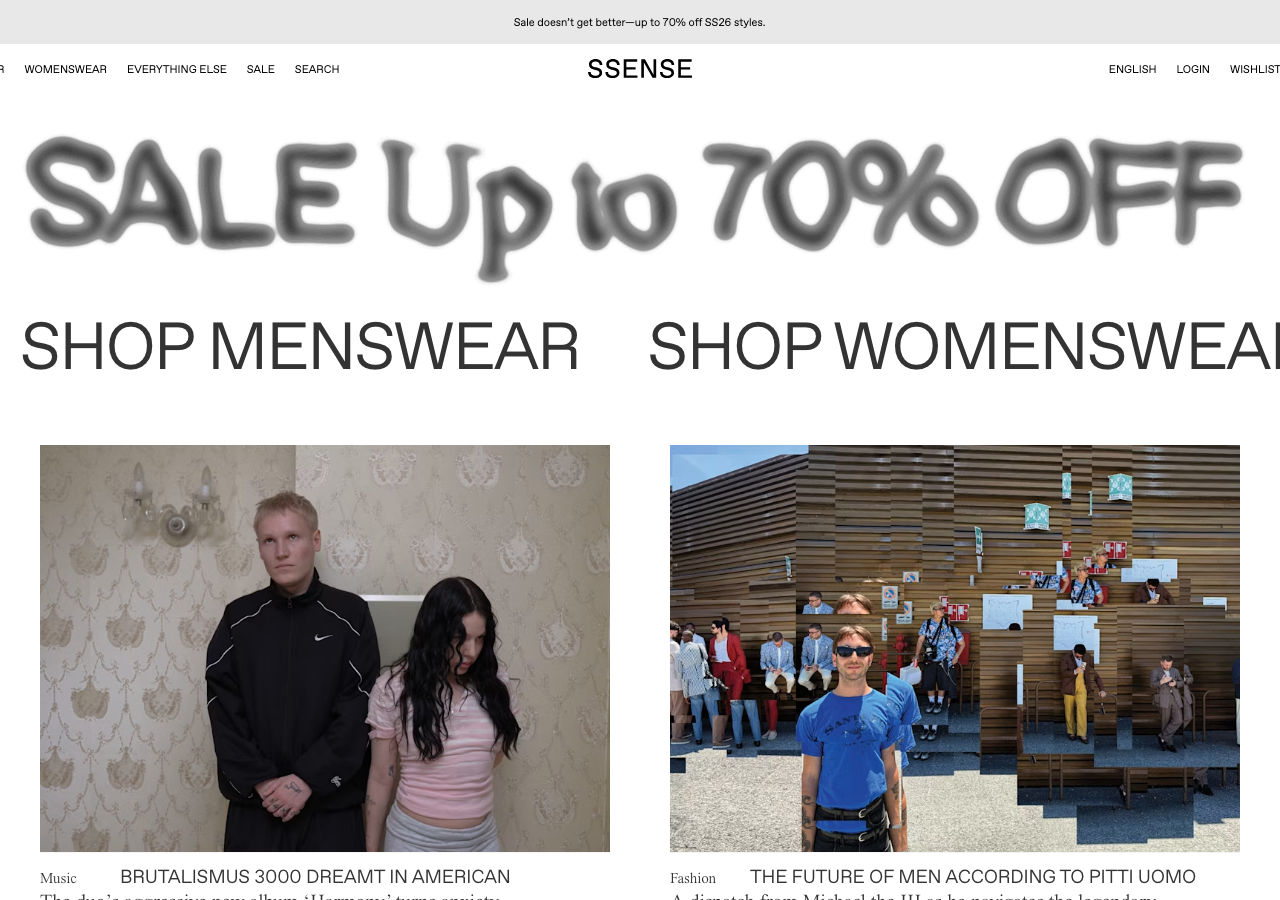
ssense.comThe reference for treating an e-commerce homepage as a print magazine cover: an oversized all-caps serif (JHA Times Now) at ~95px on near-white #f4f4f4, pure monochrome, ghost-outlined CTAs, and editorial photography carrying all the colour.
Retail flagship
Design tokens
background
surface
text
textMuted
accent
border
tone1
- display
- JHA Times Now
- body
- Favorit SSENSE Inter
- mono
Do / Don't
Reference it for
- Extreme scale contrast as the only hierarchy tool: ~95px all-caps serif display down to 11px caps meta labels, no colour or weight needed to separate levels
- A two-serif headline system: tight-tracked all-caps display ('CIRCLING BACK') stacked above a mixed-case serif subhead at ~29px for a magazine cover-title feel
- Negative letter-spacing on large serif faces to compress letterforms into elegant, editorial shapes
- Monochrome palette only: black #000000 text, graphite #333333, muted grey #888888, on #ffffff surface over #f4f4f4 page ground
- Ghost buttons: 1px hairline #979797 outline, 0px radius, no fill, uppercase micro-label ('VIEW EDITORIAL')
- Completely flat system: zero shadows or elevation, separation comes only from whitespace and the #ffffff vs #f4f4f4 tonal step
- Hairline 1px #979797 dividers and borders instead of cards or containers
- Thin uppercase sans nav (Favorit/Inter) at ~11-14px with generous tracking, split logo-centred layout (nav left, account/bag right)
Do not copy
- The SSENSE wordmark and its exact centred logo lockup
- The licensed brand faces JHA Times Now and Favorit SSENSE (source your own serif + grotesque)
- The 'Free shipping over EUR250' promo bar and its dismiss affordance
- Retail-specific nav labels (MENSWEAR, WOMENSWEAR, WISHLIST, BAG) unless you actually sell fashion
- The 'CIRCLING BACK / spring/summer 26' seasonal editorial copy
- The specific fashion-lookbook photography treatment (studio boxes, model styling)