Spotify
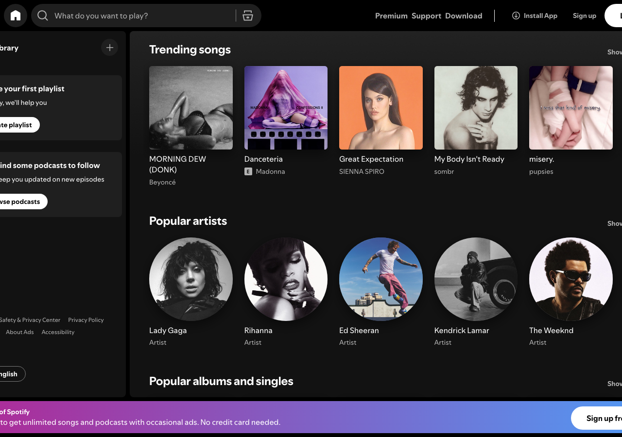
spotify.comThe reference for a near-black media command centre (#000000 canvas, #121212 cards) where one green accent (#1ed760) and full-bleed album art carry all the colour.
Media Streaming flagship
Design tokens
background
surface
text
textMuted
accent
border
tone1
tone2
- display
- SpotifyMixUI
- body
- SpotifyMixUI
- mono
Do / Don't
Reference it for
- Two-layer dark surface system: pure #000000 canvas with raised #121212 cards, no drop shadows, separation by tone alone
- Single saturated accent (Spotify green #1ed760) reserved for the primary pill button and active states, everything else greyscale
- Fixed two-column app shell: rounded sidebar panel (Your Library) left, scrolling content feed right
- Rhythmic geometry alternation between square album covers (6px radius) and fully-circular artist avatars (radius 500px)
- Compact utilitarian sans at 11/14/16/24px so artwork does the heavy lifting; bold weight only on section headings and item titles
- Fully-rounded pill controls: white Log in button, capsule search input, ghost Create button (radius 9999px)
- Section header pattern: bold left-aligned title with a muted Show all link flush right
- Card grid rows of six items with title + secondary muted label (artist / Artist tag) stacked beneath
Do not copy
- The Spotify wordmark and circular green logo glyph
- Spotify green #1ed760 as a literal accent (it reads instantly as Spotify)
- The exact SpotifyMixUI custom typeface
- Real album artwork, artist photography and track names (Bad Bunny, KAROL G, etc.)
- The 'What do you want to play?' search copy and 'Create your first playlist' onboarding wording
- The exact magenta-to-blue promo banner gradient as a brand signature