Porto Rocha
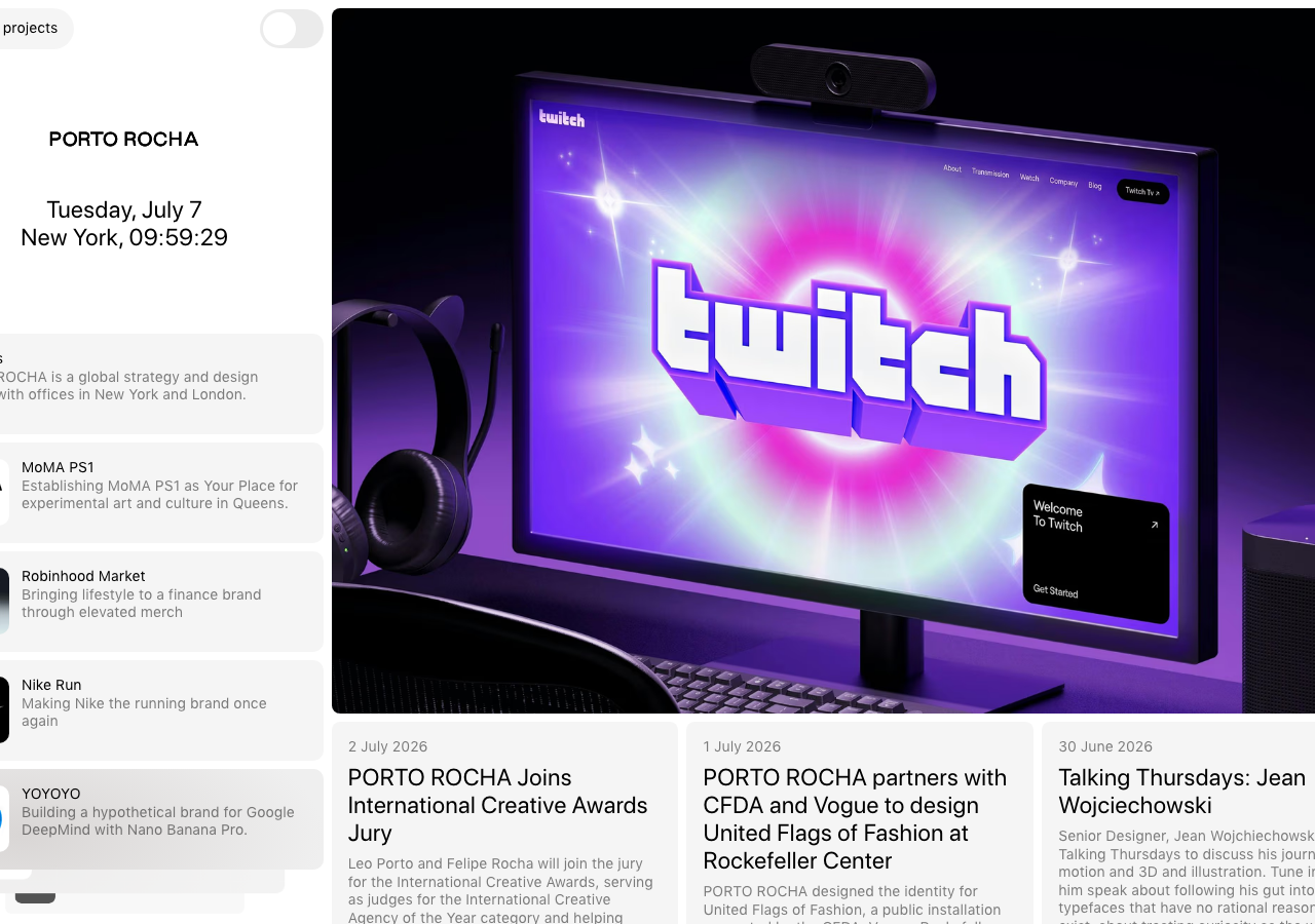
portorocha.comThe reference for a monochrome editorial agency home that runs a fixed left metadata rail (live New York clock, About, logo-thumbnail project index) against a full-bleed photographic collage and a three-column dated journal grid, with a single system-blue #007aff reserved only for links.
Agency Home flagship
Design tokens
background
surface
text
textMuted
accent
border
- display
- Sf-Pro-Display
- body
- sf-pro-text
- mono
Do / Don't
Reference it for
- Two-zone home layout: a narrow fixed left rail (~280px) of agency metadata, ticking city clock and a scrollable project index, beside a wide image-led content field
- Restraint palette: paper white #ffffff ground, ink black #000000 type, ash grey #808080 metadata, and one Apple system blue #007aff used ONLY for links and active states
- Project index as stacked rows: small square brand-mark thumbnail on the left, project name in black plus a one-line grey description (e.g. 'Building a hypothetical brand for...')
- A live self-updating location clock ('Wednesday, April 29 / New York, 22:28:37') as the only motion, signalling a working studio without decoration
- Flat, shadow-free elevation: separation via 1px hairline grey borders and generous whitespace only, giving a printed-monograph feel
- Three-column journal/news grid under the hero, each cell led by a small grey date label (e.g. '22 April 2026'), a black headline, then muted body copy
- Full-bleed photographic collage of real print collateral as the hero image, letting client work carry the screen instead of illustration or gradient
- SF Pro Display / SF Pro Text at a tight scale (14/16/18/23px), single 400 weight, so hierarchy comes from size and colour, not weight
Do not copy
- The PORTO ROCHA wordmark and centred agency lock-up
- The specific client brand marks in the index (YOYOYO, Robinhood Market, Nike Run, Kunsthalle Basel) and their thumbnails
- The Kunsthalle Basel 'K' identity collage photography used as the hero
- Apple's exact system blue #007aff as an accent (reads as iOS default; pick a considered brand link colour)
- The literal New York / London studio copy and 'A global strategy and design agency' About line
- Verbatim journal headlines and dates (Laus Awards, Milan Design Week, Creative Review)