Papier
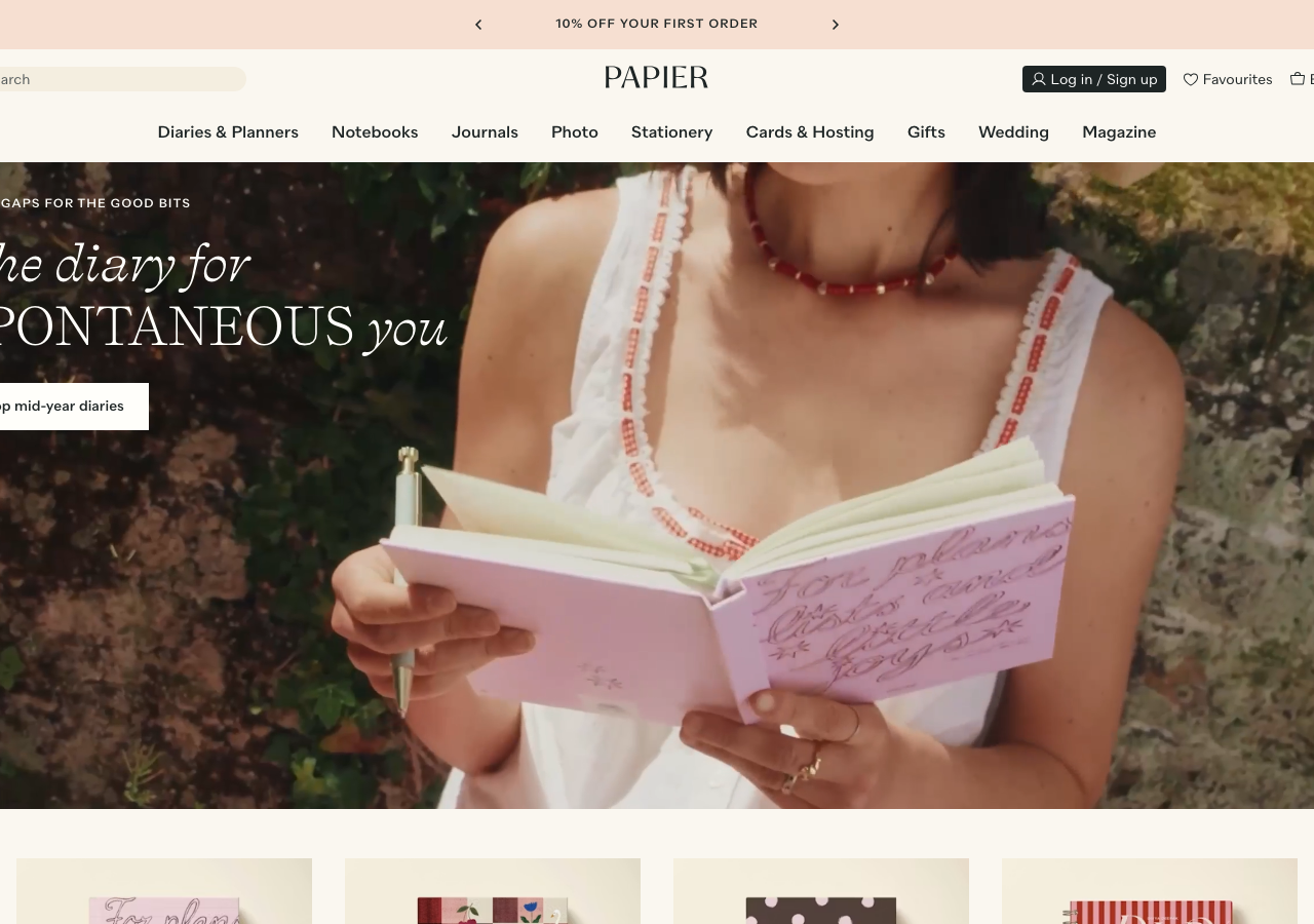
www.papier.comThe reference for warm editorial retail: a cream #f4eee0 paper canvas, deep ink #1e2525 text, and a mixed Self Modern serif-italic / Quarion caps headline that turns a stationery shop into a considered lifestyle brand.
Retail flagship
Design tokens
background
surface
text
textMuted
accent
border
tone1
tone2
- display
- Quarion
- body
- Quarion
- mono
Do / Don't
Reference it for
- The signature two-voice headline: alternate a Self Modern serif italic ('The diary for', 'you') against Quarion in tracked uppercase ('SPONTANEOUS') inside one line, sizes ~48px display
- The paper-tone canvas system: layer #fffefa, #faf7f0, #f4eee0 and #ece1c7 as barely-different section fills so the whole page reads warm without hard borders
- Ink-on-cream contrast: body and headings in #1e2525 (never pure black) on cream, muted secondary in #565c5c and #8e9292
- Full-bleed lifestyle hero photo with text set flush-left in the top-left third, no scrim box, just deep-ink type over the darker region of the image
- The soft pink promo bar (#f6dfd1) at the very top with a centred rotating offer and left/right chevron arrows
- Product grid cards on their own tinted paper tiles (#faf7f0) with 24px radius, product name + '2 bindings' + price stacked at 14px Quarion
- The tiny all-caps eyebrow at 12-14px with 1px letter-spacing above a display line ('LEAVE GAPS FOR THE GOOD BITS')
- Restrained button: ink outline / ghost fill 'Shop mid-year diaries', square-ish 4px radius, no gradient
Do not copy
- The Papier wordmark set in Self Modern caps
- The exact seasonal palette combination (the paper + forest + apricot + duck-egg mix reads as Papier)
- The 'LEAVE GAPS FOR THE GOOD BITS' / 'The diary for SPONTANEOUS you' brand copy
- The specific diary and journal product names (Il Giardino, Casa Soluna, Quilted & Gathered, La Pera)
- The hand-lettered pink journal hero photograph and the model imagery
- The '4.75 rating 16,000+ reviews' and '@Papier' social proof
- The Quarion + Self Modern licensed type pairing as a lift