Osteria Ilaria
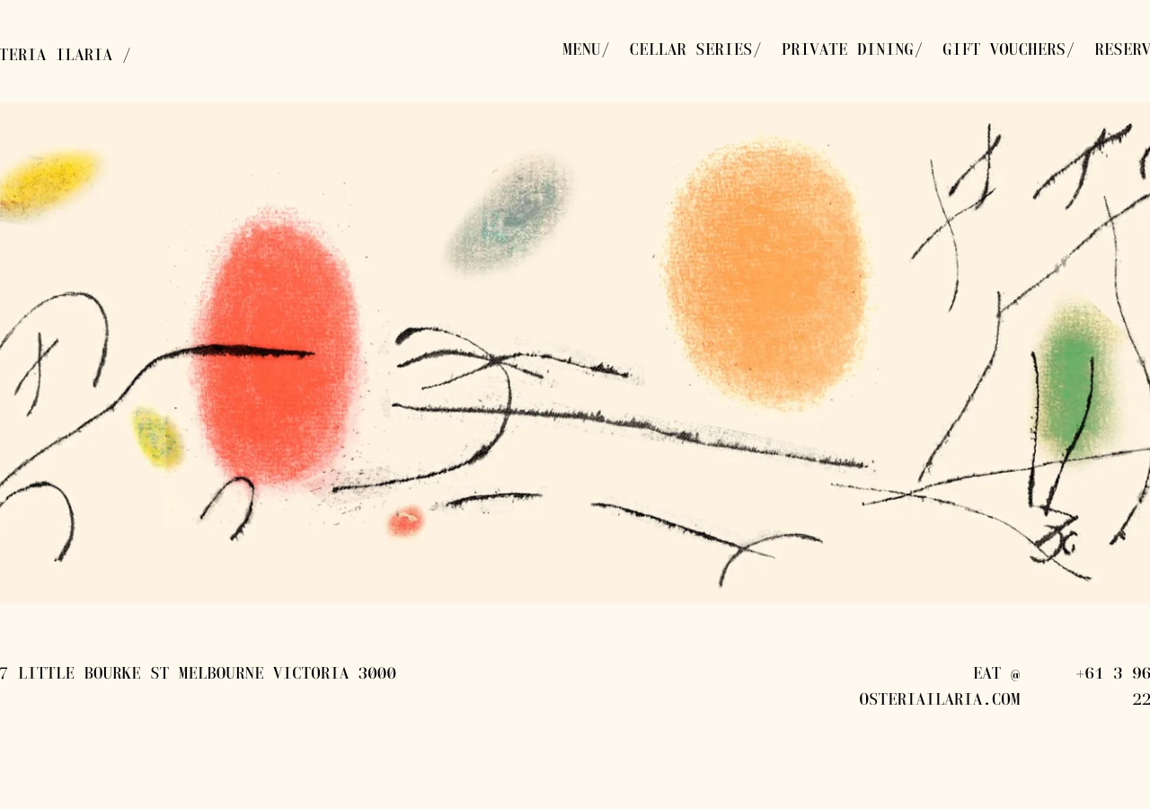
www.osteriailaria.com/The reference for pairing a light monospace (laplace-mono-light) in letterspaced uppercase against a warm cream field (#FDF6E5) and a single hand-painted Miro-esque abstract as the entire hero, so a restaurant reads as gallery not menu.
Hospitality flagship
Design tokens
background
surface
text
textMuted
accent
border
tone1
tone2
- display
- Laplace-Mono-
- body
- laplace-mono-light
- mono
- laplace-mono-light
Do / Don't
Reference it for
- Light monospace display in all-caps with positive letter-spacing (laplace-mono-light) carrying nav, wordmark and body alike, one typeface doing everything
- Warm cream page field hsla(40,88.24%,96.67%) ~#FDF6E5 instead of white, the whole site sits on paper
- A single large hand-drawn / painted artwork (loose ink lines + soft colour blobs: red, ochre, teal, green, yellow) as the hero, no photography of food
- Wordmark set as OSTERIA ILARIA followed by a trailing slash, the slash used as a persistent typographic device (MENU/ CELLAR SERIES/ RESERVE/)
- Deep olive-green as the only saturated brand ink for the site title hsla(69.31,61.7%,18.43%) ~#404B12 against black body copy
- Section labels as ILARIA / MENU, ILARIA / CELLAR SERIES, a fixed prefix-slash-label naming pattern
- Menu presented as plain letterspaced mono text lines with trailing prices (Scallop, basil butter, cacciatore - 14ea), no cards, no dividers
- Charcoal near-black hsla(240,2.61%,22.55%) ~#37373A reserved for inverted panels / drawers, warm grey hsla(42.86,3.87%,64.51%) ~#A8A5A0 for buttons and strokes
Do not copy
- The Osteria Ilaria wordmark and the trailing-slash lockup
- The specific hand-painted Miro-style artwork and its exact colour blobs
- The licensed Typekit face fino and laplace-mono-light as literal font choices
- The Melbourne address, phone, and eat@osteriailaria.com contact details
- The actual menu copy and dish descriptions (Sher wagyu rump cap, basil cheesecake, etc.)
- The Conferre Group / Wurundjeri acknowledgement wording and sibling-venue address list
- The olive-green + cream exact palette as a whole (recolour to the new brand)