Osip
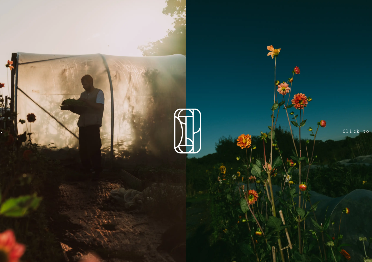
osiprestaurant.com/The reference for a full-bleed split-screen photographic entry gate, warm bone #FBFAF9 ground under a bespoke Bruton serif, that treats a restaurant homepage like the cover of a book.
Hospitality flagship
Design tokens
background
surface
text
textMuted
accent
border
tone1
- display
- Bruton
- body
- BrutonMedium
- mono
Do / Don't
Reference it for
- Full-viewport split-screen hero: two edge-to-edge dusk photographs meeting at centre, with a line-drawn monogram logo straddling the seam
- Warm bone/off-white ground rgb(251,250,249) instead of pure white, paired with pure black rgb(0,0,0) text and hairline rules
- A single bespoke serif carrying the whole site (BrutonMedium, one 400 weight, 62 uses) so type IS the brand
- Restrained micro type scale: nav and labels at ~13-15px (12.8/13/14.4/15.2px) with generous 23-24px line-height
- Widely letter-spaced small-caps entry cue set right (Click to enter) as the only call to action on the gate
- Editorial section pattern: uppercase category label (THE RESTAURANT / PRIVATE DINING / THE ROOMS) over a soft sentence of prose
- Place-anchored storytelling copy that names the landscape and building age (300 year old inn, Somerset hills, pine forest) instead of selling
- Multi-CTA menu blocks that offer parallel routes (Sample tasting Menu / Brochure / Enquire / Photo Essay) rather than one funnel
Do not copy
- The Osip wordmark and the interlocking O-S line-drawn monogram
- The bespoke BrutonMedium typeface (proprietary, licensed to the brand)
- The specific farm and dahlia-field dusk photography and the man-in-the-polytunnel image
- Real venue details: 25 Kingsettle Hill Bruton, phone, and the osiprestaurant.com addresses
- The Everything In Between design credit and @merlin_johnson handle
- Brand-specific copy like 'an expression of the Somerset landscape' and 'a holistic destination'