Noma 2
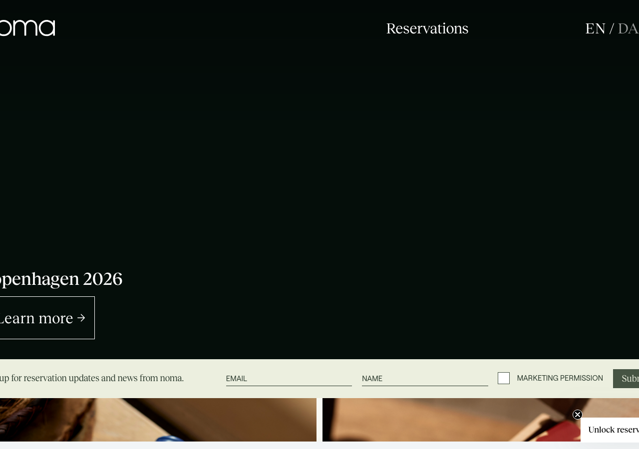
noma.dkThe reference for a fine-dining editorial voice: deep forest ink #29382b on bone #f9f9f3, the Reckless serif carrying a lowercase wordmark and long-form letter, restraint doing all the work.
Hospitality flagship
Design tokens
background
surface
text
textMuted
accent
border
tone1
tone2
- display
- Reckless-Neue
- body
- Reckless
- mono
Do / Don't
Reference it for
- The forest-green-on-bone palette: foreground #29382b against background #f9f9f3, a warm off-white that reads calmer than pure white
- Reckless (serif) as the whole voice, headings in Reckless-Neue, a distinct optical-size sibling for display vs body
- Roobert (sans-serif) reserved only for UI micro-labels (EN/DA, MARKETING PERMISSION, form fields) in ~15px
- Hero headline set large in Reckless at the fluid --font-size-1 clamp(2rem, -0.5rem + 8vw, 4.5rem), bottom-left anchored over a dark image
- Outlined button: text + right arrow inside a 1px black box (Learn more ->), no fill, no radius, generous padding
- Lowercase italic wordmark noma set in the serif, tiny top-left, letting the type be the logo
- A seasonal palette ramp (--season-color-1..8) from bone #f9f9f3 through sage #bfd1a7 to near-black green #0c251b for tonal section shifts
- Body copy at 18px / line-height 1.8 in the serif for a genuinely readable long letter, tracking 0.18px
Do not copy
- The noma lowercase serif wordmark
- The exact forest-green + bone pairing as a whole identity (it is theirs)
- Reckless and Roobert as a licensed type pairing (specify your own faces)
- The Copenhagen 2026 / twelve-seasons narrative and the founder letter copy
- The seasonal-colour naming system as branded language
- Real dish, restaurant and residency photography
- The Noma Projects / Noma Kaffe sub-brand product tie-ins