Design tokens
background
surface
text
textMuted
accent
border
tone1
- display
- Helvetica Now Text
- body
- Helvetica Now Text Medium
- mono
Do / Don't
Reference it for
- Strict no-accent monochrome system: Obsidian #111111, Paper White #ffffff, plus three greys (Concrete #e5e5e5, Soft Mist #f5f5f5, Steel #707072) and nothing else, let imagery be the only colour
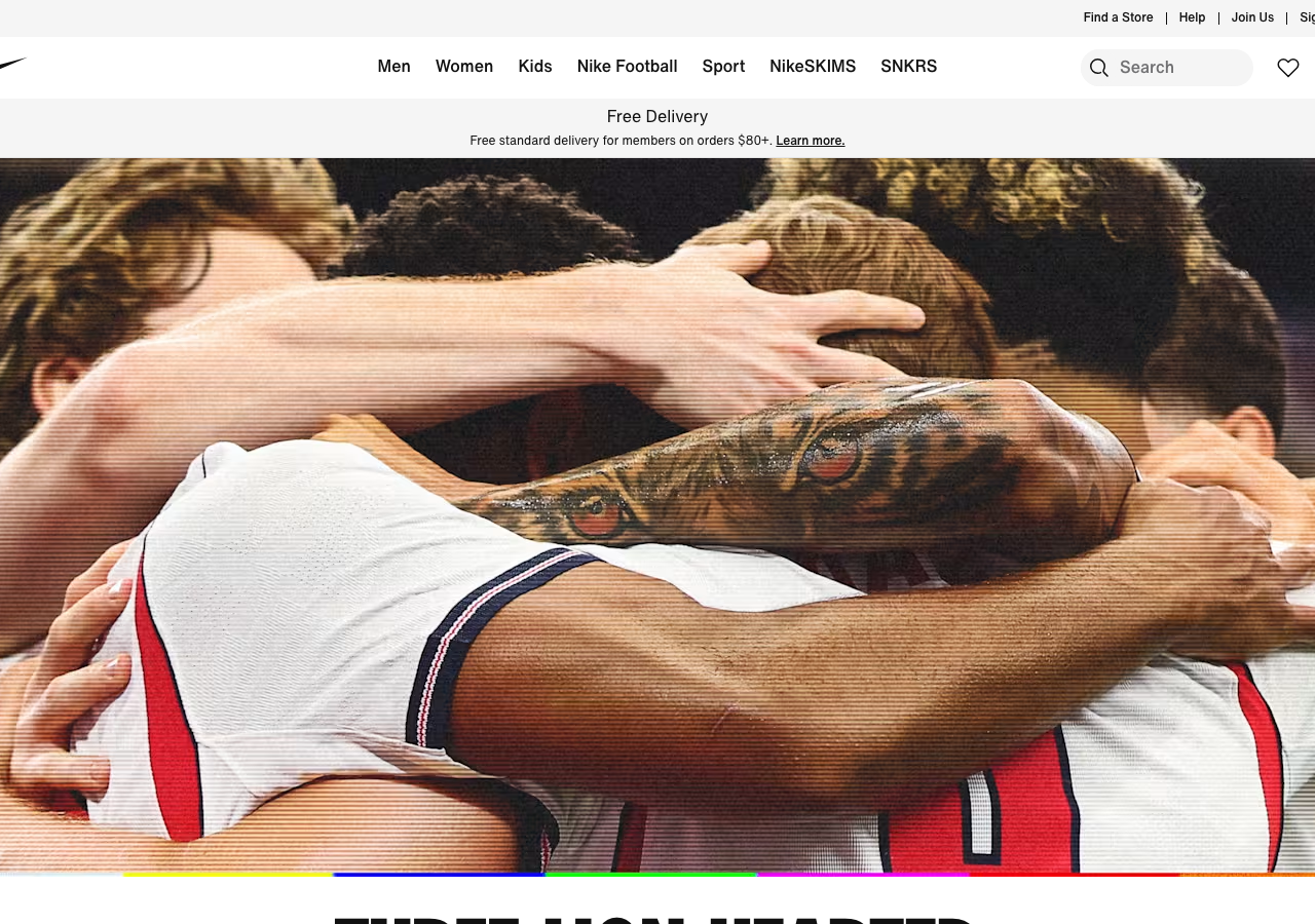
- Full-bleed dark video hero that runs edge to edge under a transparent nav, with content (logo, nav, search) sitting directly on the footage
- One oversized display moment: a 76px condensed Futura-style headline against the photography, with everything else held at 12-20px utilitarian body
- Compact utilitarian type scale (12 / 14 / 16 / 20 / 24px) in a neutral grotesque, weights 400/500/700, so the chrome reads as signage not branding
- Pill controls at 30px radius (the white 'Ver' play button, nav tags) against square-cornered product cards and inputs at 0px radius, deliberate radius contrast
- Flat, zero-shadow elevation: rhythm comes from alternating full-bleed dark editorial sections with white product grids, separated by hairline #e5e5e5 borders
- Transparent top utility bar (store finder, help, join, sign in) at ~12px sitting above the main nav on the dark hero
- Centred primary nav between a left logo mark and right icon cluster (search field, wishlist, bag), a balanced retail header pattern
Do not copy
- The Nike swoosh and the Jordan Jumpman / converse logos in the utility bar
- The Futura ND / Helvetica Now custom type families (licensed house faces)
- Athlete and match footage / brand campaign imagery (the actual editorial content)
- Spanish-market campaign copy like 'ROMPE EL GUION'
- NikeSKIMS and other proprietary product-line nav labels
- The exact Nike palette names (Obsidian, Paper White) as if they were a generic system