Netflix
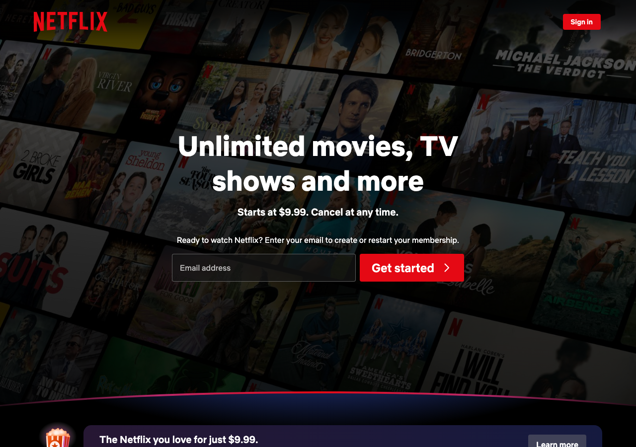
netflix.comThe reference for a cinematic black-void hero where a single Netflix Red #e50914 CTA punches through a tilted, dimmed wall of content thumbnails.
Media Streaming flagship
Design tokens
background
surface
text
textMuted
accent
border
tone1
tone2
- display
- Netflix Sans
- body
- Netflix Sans
- mono
Do / Don't
Reference it for
- Pure black #000000 canvas as the whole-page foundation, no panels or surface tints competing with the content
- A perspective-tilted, darkened mosaic of poster thumbnails behind the hero, dimmed almost to silhouette so the centred copy stays legible
- One saturated accent (red #e50914) reserved only for the wordmark, the primary Get Started button, and the Sign In pill: extreme restraint everywhere else
- Big confident centred headline around 56px in a heavy utilitarian sans (Netflix Sans, weight 700-900) with a quiet ~20px supporting line under it
- Inline email-capture pattern: dark translucent input + solid red button in a single row, with a one-line nudge above ('Ready to watch? Enter your email...')
- Top bar that floats over the imagery: left wordmark, right a language selector pill and a single sign-in button, no nav links
- A faint magenta-to-blue glow arc separating the hero from the section below instead of a hard divider or shadow
- Promo strip below the fold using the cosmic deep gradient (#192247 to #210e17) card so it glows from within rather than casting a shadow
Do not copy
- The Netflix wordmark and its exact red #e50914 brand colour
- Netflix Sans (proprietary licensed face); substitute a heavy neutral grotesque
- Real show posters, title art, and recognisable IP in the thumbnail wall
- The tilted-poster-wall motif itself, which now reads as instantly 'Netflix'
- Brand-specific copy ('Unlimited movies, TV shows, and more', pricing claims)
- The popcorn-bucket promo banner and its plan-specific messaging