Miranda
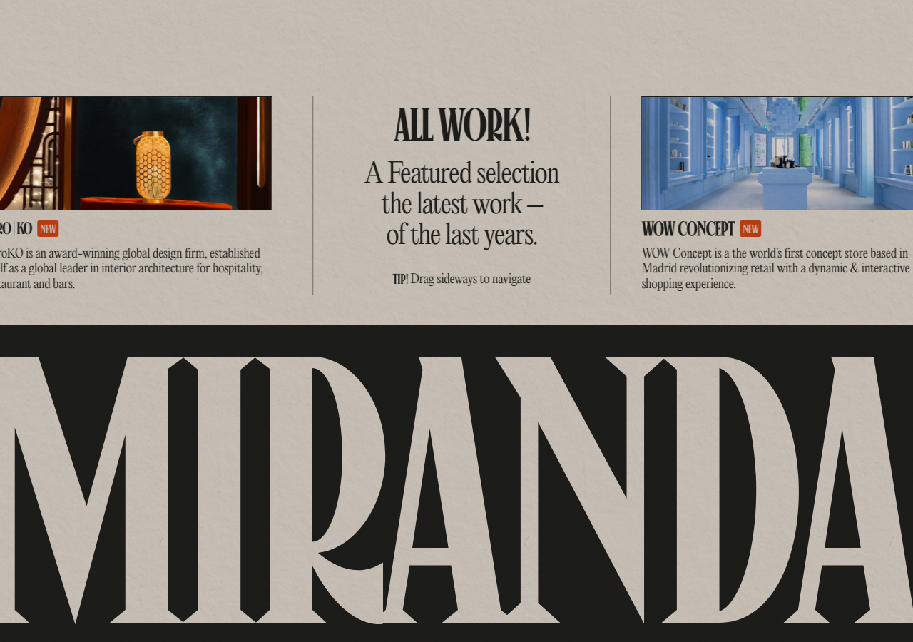
www.niccolomiranda.comThe reference for a broadsheet-newspaper portfolio on warm parchment #e2dedb, where an oversized display serif (MIRANDA, negative tracking, sub-1.0 line-height) is knocked white out of a near-black #1d1d1b ink banner.
Design Portfolio flagship
Design tokens
background
surface
text
textMuted
accent
border
tone1
- display
- Canopee
- body
- Editorial New
- mono
Do / Don't
Reference it for
- Warm parchment canvas #e2dedb with near-black #1d1d1b ink for all text, rules and banners (matte, never clinical white)
- Full-bleed near-black masthead banner with the studio name set in a huge display serif knocked out to parchment, letters tracked tight enough to nearly collide
- Newspaper masthead treatment: a blackletter/fraktur title (The Paper Portfolio) centred between a location dateline (Amsterdam, NL) and a hamburger
- Three-column editorial spread with thin 1px ink column rules, each column a project card (image, name, NEW tag, serif blurb)
- Single ember-orange accent #c03f13 used only as a stamp: the small NEW tags and inline seals, never on large fields
- Centred pull-quote column headline mixing weights (bold ALL WORK! over lighter italic-feel serif deck) with an em-dash line break
- Small-caps utility labels (TIP! Drag sideways to navigate, AVRO|KO, WOW CONCEPT) that read like caption furniture
- Flat, borderless, shadow-light components: hierarchy comes from ink-on-cream contrast and rule lines, with only a faint offset card shadow rgba(29,29,27,0.2) -4px 4px 6px
Do not copy
- The MIRANDA wordmark and its specific custom display letterforms
- The blackletter The Paper Portfolio masthead lockup
- The AvroKO / WOW Concept project names, copy and thumbnails
- Amsterdam, NL dateline and the personal-brand framing (Niccolo Miranda)
- The exact ember-orange NEW stamp tag as a lifted component
- The literal newspaper-broadsheet metaphor as a whole if the brief is not editorial or portfolio