Mgn Events
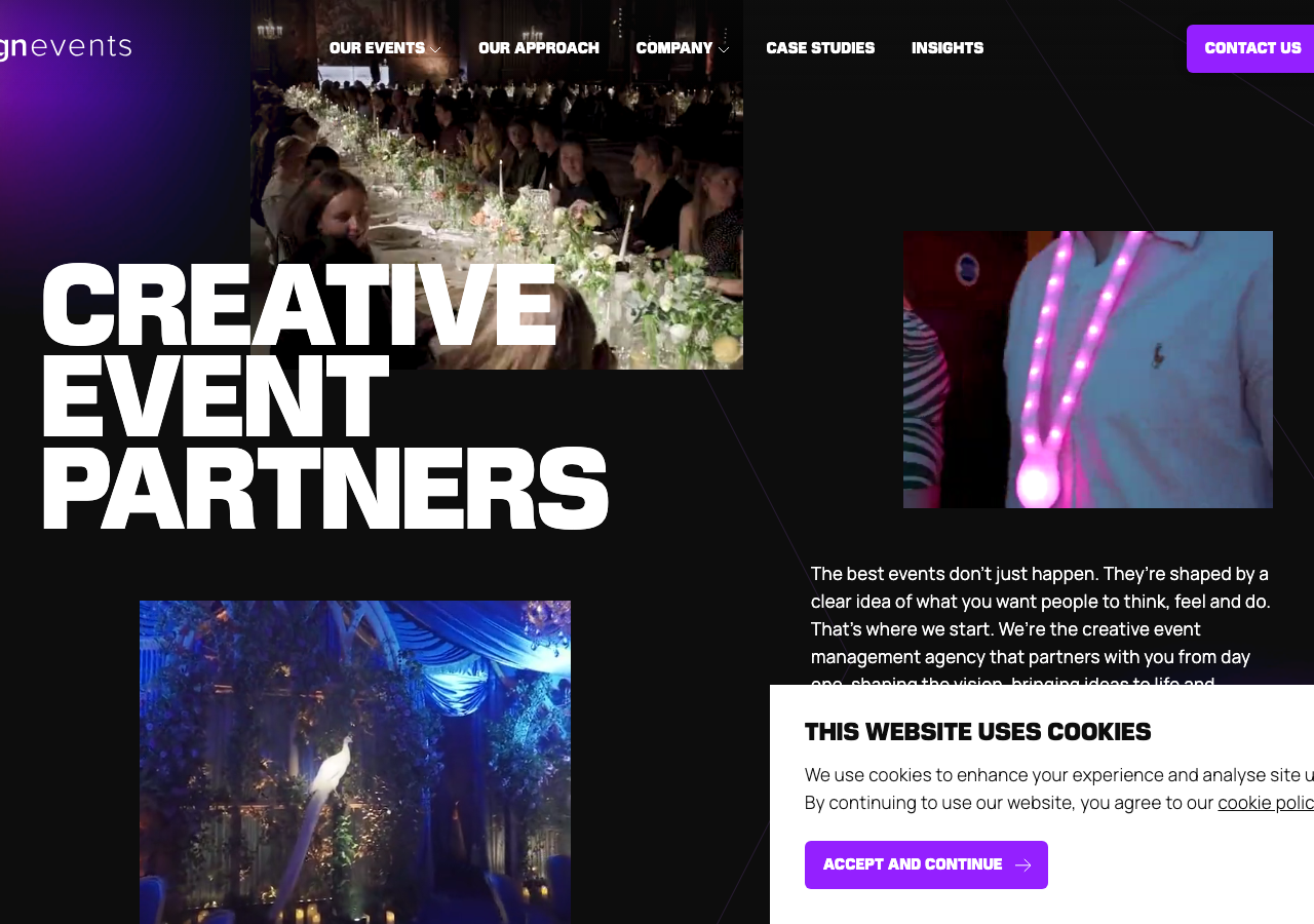
www.mgnevents.co.uk/The reference for a near-black (#0D0D0D) creative-agency hero where a wall of ultra-bold condensed Marche caps (74px, tight -0.5px tracking) collides with looping event video and a single electric-violet (#9420FF) accent.
Events Agency flagship
Design tokens
background
surface
text
textMuted
accent
border
tone1
tone2
- display
- Manrope
- body
- Marche
- mono
Do / Don't
Reference it for
- Massive condensed display headline set in Marche 700 at 74px+ (up to 112px), stacked one word per line (CREATIVE / EVENT / PARTNERS), letter-spacing -0.5px
- Near-black canvas rgb(13,13,13) with pure-white type rgb(255,255,255) as the base contrast, not flat #000
- One saturated electric-violet accent #9420FF (rgb 148,32,255) reserved for CTAs and nav pills, backed by rare orange #FF6640 and magenta #C41187 pops
- Video/image tiles bleeding into the hero at offset positions rather than a single flat banner, overlapping the headline column
- Body/UI set in Manrope 300 and 400 (17px, line-height 27px) as the calm counterweight to the heavy display face
- Solid violet pill button with uppercase label + inline arrow icon (CONTACT US ->), border-radius 4px
- All-caps micro-labels for nav and section eyebrows in Manrope with +0.5px tracking (OUR EVENTS, OUR APPROACH)
- Two-word poster headings per section (MAGIC IN / THE DETAILS, BRAND / EXPERIENCES) reusing the stacked-caps device
Do not copy
- The MGN Events wordmark (lowercase mgn + events lockup)
- The exact violet-to-black palette as a set; lift the structure, not the identity
- Real event photography and video of actual guests and clients
- Named client testimonials (Ralph Lauren, Trainline, PMG) and their quotes
- The 'MAGIC IN THE DETAILS' brand line and its exact wording
- The KOTA studio footer credit
- The specific Marche display face if licensing is unavailable; substitute a comparable condensed grotesque