Mano Cornuto
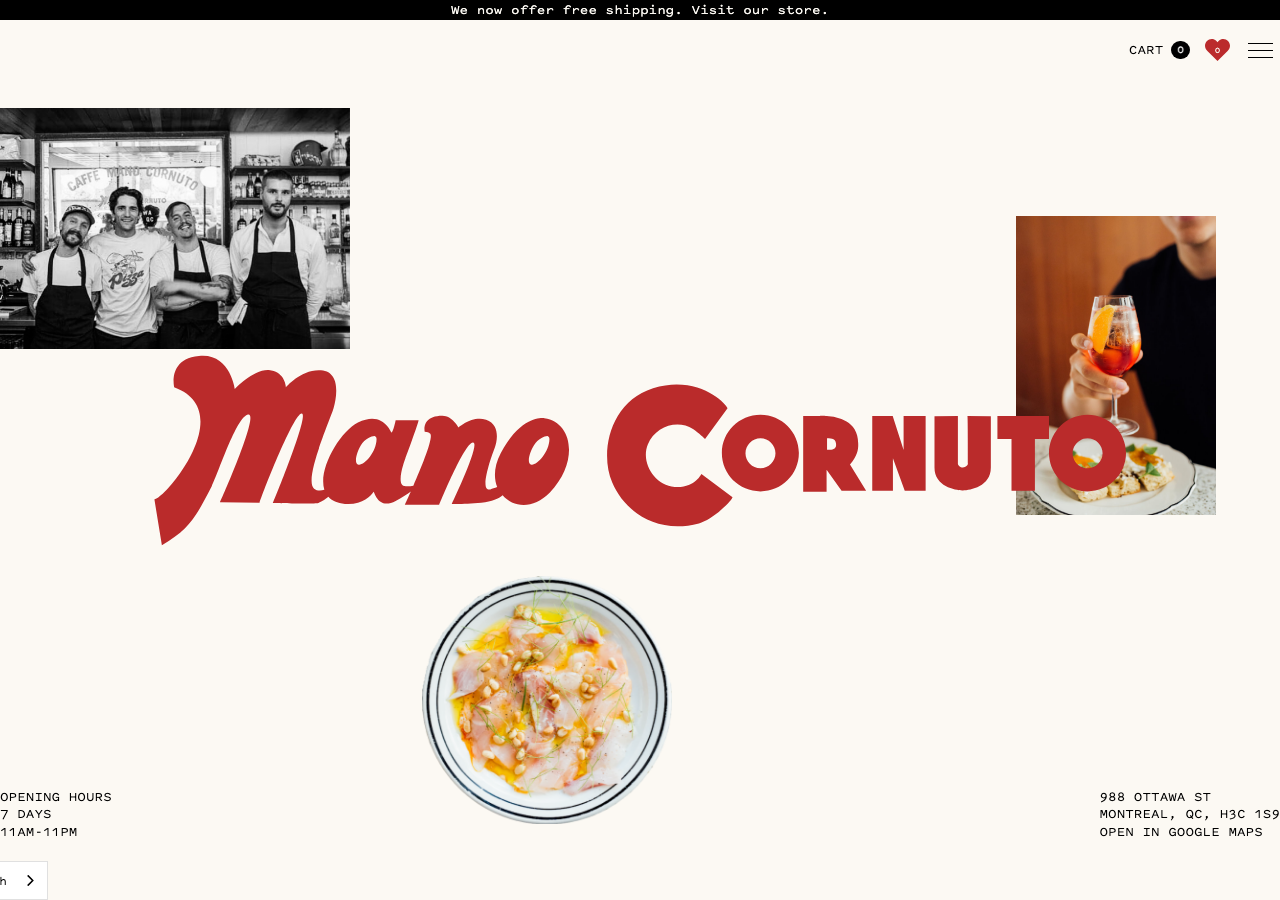
www.manocornuto.com/The reference for a scrappy neighbourhood Italian caffe that leads with a giant firebrick-red (#ba2b2b) Gopher-Display script wordmark laid across cropped black-and-white staff photos on warm beige (#fcf9f3).
Hospitality flagship
Design tokens
background
surface
text
textMuted
accent
border
- display
- Gopher
- body
- pitch-sans
- mono
Do / Don't
Reference it for
- Oversized script display logo (Gopher Display Bold) in firebrick red #ba2b2b spanning most of the viewport as the hero centrepiece, not a heading
- Warm beige page ground #fcf9f3 (rgb 252,249,243) instead of plain white for a lived-in trattoria feel
- Firebrick red #ba2b2b as the single hot accent against beige + near-black text
- Pitch Sans (mono-adjacent grotesque) at 500 weight for all functional copy, set in small uppercase 12-14px with wide tracking for opening hours, address, reservation blocks
- Two-tier font system: Gopher Display Bold for the wordmark, Pitch Sans for everything else
- Utility corners: opening hours pinned bottom-left, address + Google Maps bottom-right, both in tiny uppercase Pitch Sans
- Cropped editorial food + staff photography (B&W group shot, a spritz in hand, a plate of crudo) scattered asymmetrically around the wordmark
- Slim black top announcement bar (free shipping / visit store) full-bleed above a beige body
Do not copy
- The Mano Cornuto script wordmark and name
- The exact firebrick + beige + mc-green (#314d23) palette as a set
- The real staff group photo and the founders' faces
- The specific Montreal address, phone, reservations@manocornuto.com details
- The horned-hand (mano cornuto) brand concept and the gold charm hanging top-left
- The Gopher Display + Pitch Sans licensed foundry pairing verbatim
- Brand-specific copy like 'YES, WE NOW TAKE RESERVATIONS :)'