Lune Croissanterie 2
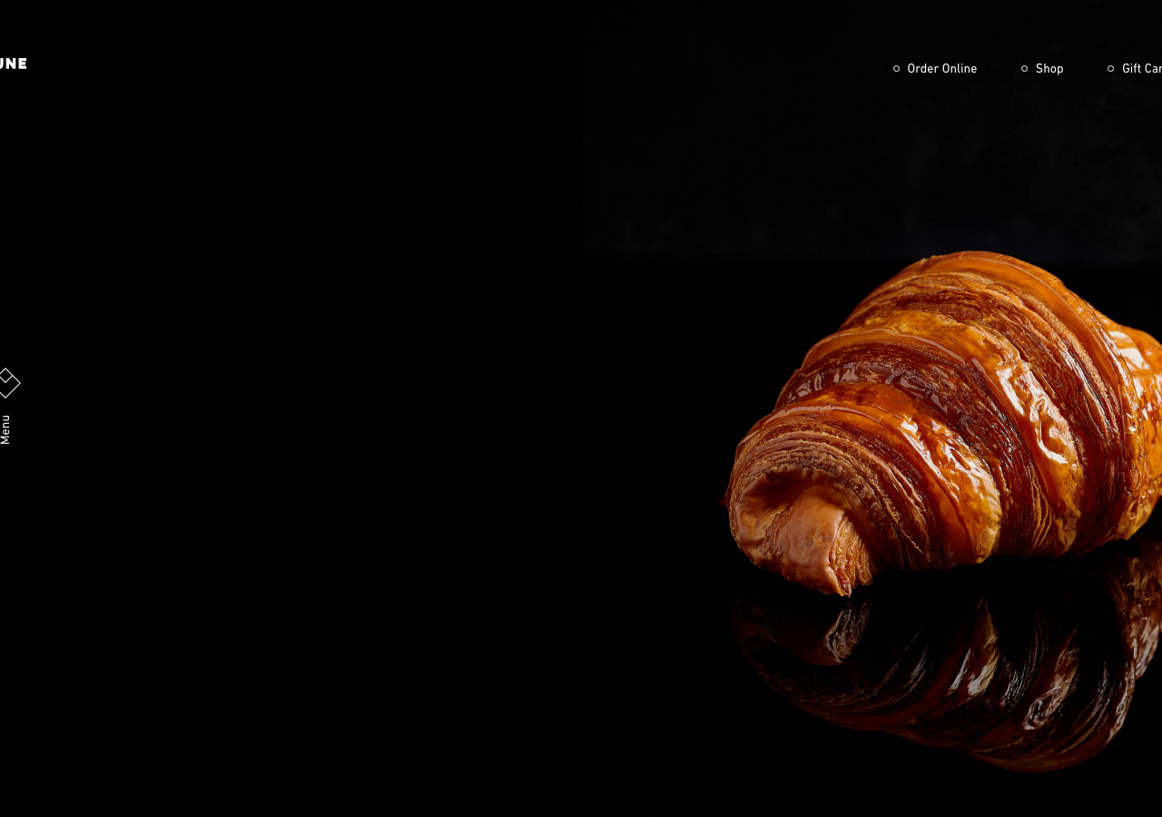
lunecroissanterie.com/The reference for treating a single product as a museum object: a pure #000000 canvas, one macro-lit croissant mirrored on a glossy floor, and giant ghosted outline letters (L, U, N, E) that anchor each scroll section in DIN Next.
Hospitality flagship
Design tokens
background
surface
text
textMuted
accent
border
- display
- DIN Next LT W01
- body
- DIN Next LT W01 Regular
- mono
Do / Don't
Reference it for
- Pure black stage: rgb(0,0,0) full-bleed background with rgb(255,255,255) text, letting hero-lit product photography do all the colour work
- Mirror-reflection product shots (croissant reflected on a gloss floor) as the hero centrepiece, image right-anchored on a wide empty left column
- Oversized ghost letters: 115.2px display glyphs at -5.76px letter-spacing, one giant outline character per section spelling the brand across the scroll (L, U, N, E)
- DIN Next LT condensed geometric sans as display face paired with Untitled Sans for body, both at weight 400
- Tiny circle-bullet nav items (Order Online / Shop / Gift Cards) set in 14px caps, generously tracked
- Vertical rotated Menu label beside a small diamond glyph as the primary menu affordance, far left
- Editorial pull-headline at 45-50px (line-height 70-78px) set flush against a plated macro photo, e.g. 'Lune is an institution solely dedicated to the creation of croissants.'
- Minimal boxed 'Read More' outline button, sitting in vast negative space rather than a busy CTA row
Do not copy
- The Lune wordmark and the spaced-caps LUNE logotype
- The exact hyperreal croissant and cross-section photography (real studio product shots)
- The literal L-U-N-E ghost-letter sequence spelling this specific brand
- Lune's brand copy ('an institution solely dedicated to the creation of croissants')
- The real Melbourne/Brisbane/Sydney venue list and addresses
- The licensed DIN Next LT / Untitled Sans webfonts (swap for a similar condensed geometric grotesque)
- The diamond menu glyph as a signature mark