Luca
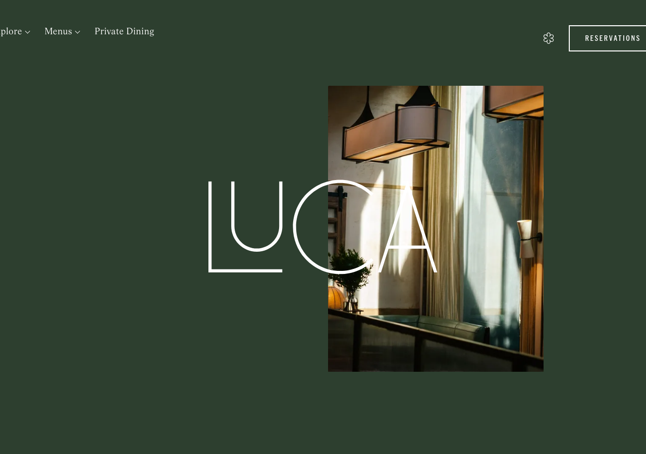
luca.restaurantThe reference for a full-bleed forest-green (#2d3f2f) restaurant landing where a hairline Magister-serif wordmark overlaps a single warm interior photo, the logo drawn OVER the image so type and picture share the same plane.
Hospitality flagship
Design tokens
background
surface
text
textMuted
accent
border
tone1
tone2
- display
- American Grotesk
- body
- Magister
- mono
Do / Don't
Reference it for
- Deep forest-green ground #2d3f2f as the entire page background, not a section band, so a single photo carries all the warmth
- Hairline outline logotype: a light-weight display serif (Magister here) at ~90px letter-spaced, sitting HALF over the hero image and half over the green so it reads as one composition
- Off-centre single hero image (a 3/4-ish portrait crop of a warm lit interior) instead of a grid or full-bleed cover
- Restrained tri-typeface system: Magister serif for the wordmark/body, American Grotesk for nav + labels, everything at weight 400 only
- All-caps micro-labels tracked wide (letter-spacing 3.2px-3.6px) for RESERVATIONS, FROM THE PASS, OPENING TIMES
- Outlined pill/rectangle CTA (RESERVATIONS) in 1px offwhite #e9e7e7 stroke, no fill, radius ~2px
- The mint/sage secondary palette #d5dccd and olive #5c5f42 pulled straight from the photography for accents and dividers
- Warm brown #38331b as the deepest text/ink note against the green, keeping the whole thing tonal not high-contrast
Do not copy
- The LUCA wordmark and its specific letterform overlap with the interior photo
- The exact #2d3f2f forest-green + mint + olive Clerkenwell palette as a set
- The Magister and American Grotesk licensed typefaces
- The Michelin flower mark and the real interior photography
- Clerkenwell address, phone, corkage and reservations copy
- The 'A Modern Italian in the heart of Clerkenwell' tagline and 'FROM THE PASS' section names
- Everything In Between / ditta studio credits