Leve Hytter
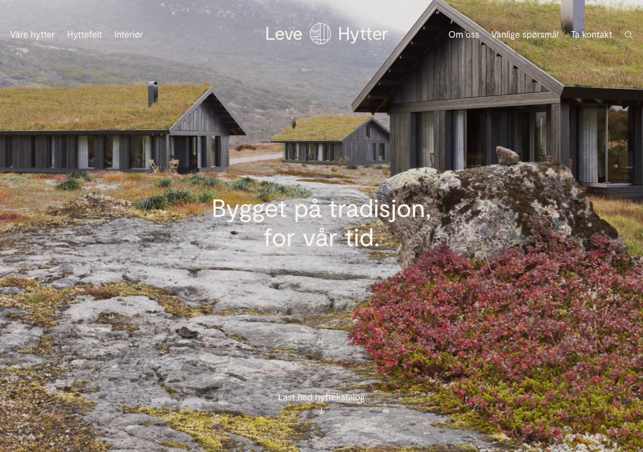
levehytter.noThe reference for warm-earth premium-catalogue calm: dark bark brown rgb(52,37,25) on warm cream rgb(247,244,236), Moderat sans set light, and a full-bleed landscape hero with the headline centred low over the photo.
Real Estate flagship
Design tokens
tone1
tone2
- display
- Moderat
- body
- Moderat
- mono
Do / Don't
Reference it for
- The signature two-colour system: dark bark brown text rgb(52,37,25) on warm ivory rgb(247,244,236), almost no other colour, letting product photography carry all the richness
- Warm mid-brown accent rgb(117,86,64) for surfaces and secondary blocks that stay inside the earth family
- Full-bleed edge-to-edge landscape hero photo with the display headline set low-centre in white, not top-left
- Moderat (with Helvetica Neue / Arial fallback) as the single face, Regular 400 for body, Bold 700 for headings, no serif display
- Restrained type scale: 15px body most common, 18px and 16px secondary, jumping to 25/30/40px for headings
- Tight positive letter-spacing (0.1px on body, 0.3px on smaller labels) that keeps the sans crisp
- Generous rounded corners as a system: 15px cards, 28-32px large panels, 60px pill buttons, 100% circles
- Two-line poetic hero headline in the local language ('Bygget på tradisjon, for vår tid') set large and calm
Do not copy
- The Leve Hytter wordmark and the circular cabin-in-a-ring logo glyph
- The exact bark-brown and ivory pairing as a lift-wholesale palette
- The Norwegian cabin photography and the sod-roof mountain landscape imagery
- The Vy cabin model names and product line copy
- Bielke&Yang's specific editorial voice and Norwegian body copy
- The Moderat licensed typeface (proprietary, self-hosted woff2)
- Real project names like 'Kragerø View' and the architect Einar Jarmund references