Land Of Ride
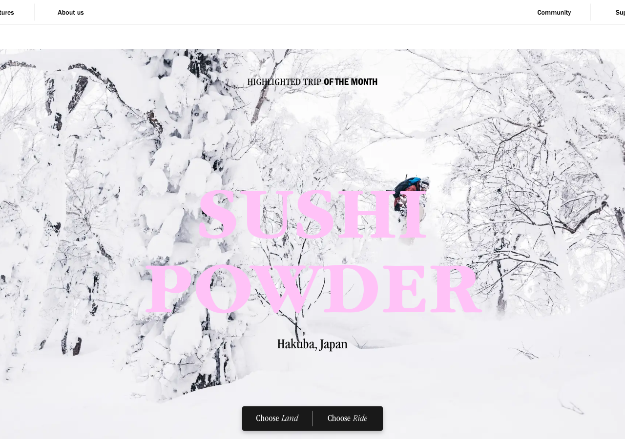
landofride.comThe reference for full-bleed editorial travel: a giant candy-pink Garamond display headline (#FFC2F7) laid straight over an edge-to-edge adventure photo, monochrome UI chrome, and a low pill CTA that splits one decision into two.
Hospitality flagship
Design tokens
background
surface
text
textMuted
accent
border
tone1
tone2
- display
- GaramondNarrow
- body
- FranklinGothicCondensed
- mono
Do / Don't
Reference it for
- Oversized display serif set in Garamond Light (72px) laid directly over full-bleed photography, no scrim, no card
- Candy-pink headline #FFC2F7 as the sole colour against an otherwise black/white page, letting the photo carry the colour
- Monochrome nav: FranklinGothicCondensed caps at 14px, split left/right (Adventures + About us | Community + Support), no logo lockup competing with the hero
- The mixed-typeface system: Garamond serif for editorial voice, FranklinGothic for UI, plus a deep display library (CooperBlack, Sequel, RoadRage, Kabel) swapped per adventure for character
- Eyebrow as inline mixed-weight run: 'HIGHLIGHTED TRIP' book + 'OF THE MONTH' demi, one line, letter-spacing 0.2px
- A single black pill CTA at the base of the hero holding two choices split by a hairline divider ('Choose Land | Choose Ride'), italic accent words
- Place-line in Garamond italic under the headline (20px) as caption, not label
- 3px near-square border radius as the house corner, applied consistently across 19 elements
Do not copy
- The Land of Ride wordmark and the 'Choose Land / Choose Ride' brand line
- The candy-pink #FFC2F7 as your own signature colour
- The actual expedition names (Sushi Powder, Surf Ranch, Sands of Gobi) and their EUR pricing
- The named adventure photography (Hakuba powder, Maldives surf) and the tagged @handle community shots
- The specific display-font grab-bag (RoadRage, CheapsMan, AttackGraffiti) as-is
- The 'only Newsletter worth riding' voice line
- Real people, IG handles and trip captions from the community wall