Intercom
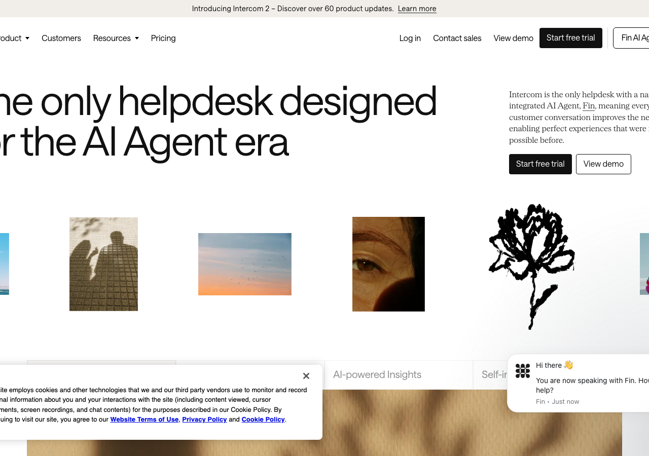
intercom.comThe reference for an editorial-magazine SaaS hero on warm cream (#faf9f6) with whisper-light weight-300 grotesk display and one electric-violet (#0007cb) accent doing all the chromatic work.
SaaS Product flagship
Design tokens
background
surface
text
textMuted
accent
border
tone1
tone2
- display
- Serrif
- body
- Saans
- mono
- SaansMono
Do / Don't
Reference it for
- Warm near-white canvas #faf9f6 instead of cold SaaS grey, so the page reads as paper not screen
- Oversized light grotesk display (Saans-like) at weight 300, ~80px, tight leading: confidence without bold weight
- Single saturated accent (#0007cb electric violet) used only in tiny doses (the corner registration ticks), never as fill
- Black-filled primary button paired with a hairline-outlined secondary (Start free trial / View demo), both with sharp 4px corners
- Square 4px corners on every control rejecting the rounded-pill trend for architectural precision
- A horizontal band of mixed thumbnail tiles (photo, sketch, ink illustration) used as an editorial mood strip under the headline
- Right-aligned small body paragraph as a deck/standfirst beside the big headline, magazine masthead layout
- Flat depth: no shadows, separation via warm tone progression #faf9f6 to #f1eee9 to #d3cec6 and whitespace
Do not copy
- The Intercom wordmark and the Fin AI-agent product naming
- The exact electric-violet #0007cb as your brand colour (it is Intercom's signature)
- The hand-drawn black ink flower / peony motif in the thumbnail strip
- The Saans / SaansMono proprietary typeface family
- The literal helpdesk product-UI inbox screenshot and its sample conversation content
- The 'only helpdesk designed for the AI Agent era' positioning line