Ikoyi
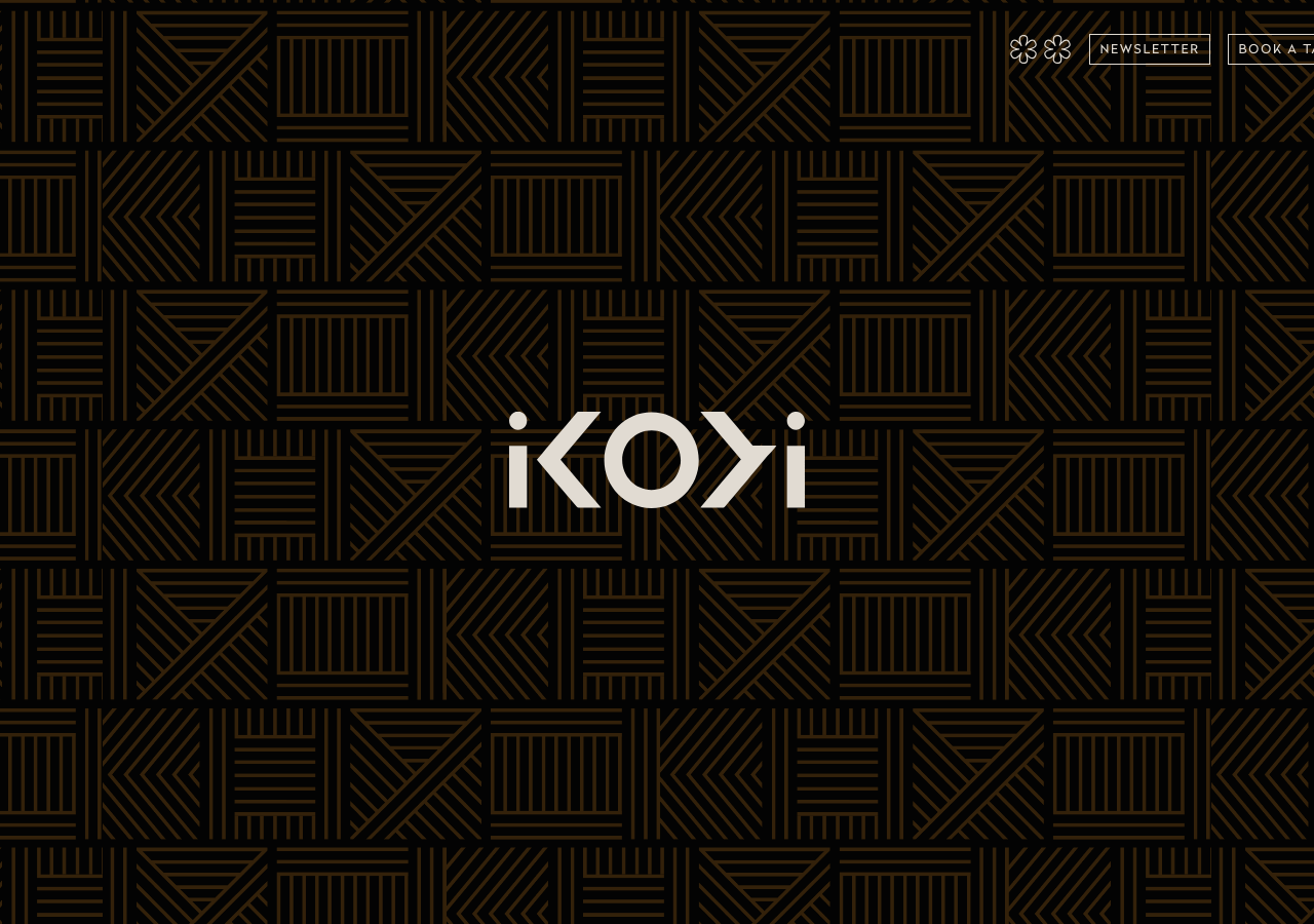
ikoyilondon.com/The reference for a fine-dining restaurant told as a hushed, near-black editorial: bone-white #e1dbd2 type and geometric ochre #d99637 line-pattern on #100b04, letter-spaced Radikal caps over Baskerville serif body.
Hospitality flagship
Design tokens
background
surface
text
textMuted
accent
border
tone1
- display
- Baskerville
- body
- Radikal
- mono
Do / Don't
Reference it for
- Full-bleed dark hero (#100b04) carrying a tiled ochre-on-black geometric line motif (#d99637 strokes at ~15% presence) with a single centred bone-white wordmark, no CTA competing for the eye
- Two-family type system: Radikal (sans) for UI/labels in caps with generous letter-spacing (1.96px / 1.715px), Baskerville serif for the long about/menu prose
- Bone-white text #e1dbd2 as the ONLY foreground on near-black, never pure #ffffff, keeps the whole page warm and matte
- Tiny, confident type scale: 14px body dominant, 16px for emphasis, 10-12px letter-spaced caps for nav and eyebrows, nothing shouts
- Menu-as-plain-statement copy: price and cadence in a bare sentence ('Our tasting menu is GBP 395') rather than a styled card
- Two Michelin-star flower glyphs sitting quietly in the top-right of the nav as the only ornament besides the pattern
- Outlined pill button ('BOOK A TABLE') in thin bone-white stroke on black, no fill, matching the restrained luxe register
- Narrow measure text columns (max-width 588px / 700px) centring long serif paragraphs for a considered, magazine feel
Do not copy
- The IKOYI wordmark with its mirrored-K/reversed-arrow letterforms
- The specific tiled geometric line pattern (its adinkra/textile-inspired motif is brand-owned)
- The two Michelin-star flower marks
- The exact ochre-bronze-on-black palette as a set
- Restaurant-specific copy (the spice-cuisine story, GBP 395 tasting menu, 180 Strand address)
- The 'Design by EverythingInBetween' studio credit
- The shop product names and imagery (plantain carrier bag, cookbook, tees)