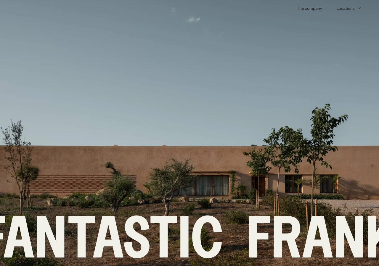
Fantastic Frank
fantasticfrank.com/The reference for editorial-magazine real estate: a full-bleed property photo under a giant edge-to-edge messina-sans wordmark in chalk lab(99.65% -.18 2.05), on a warm bone-sand ground lab(94.99% -.91 3.40) with charcoal ink lab(13.23% -.21 2.88) and a single muted olive accent.
Real Estate flagship
Design tokens
background
surface
text
textMuted
accent
border
tone1
- display
- Md-Lorien
- body
- messina-sans
- mono
Do / Don't
Reference it for
- Oversized full-width hero wordmark (44px+ display, letter-spacing -0.24px) sitting at the baseline of a full-bleed architecture photo, cropped hard at both edges
- Warm bone-sand background lab(94.99% -.91 3.40) instead of pure white, paired with charcoal ink lab(13.23% -.21 2.88) for a printed-catalogue feel
- Chalk near-white lab(99.65% -.18 2.05) for text laid over photography so it reads warm, not stark
- Single restrained accent: muted olive lab(54.2% -1.84 17.02) as the only chromatic note in an otherwise neutral system
- Two-face pairing: messina-sans (sans) for nav, labels and the wordmark, md-lorien serif for editorial headings and property names
- Everything at weight 400: no bold anywhere, size and scale carry hierarchy (12/14/16/32/44px steps only)
- Property cards as a magazine grid: photo, then serif title, then a terse spec stack (4 Bedrooms / 4 Bathroom / 232 m² / 2.250.000 EUR)
- Curatorial section labels as content, not decoration: 'Weekend Pick', 'Most loved', 'Hot right now', 'Editors pick'
Do not copy
- The Fantastic Frank wordmark and name
- The exact messina-sans + md-lorien licensed typefaces
- The specific property photography and real listing addresses
- The real office details (Sturegatan 34, Stockholm; +46 8 120 45 100; info@fantasticfrank.com)
- The city roster and the specific listing copy / prices
- The 'A Frank Chat with...' journal series naming convention
- The exact sand-plus-olive palette as a lift-and-shift scheme